Widget Customization
This page describes common settings you can apply to most widgets in MT Showcase.
Drop shadows
A drop shadow makes a widget look raised above the background. You can set the shadow's color, position and blur. The default color is black, but white or pale gray can work better on dark backgrounds.
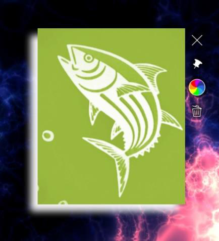
These widgets have drop shadow attributes: Image viewer, Video viewer, Video carousel, Web browser and PDF book.
- Click Structures and select the structure.
- Select the widget in the structure tree.
- Open Advanced at the end of its attributes and set:
- Drop shadow color: for example
white,#FFFFFForrgba(255,255,255,1). See Colors. - Drop shadow offset: how far the shadow is moved, horizontally and vertically, for example
-20 20. The default0 0puts the shadow evenly around the widget. - Drop shadow blur radius: how soft the shadow is. The default is
20px. - Drop shadow quality and Drop shadow gamma: fine-tune how the shadow is drawn. You rarely need to change them.
- Drop shadow color: for example
To give every widget in an app the same shadow, set these attributes in the Widget decorations theme defaults instead. See Themes.
Size limits
You can set a maximum and minimum size for widgets. If a visitor makes a widget too big or too small, it resizes itself back within the limits. This stops visitors from accidentally blowing a widget up to cover the whole screen, or shrinking it until it is unusable. For example, to keep widgets no bigger than one screen, set the maximum size to 1920 × 1080 pixels.
Maximum widget size
While a visitor is moving or resizing a widget, it can grow somewhat beyond its maximum size. When they let go, it shrinks back to the maximum size. This feels more natural than a hard stop, which visitors might mistake for a fault.
Minimum widget size
In the same way, a widget can shrink somewhat below its minimum size while a visitor is resizing it. When they let go, it grows back to the minimum size.
Set the maximum and minimum sizes
Size limits are set with a Size limit behavior. For example, to limit the size of a web browser:
- Click Structures and select the structure.
- In the structure tree, find the web browser's Behavior operators row, open the … menu and choose Add Widget.
- In the Add Widget to Behavior operators dialog, choose Size limit on the New Widget tab. To reuse a size limit you already have, use the From Library tab.
- Select the new Size limit and set:
- Minimum size: the minimum width and height, for example
10cm 10cm. The default is100px 100px. - Maximum size: the maximum width and height, for example
1920px 1080px(the default), the size of one landscape screen. - Maximum size multiplier: how far a widget can grow beyond its maximum size while a visitor is resizing it. The default
1.6lets it grow 60% bigger before it shrinks back.
- Minimum size: the minimum width and height, for example
To use the same size limit elsewhere, open its … menu and choose Add to Library. You can also set a default size limit for all widgets in the theme. See Themes.
Snap to angle
Visitors can normally rotate items freely. A Snap to angle behavior makes a rotated widget turn itself back to the nearest allowed angle when the visitor lets go, like a boat righting itself. For example, you can make sure a video viewer or web browser always returns to upright.
For example, with 8 rotation divisions, the allowed angles are 45 degrees apart. If a visitor rotates an image to about 60 degrees and lets go, it turns back to 45 degrees.
To add it to a web browser:
- Click Structures and select the structure.
- On the web browser's Behavior operators row, open the … menu and choose Add Widget, then choose Snap to angle.
- Select the new Snap to angle and set:
- Rotation divisions: how many allowed angles there are in a full circle. Divide 360 by this number to get the step between them. 4 allows 0, 90, 180 and 270 degrees; 2 allows 0 and 180; 1 (the default) always turns the widget back upright.
- Duration of adjustment to snap angle: how long, in seconds, the widget takes to turn to the allowed angle. The default is 0.4.
As with size limits, you can add a snap to angle to the Widget Library to reuse it, or set it as a theme default.
Colors
Many widgets have color attributes, for example the bubbles and connectors of a finger menu, annotations, drop shadows, and the Particles effect.
You can enter a color in several ways:
- Color picker: click the color swatch next to the attribute and pick a color.
- RGBA value: for example solid purple is
rgba(128,0,128,1). The last number is the opacity, from 0 (fully transparent) to 1 (solid).rgb(128,0,128)also works. - Hex code: for example
#800080. Add two more digits for opacity, for example#80008080for half-transparent purple. - Color name: a CSS color name such as
purpleordarkmagenta. Names are not case-sensitive.
Whichever way you enter it, the Editor saves the color as an RGBA value.
Text style
A Text style sets how text looks in widgets. Set it in the Widget decorations theme defaults to change the text of every widget in the app, or give one widget its own text style. Some parts of widgets, such as the caption bar, have no text style of their own and always follow the theme's text style.
- Font: to use your own font, drag an OpenType or TrueType font file from the Media Library panel onto the Font file attribute. You can set the font size and color, and make the text italic or bold. You can also make the characters look thicker or thinner by changing the render width.
- Outline and glow: add an outline with a stroke color and width, and a glow with a glow amount and color.
- Shadow: add a drop shadow to the text, with its own color, blur and offset.
- Layout: set the vertical and horizontal alignment and how text wraps.
Maximization areas
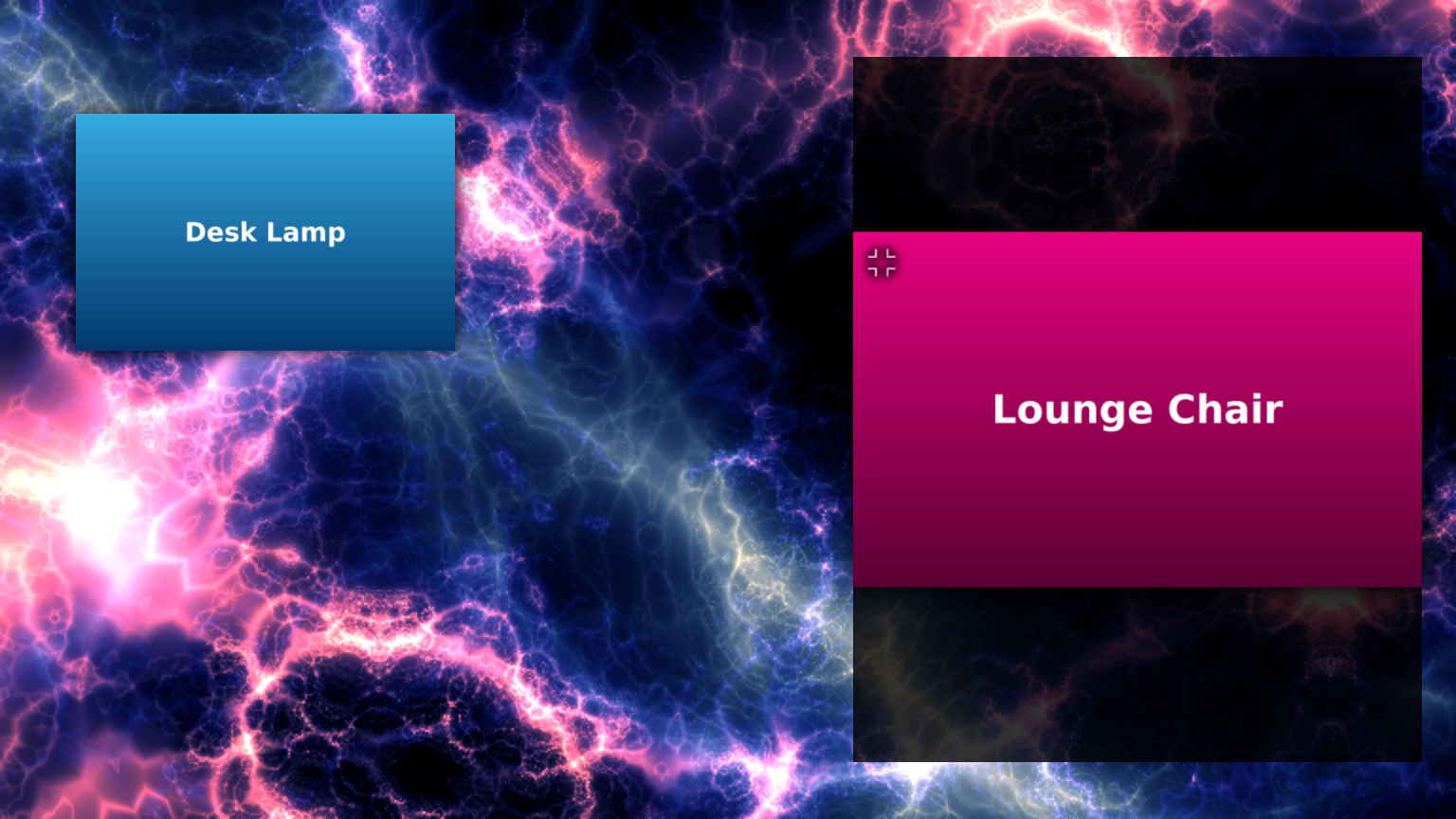
A maximization area is a region of the screen where maximized widgets are shown. When a widget is maximized, for example with its toolbar's Maximize widget button, it floats to the nearest maximization area and scales up to fill it, keeping its proportions. Without a maximization area, maximized widgets fill the whole screen. An app can have several maximization areas.
Use maximization areas when the wall includes a separate breakout display that maximized content should not spread onto, or when you want a different background or toolbar timeout for maximized widgets.
Note
A maximized widget is pinned and cannot be unpinned or moved until it is unmaximized.
Maximize and unmaximize widgets
- To make widgets open maximized, turn on Maximize widget when it opens? on the widget, or for every widget in the theme's Widget behavior defaults.
- To let visitors maximize a widget, give its toolbar a Maximize widget button. See Toolbars.
- To unmaximize, visitors tap the dark background of the maximization area beside the widget. A small Unmaximize button appears on that side of the widget and hides again after the Toolbars timeout (2 seconds by default). The button appears even if the widget has no toolbar.
- When it is unmaximized, the widget returns to where it was before, with its size and angle, and is pinned again if it was pinned. Before MT Showcase 26.10.0, it returned to the center of the screen, upright and unpinned.
Add a maximization area
- Click Structures and select the app's structure.
- On the Overlay layer row, open the … menu, choose Add Widget, and add Maximization area.
- Set its attributes:
- Location and Size: the area on screen.
- Background color: the color behind a maximized widget. The default is semi-transparent black,
rgba(0,0,0,0.8). - Toolbars timeout: how long an unused toolbar stays visible in the area, in seconds. The default is 2. For widgets without a toolbar, this also applies to the Unmaximize button.
- If you add several areas, rename each one in the tree (… > Rename) so you can tell them apart.
Opening animations
There are two kinds of opening animation:
- Opening animation plays while a visitor taps and holds to open a finger menu or rotating menu. There are two styles:
- Circular progress animation: a circular progress bar. You can set its color.
- Stars progress animation: a spinning spiral of small stars. You can set the star color and the spin speed.
- Content opening animation duration sets how long a widget takes to fade in and grow when it opens from a menu, a content hotspot or a Codice card. The range is 0.1 to 2 seconds, and the default is 0.3. A short duration feels quick and crisp; a longer one feels smooth and graceful. The attribute is under Advanced.
Set the menu opening animation
- In the structure, select the Finger menu or rotating menu. To set it for every menu in the app, open the theme on the Defaults page and go to the menu's component instead.
- In Opening animation, pick an existing animation or create a new one, choose Circular progress animation or Stars progress animation, and give it a name, such as White stars.
- Set the animation's attributes, for example its Color.
- Under Advanced, set Content opening animation duration to how long menu items take to open.
The animation is a shared widget: it appears in the Widget Library and can be reused by other menus and apps.
Set the content opening duration for hotspots and Codice cards
- Content hotspot: select the hotspot, open Advanced, and set Content opening animation duration.
- Codice card: open the Widget Trigger code on the Codice DB page, click Edit trigger content, select the Codice content, open Advanced, and set Content opening animation duration.
To set either one for the whole app, use the Content hotspot or Codice content component of the app's theme.
Closing content
There are several ways to close content:
- Throw it away: visitors can throw a widget such as an image or video off the screen. It closes when it leaves the visible area. Tapping the center of a menu closes the menu.
- Close button: add a Close button to the widget's toolbar. See Toolbars.
-
Close after idle: content closes by itself after no one has touched it for a while. Add a Close after idle behavior to the widget's Behavior operators and set its timeout. Menus have their own Close after idle for the items they open, and Menu idle timeout for the menu itself. See Themes.
An item opened from a menu can have a Close after idle in up to three places. Only the most specific one applies:
- the item's own setting in the content set;
- the widget's own setting;
- the menu's setting for the items it opens, on the menu itself or in the theme on the Defaults page.
For example, with 30 seconds on the menu and 60 seconds on a video viewer, a video opened from the menu closes after 60 seconds. Before MT Showcase 26.10.0, all of them ran and the shortest always won.
-
Close on next tap: with Close content on next tap? on a menu, tapping a menu item closes the content previously opened from that menu first. With Close previously opened content on next tap on a content hotspot, tapping the hotspot again closes its content instead of opening more.
- Exclusive mode: with Exclusive mode on a finger menu or rotating menu, opening an item closes everything else that menu opened, so one item from the menu is open at a time. It takes precedence over Close content on next tap?. See Finger Menus: Open one item at a time.
- Close with the launcher: menus, hotspots and Codice cards can close their content when they themselves go away (Close content when menu is removed?, Close content when hotspot is removed? and Dismiss contents when Codice is lifted). This only closes content opened directly by that launcher. For example, if a menu opens a hotspot image, closing the menu closes the image but not what the image's hotspots opened, unless those hotspots also have the setting on.
- Screen wipe: add a Screen wipe widget to a menu, hotspot or Codice card. When it opens, it closes all content that visitors have opened, including open menus.
- Restart the app: restarting an app from the Dashboard (Restart?) or switching apps resets the app completely. All content closes, videos return to the start, and annotations are cleared.