Content Hotspots
A content hotspot is an area of the screen that opens content when a visitor taps it: an image, video, PDF, web page, or even a finger menu or rotating menu.
You can place hotspots in two ways:
- On the screen: a hotspot in the Main layer has a fixed size and location, for example over part of your app's background image. It is invisible unless you give it a background color or a visualization widget.
- On a widget: a hotspot attached to an image, video or text viewer moves, turns and scales with that widget. One image can carry several hotspots, each opening different content. This is how you build a hotspot image, such as a campus map where each building opens its own page.
A widget carrying hotspots can itself be anywhere an image or video can go: directly in a structure, inside a menu's content set, or launched by a Codice card.
Hotspots also carry a signal, so they can drive logic: a group can reveal content only when several hotspots are active. See Groups and Logic.
Add a hotspot on the screen
- Click Structures and select the app's structure.
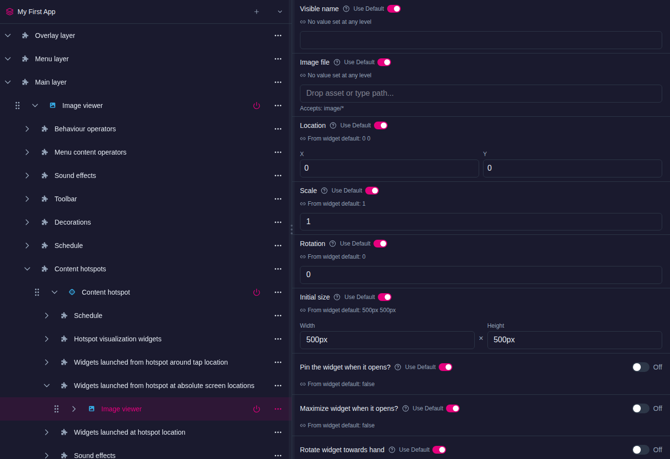
- On the Main layer row, open the … menu and choose Add Widget, then select Content hotspot.
- Set Hotspot location (the top-left corner, in pixels) and Hotspot size.
- Optionally, set a Background color so you can see the hotspot on the wall while you set it up. Return it to transparent when you are done, or add a visualization widget instead (see Hotspot slots).
- Add the content the hotspot opens to one of its launch slots (see below).
To tell several hotspots apart in the tree, give each a name with Rename in its … menu.
Add hotspots to an image, video or text
- Select the Image viewer, Video viewer or Text viewer in the structure tree, and make sure it has its image, video or text.
- Expand it. On its Content hotspots row, open the … menu and choose Add Widget, then select Content hotspot.
- Set the hotspot's Hotspot location and Hotspot size. The location is measured from the widget's top-left corner, so
0 0puts the hotspot at the corner of the image. To make the whole image one hotspot, set the size tocalc(100%) calc(100%). - Add the content the hotspot opens to one of its launch slots.
- For more hotspots on the same widget, repeat steps 2 to 4. Make sure the hotspots do not overlap.
In a menu
To open a hotspot image from a finger menu, rotating menu or teaser, put it in the menu's content set as a widget item:
- Open the content set, select the folder the item belongs in, and click Add Widget. Choose Image viewer.
- Set the new item's Image file by dragging an image from the Media Library panel, and give it a Visible name: its label in the menu.
- Expand the item in the content set tree. On its Content hotspots row, choose Add Widget and add a Content hotspot, then set it up as above.
Images dragged into a content set as plain files cannot carry hotspots; add the image as a widget item instead. To use a hotspot image you have already built somewhere else, add it to the Widget Library with Add to Library in its … menu. Then add a copy of it to a content set with Add Widget and the From Library tab.
From a Codice card
A Codice card can launch an image viewer with hotspots, just like any other widget. See Codice Cards.
Hotspot slots
Expand a content hotspot in the tree to see its slots:
| Slot | What goes here | Where it appears |
|---|---|---|
| Hotspot visualization widgets | An image, image movie or video that shows visitors where the hotspot is and hints at its content. Tapping it works like tapping the hotspot, and it extends the tappable area even if it lies outside the hotspot. | Its Location is measured from the hotspot's top-left corner. |
| Widgets launched from hotspot around tap location | Content that opens near the visitor's finger. | Its Location is measured from the tap. |
| Widgets launched from hotspot at absolute screen locations | Content that always opens at the same place on the screen. Use it to open several items side by side, such as a product video and its brochure. | Its Location is measured from the top-left corner of the screen. |
| Widgets launched at hotspot location | Content that opens at the hotspot itself. | Its Location is measured from the hotspot's top-left corner. |
| Sound effects | Sounds played when the hotspot is used. See Sounds. | — |
To fill a slot, open its row's … menu and choose Add Widget. You can add any widget that can be launched, including menus.
Hotspot settings
| Setting | What it does |
|---|---|
| Hotspot location, Hotspot size | The tappable area. |
| Background color | Fills the hotspot. Transparent by default. |
| Content opening animation duration | How long launched content takes to open. |
| Rotate contents towards hand | Turns content launched around the tap location to face the visitor's hand. Content launched at absolute screen locations is not affected. |
| Close previously opened content on next tap | Each tap closes what the hotspot opened before launching new content. Off by default, so each tap adds more content. |
| Close content when hotspot is removed? | For a hotspot on a widget: closes the launched content when that widget is closed. |
| Trigger mode, Signal name and the other signal settings | How the hotspot's signal behaves when it is tapped. See Groups and Logic. |
Several hotspots in a grid
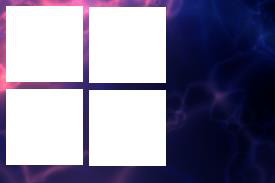
To lay out several hotspots on the screen or on an image, give each its own Hotspot location and Hotspot size, and make sure they do not overlap. For example, four hotspots in a grid with 50-pixel gaps:
| Hotspot | Hotspot location | Hotspot size |
|---|---|---|
| Hotspot 1 | 50 50 |
450 450 |
| Hotspot 2 | 550 50 |
450 450 |
| Hotspot 3 | 50 550 |
450 450 |
| Hotspot 4 | 550 550 |
450 450 |
Test the hotspot
Changes reach the wall as you make them. Tap the hotspot area on the wall; the content you added opens. If you used a visualization widget, it shows you where the hotspot is.