Finger Menus
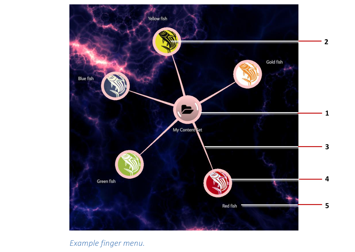
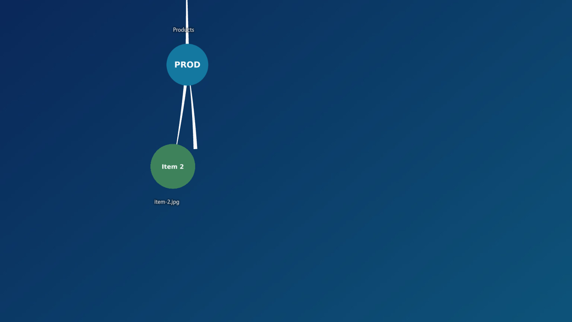
A finger menu opens when a visitor taps and holds an empty area of the screen. It can also be launched from a content hotspot, a teaser or a Codice card. A finger menu is a circular, animated menu: child bubbles radiate from a central bubble, joined to it by connectors. Each child bubble is a menu item, and can show a thumbnail of the item. Tapping a folder bubble opens it as a submenu; tapping any other bubble opens the item.
The items come from a content set. The look of the bubbles and connectors comes from the app's theme.
Step 1: Create the content set
- Upload the images, videos or PDFs you want to the Media Library panel, if they are not there yet. For example, upload a folder of images.
- Click Content Sets in the left navigation, click New Content Set, enter a name such as Content for Menus, and confirm.
- Open the new content set and drag the items from the Media Library panel into its tree. Folders you create with New Folder, or drag in from the media library, become submenus.
Changes save automatically. For more on building content sets, including web addresses and widget items, see Content Sets.
Step 2: Add the finger menu
- Click Structures and select the app's structure.
- On the Menu layer row, open the … menu and choose Add Widget, then select Finger menu.
- With the finger menu selected, set its Content slot to Content for Menus.
That is all a working finger menu needs. On the wall, tap and hold an empty area of the screen. After a brief delay, the menu opens.
Build it from a folder in one step
You can also drag a media library folder straight onto the Menu layer row. The Editor asks what to build; one of the choices is a new content set shown by a finger menu.
Step 3: Style the menu in the theme
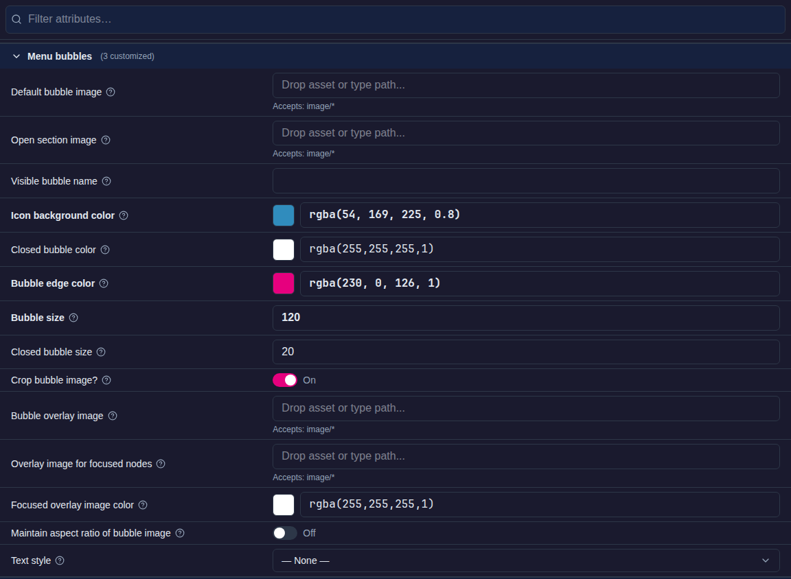
Bubbles, connectors and menu behavior are set in the app's theme, so every finger menu in the app looks and behaves the same:
- Click Defaults and open the app's theme.
- Under Components, use these entries:
- Menu bubbles: the bubbles. For example, Icon background color (the bubble fill), Bubble edge color, Bubble size, Visible bubble name and Default bubble image.
- Menu bubble connectors: the lines between bubbles. For example, Connector color.
- Finger menu: the menu itself, such as Menu idle timeout, Rotate menu towards hand, Close content on next tap?, Exclusive mode (see Open one item at a time), and the physics of the bubbles: Menu item mass, Menu item friction, Length of connector and so on.
- To use a different style of menu item altogether, set the Finger menu component's Menu item type. Choose an existing shared widget, or choose + Create new..., name it, and pick Menu bubbles or Menu nodes (the cube-shaped items used by rotating menus). Use Menu bubble connectors in the same way to create a named connector style.
Colors can be entered as a hex code (#800080), an RGBA value (rgba(128,0,128,1)) or a name (purple), or picked with the swatch. For a transparent bubble, use rgba(0,0,0,0), #00000000 or transparent.
For a worked example, see Themes: style finger menus.
Item names, thumbnails and section images
- Names: each bubble shows its item's Visible name. Select an item in the content set to edit it, or use Rename in its … menu.
- Thumbnails: an item's Preview image is shown on its bubble. The central bubble uses the content set's own preview image, which you set with Content set settings.
- Open section image: an image shown in the center of the menu while a folder is open, instead of that folder's usual bubble image. Set it on Menu bubbles in the theme to use one image for every open folder, or on a single folder to give that section its own; see Give each section its own image and background.
Give each section its own image and background
Each folder in a finger menu is a section, and a section can change the wall while it is open. It can show its own logo in the center of the menu and put its own widgets on the Background, Main and Overlay layers. Going back to the previous section puts that section's own look back, and closing the menu returns to the structure's normal layers.
These settings need MT Showcase 26.09.13 or later.
Step 1: Build the background and add it to the Widget Library
A section's background is a shared widget from the Widget Library. Build it once in a structure, where you can see it on the wall, and then add it to the Library.
- Click Structures and select the app's structure.
-
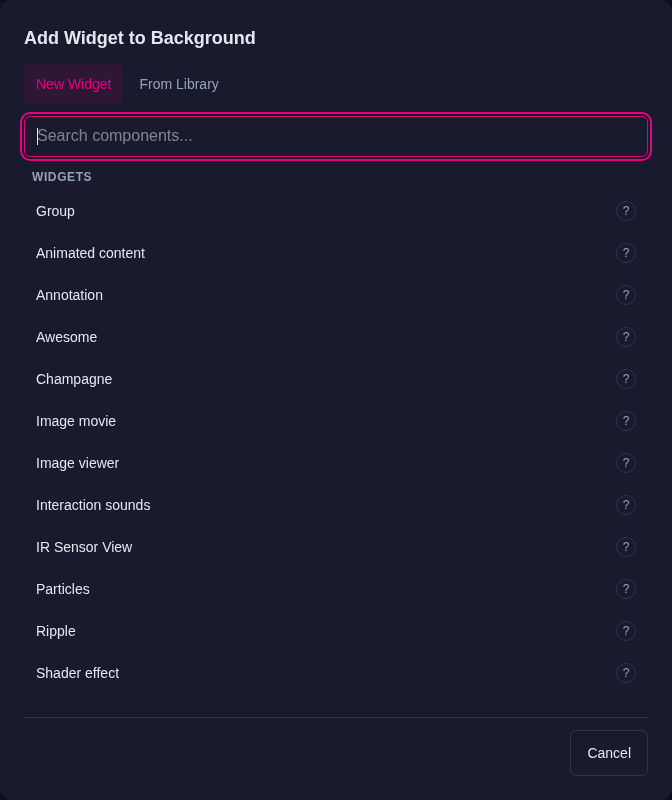
On the Background layer row, open the … menu and choose Add Widget. Choose the widget for the background, such as Image viewer for a picture, or Awesome or Shader effect for an animated background.
-
Select the new widget and set it up. For a full-screen picture, drag the image from the Media Library panel into Image file, set Location to
00, set Initial size to the screen resolution of the wall (for example3840px×2160px), and turn on Pin the widget when it opens? so visitors cannot move it.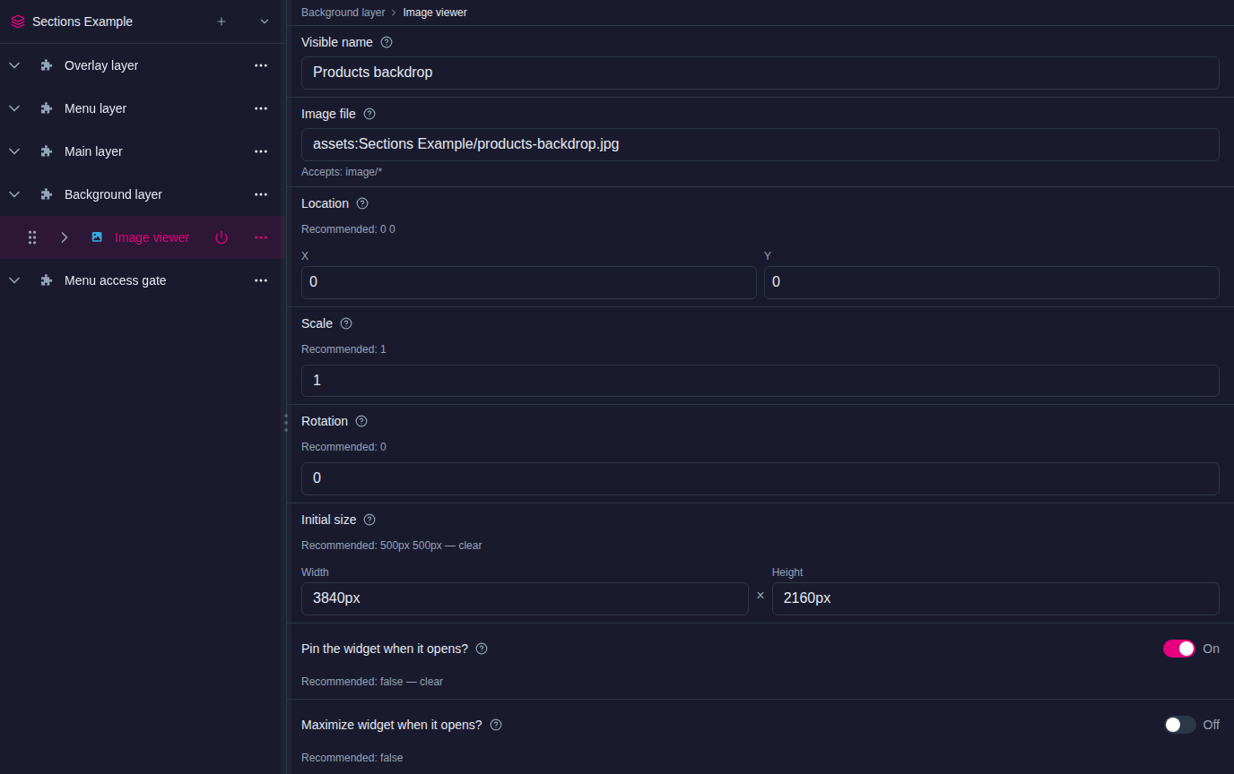
-
Open the widget's … menu and choose Rename. Give it a name you will recognize in a list, such as Products backdrop. The Library entry takes this name.
-
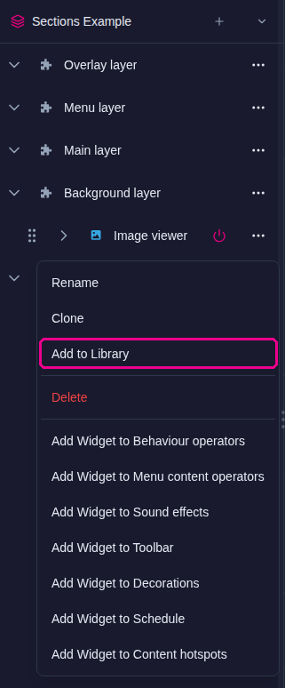
Open the … menu again and choose Add to Library. The Library keeps its own copy.
-
If the widget should not stay on the structure's own background, delete it from the structure. The copy in the Library is not affected.
Repeat these steps for each section that needs a different background.
A background with more than one part
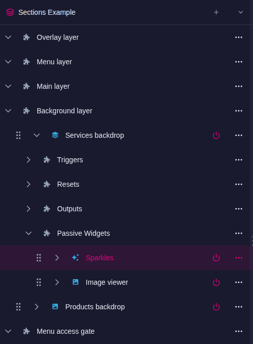
To load several widgets together, such as a picture with a Sparkles effect over it, add a Group to the Background layer instead. Rename the group, then use the group's … menu > Add Widget to Passive Widgets to add each part. Add the group to the Library, and every part comes with it.
Step 2: Set up each folder
The section settings appear only when the content set is used by a finger menu or a rotating menu, so complete Step 2: Add the finger menu first.
- Click Content Sets and open the menu's content set.
-
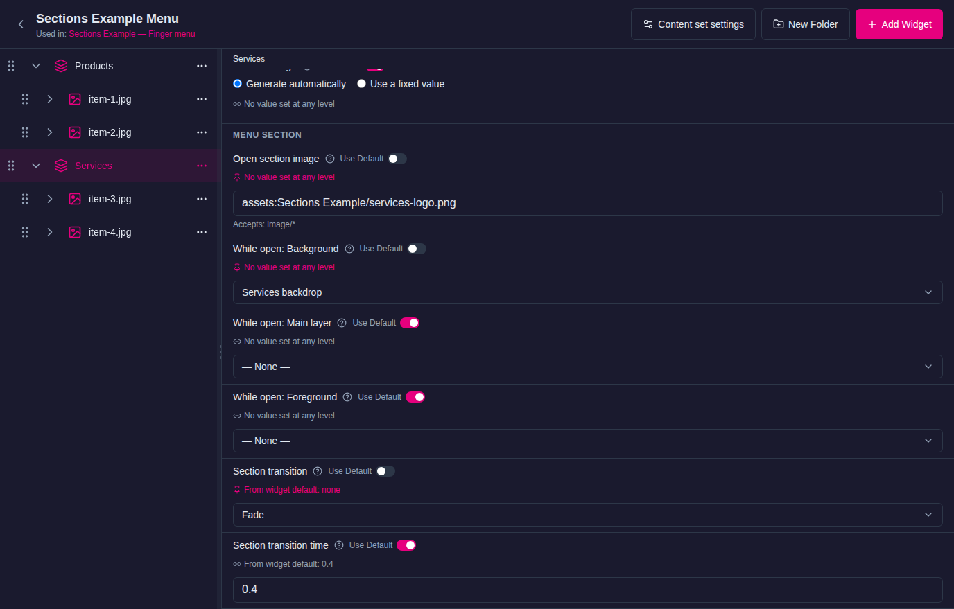
Select a folder. Under the folder's own fields, Menu section lists what the menu does while this folder is open:
- Open section image: the image in the center of the menu. Drag an image from the Media Library panel into the field. Leave it unset to use the theme's image.
- While open: Background: the widget shown on the Background layer. Choose the entry you added to the Library, for example Products backdrop.
- While open: Main layer and While open: Foreground: widgets for the Main layer and for the Overlay layer, in front of everything else. Leave them at — None — if the section does not need them.
- Section transition: Fade fades the section's widgets in and out; None shows and removes them at once. Section transition time sets the length of the fade, in seconds.
-
Repeat for each folder. To give the top level of the menu its own look too, click Content set settings: the content set's own settings have the same Menu section.
Changes save automatically. On the wall, open the menu and tap a folder: its image and background appear. Tap back, and the previous section's look returns.
How items open
Each item opens in the widget that matches its type: images in an Image viewer, videos in a Video viewer, PDFs in a PDF book, web addresses in a Web browser and 3D models in the 3D model viewer. Where there is more than one widget for a type, such as PDF book and PDF flow for PDFs, the item has a Player type setting in the content set, so you can pick a different widget for that item only.
To control where opened items appear, use the Finger menu component's Display location for menu content and Relative or absolute display location? in the theme.
Open one item at a time: Exclusive mode
By default, every item a visitor opens from a menu stays open until it is closed. With Exclusive mode on, opening an item from the menu first closes everything that menu opened before, so exactly one of its items is open at a time. Use it, for example, when several menus on one wall each play videos and only one video per menu should play.
- Only items opened from this menu are closed. Items opened from other menus, from content hotspots or from Codice cards stay open.
- Tapping an item that is already open opens it afresh and closes the old copy.
- While Exclusive mode is on, Close content on next tap? has no effect on that menu.
- A teaser opens the menu in its Menu slot, so it follows that menu's setting.
- Exclusive mode is off by default, so existing apps behave as before.
Exclusive mode works the same way for finger menus and rotating menus. It needs MT Showcase 26.10.0 or later.
To turn it on for one menu:
- Click Structures and select the app's structure.
- Select the finger menu or rotating menu, for example in the Menu layer.
- Turn on Exclusive mode.
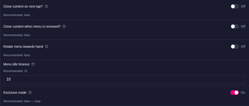
To turn it on for every finger menu or rotating menu in an app, click Defaults, open the app's theme, go to Components > Finger menu or Rotating menu, and turn on Exclusive mode there. A menu that sets its own value in the structure keeps it.
More than one menu in a layer
If a layer holds more than one menu that opens on a tap and hold, such as a finger menu and a rotating menu in the Menu layer, a hold opens only one of them: the one placed highest in that layer in the structure tree. To choose which menu opens, drag it above the others in its layer. Menus opened by a content hotspot or a teaser do not open on a hold. This needs MT Showcase 26.10.0 or later; earlier versions opened every such menu in the layer, on top of each other.