Concepts
Apps
An app is an individual MT Showcase application. It defines the content visitors see on the wall (images, videos, PDFs, web pages and so on) and how screen items such as menus, hotspots and the background look and behave.
An app brings together three things:
- A structure: which widgets are in each layer of the app. See Structures.
- A theme: default attribute values for the app's widgets. See Themes.
- A service set: services such as email sending and data gathering. See Service sets.
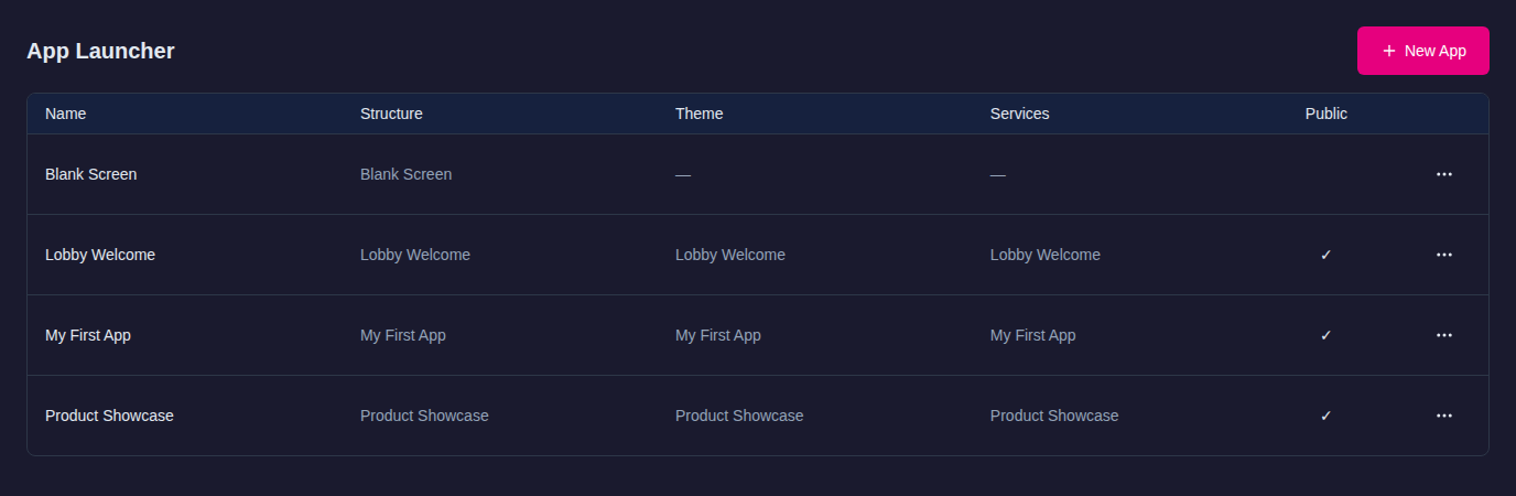
One MT Showcase server can hold many apps. You create and manage them on the App Launcher page. When you click New App, MT Showcase creates the app together with its own structure, theme and service set, all named after the app, so the app is ready to edit straight away. To assign a different structure, theme or service set, open the app's … menu and choose Edit.
To run an app, go to the Dashboard and choose the app for a player under Connected Players. Each player runs one app at a time.
For a walkthrough, see Getting Started.
Widgets and attributes
A widget is a component in an MT Showcase app. A widget's attributes, such as its size, behavior and appearance, can be defined in the Showcase Editor.
Content widgets
There are several types of widget in MT Showcase. But as an MT Showcase app designer, you will mainly focus on widgets that display content directly (such as the image viewer) and widgets that open or launch content (such as menus and hotspots).
The following widgets display content directly. They contain the text, images and video content that you want to show on your video wall.
- Image viewer: Displays image files, including PNG, JPEG, BMP and TIF files.
- Image movie: Plays a sequence of images as an animation or movie.
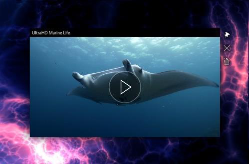
- Video viewer: Plays a video. The video source can be a video file (e.g., an MP4 movie), a video stream, or a video capture device (e.g., a web cam).
- Web browser: Displays web pages and HTML files, but can also display images, videos, text files and PDFs.
- PDF Book: Displays PDF documents as open books. It uses a realistic page-flip animation when paging through a document.
- PDF Flow: Displays PDF documents as a stack of pages. It uses a carousel-like animation when paging through a document.
- Text viewer: Displays custom text content and text files.
- Model3d (3D model viewer): Displays an interactive 3D model (glTF/GLB, OBJ, STL or FBX). Visitors rotate it by dragging, or it can spin by itself.
- Cloud: Displays a rotating collection of items (images, movies, browsers, and so on), clustered together in a ball. Users rotate the cloud to find the item they want.
See Content Widgets for more details about content widgets.
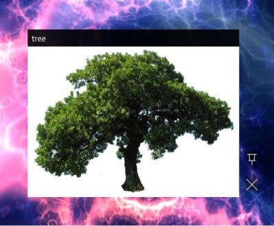 Image viewer |
 Video viewer |
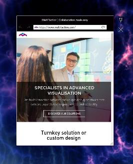 Web browser |
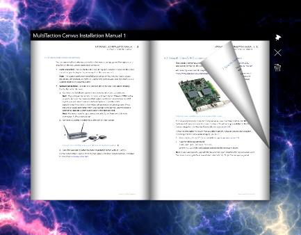 PDF book |
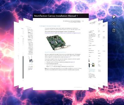 PDF flow |
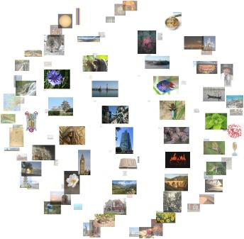 Cloud widget |
Example content widgets
Menu and hotspot widgets
These widgets display menus or activate screen hotspots.
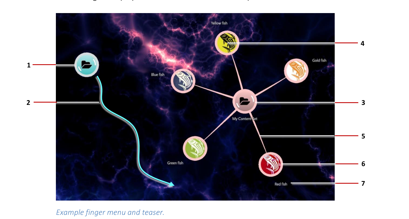
- Finger menus: These display when a user taps and holds an empty area of the screen. They can also be launched from content hotspots or with a Codice card. A finger menu is a circular animated menu, with child bubbles radiating from a central bubble. Child bubbles represent individual menu items and can display thumbnail images. Separate widgets control the appearance and behavior of the individual bubbles and the connectors that radiate out from the central bubble to the child bubbles. You can also replace bubbles with nodes (either cubes or custom images).
- Rotating menus: These display when a user taps and holds an empty area of the screen. They can also be launched from content hotspots or with a Codice card. A rotating menu is an oval animated menu, with items orbiting a central node. The effect is similar to satellites orbiting a planet. Users can tap an orbiting item to open a submenu of items such as images, videos and PDFs. Rotating menus are a direct alternative to finger menus. A separate widget controls the appearance of the menu items. By default, the central node, orbiting items and submenu items are all shown as bubbles, like the ones in finger menus, but you can display them as nodes (cubes or custom images).
- Teasers: These are menu launchers. They can be a single bubble drifting slowly across the screen, 'wobbling' briefly at regular intervals to attract users' attention, or a single bubble that fades in and out, reappearing at random screen locations. In both cases, users can tap the teaser to open a regular finger menu or rotating menu. For greater impact, you can specify multiple instances of a teaser drifting across the screen at the same time, and you can use a custom image or video instead of a bubble. (A separate widget controls the behavior of the teaser menu, including its speed, direction and animation properties.)
- Content hotspots: These are special areas of the screen that support custom interactions. When users tap a hotspot, menus or other widgets such as images or videos are displayed. The app designer specifies the number of hotspots, their size and location. They can also assign images or videos as hotspot background.
Other types of widget include games (Pong and Missile Command) and Codice detectors. (A Codice is a 2D barcode or marker printed on paper or card.)
Most widgets mentioned above are interactive. Users can move, resize, rotate, pin and close these widgets, if permitted. As the app designer, you determine what actions are permitted for each widget in the app. For example, you may include an image with a fixed size and position in your app, but superimpose a hotspot above this image so that, when a user taps the image, MT Showcase opens a menu of secondary items (such as images, videos, or PDFs) that users can move and resize as they like.
Attributes
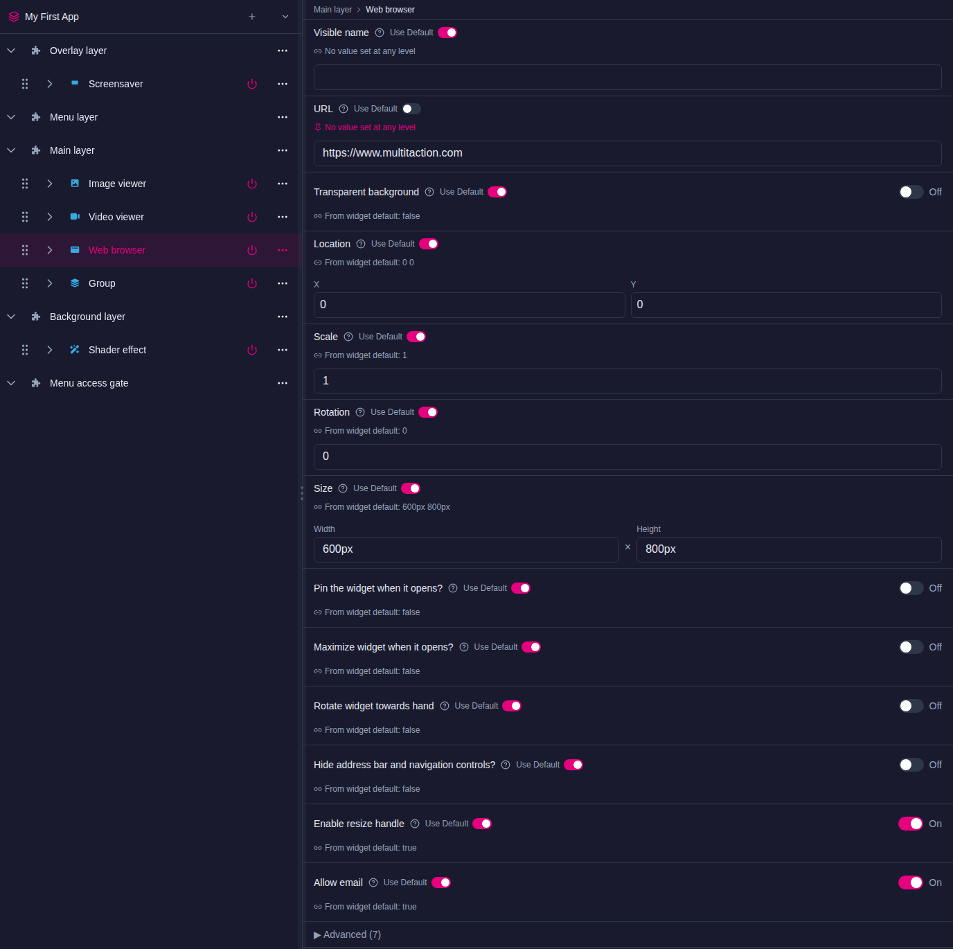
A widget has attributes that define its size, location, appearance or behavior. Some widgets have many attributes, others only one or two, and some have none.
When you select a widget in the Editor, its attributes appear in the attributes panel. Most attributes are numbers (such as sizes, screen coordinates or timeouts), on/off switches, colors, or choices from a list. Some point to a file in the media library, such as a PDF book's document. Others point to a shared widget, such as a toolbar.
Each attribute shows where its value comes from. With Use Default on, the widget follows the app's theme; the caption reads From theme: value or From widget default: value. Set a value and the widget keeps its own value instead. See Themes.
Less-used attributes are collapsed under Advanced (n).
Widget library
The widget library is a collection of shared widgets that you can reuse in any app on your MT Showcase server.
A shared widget is a widget you have created and named once, such as a toolbar or a menu bubble style, and then use in many places. Shared widgets you create appear on the Widget Library page. Click a widget's name to open it. Its … menu offers Edit, Rename, Duplicate, Copy to structure… and Delete; Copy to structure… opens a searchable list of the server's structures. The page also shows where each widget is used in structures, themes and content sets. To reuse a widget from a structure elsewhere, open its … menu in the structure tree and choose Add to Library.
The most common types of shared widget include:
- Menu bubbles: Items in finger menus are shown as bubbles, radiating from a central bubble. This widget sets the bubble size, color, image and label.
Note
By default, finger menus render menu items as circular bubbles. But if you prefer, you can use any image you want. For example, you can set up a finger menu to use your corporate logo instead of bubbles.
-
Bubble connectors: In a finger menu, connectors attach child bubbles to the central bubble. This widget sets the connector color and length and how much they bend when a user drags the menu.
-
Toolbars: Before you can assign a toolbar to, say, an image viewer, you must create and name a toolbar widget. For example, you may want to create a toolbar named 'Pin and Close Toolbar'. You can then assign this toolbar to any image viewer in your app. In fact, you can assign this toolbar to any content widget in your app (for example, video viewers, PDF viewers and browsers).
-
Teaser behaviors: A teaser needs a behavior widget that controls how it moves. Two behaviors are available:
- Floating content behavior: The teaser floats slowly across the screen, animating briefly at regular intervals.
- Fading content behavior: The teaser pulses rhythmically, fading in and out at random screen locations.
-
Opening animations: Many widgets can play an animation when they open. For example, finger menus can open with a circular progress bar or a spinning spiral of small stars. You can create and name widgets to control the properties of these animations, such as their color and speed (such as 'White star spiral').
-
Close after idle: If a user stops interacting with a widget (for example, a menu item or an item opened from a hotspot), the widget fades and closes automatically. 'Close after idle' specifies the timeout and fade duration for idle widgets. You can create separate versions of this widget. For example, you may want two versions of this widget ('30 second timeout' and '60 second timeout') to enable you to assign different timeouts to, say, videos and PDFs.
-
Snap to angle: You can constrain the incremental rotation of widgets so they automatically re-adjust themselves to a fixed angle of rotation. The effect is similar to a boat righting itself after keeling over. The snap to angle widget sets the incremental rotation for other widgets.
-
Text style: You can customize how text in different widgets is displayed by adding a custom Text style to a widget or theme in your Showcase app. For example, you can change the color of Finger menu item names or use a custom font to add branding to your app.
Choose a shared widget
Settings that hold a shared widget, such as a teaser's Menu or Teaser visualization widget, show a drop-down list:
- Pick a widget from the list, or choose + Create new... to make one.
- Edit, beside the list, opens the chosen widget so you can change it.
- Drag an image or video from the Media Library panel onto the list. The Editor makes a matching widget showing that file, such as an Image viewer or Video viewer, and chooses it. Drop one file at a time. A file the setting cannot show is refused with a message.
The Edit button and dropping files on the list need MT Showcase 26.10.0 or later.
Structures
A structure defines the framework of an app: which widgets are in each layer of the app, with their size and position on screen. Every app gets its own structure when you create it. You edit structures on the Structures page.
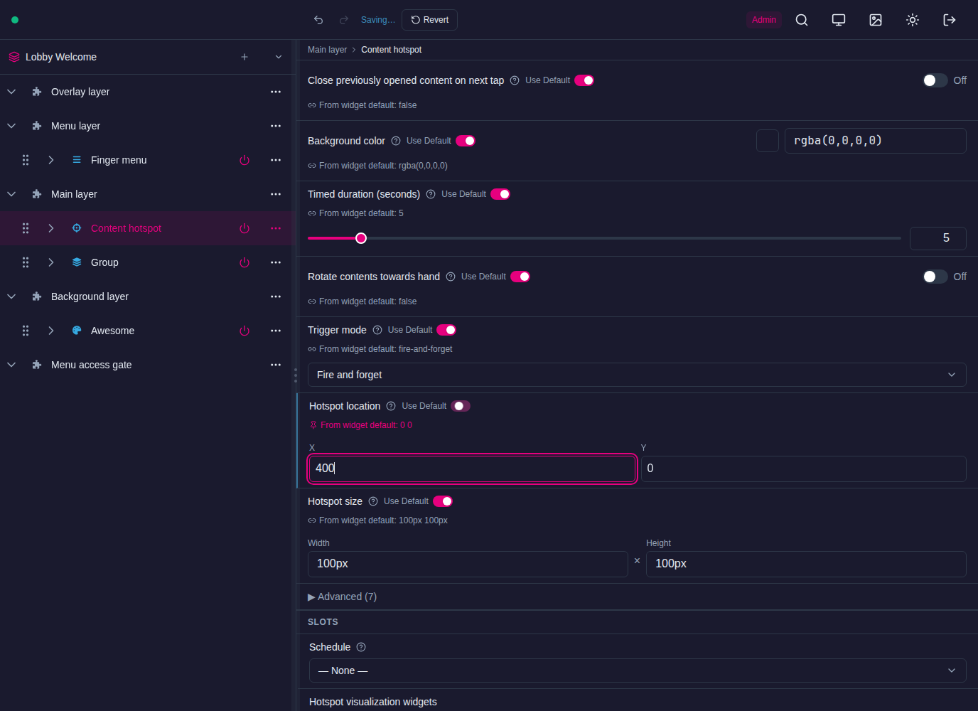
The structure tree shows the app's layers as rows: Overlay layer, Menu layer, Main layer and Background layer, plus the Menu access gate. To add a widget to a layer, open the … menu on the layer's row and choose Add Widget. Select a widget to edit its attributes on the right. Changes save automatically.
Delete a widget
To delete a widget, open its … menu in the structure tree and choose Delete. The widget disappears from the tree, and a message at the bottom of the screen counts down 30 seconds:
- Undo brings the widget back, with its settings, at any time during the countdown.
- Delete now deletes the widget straight away, without waiting for the countdown.
When the countdown ends, the widget is deleted. The Delete now button needs MT Showcase 26.10.0 or later.

Overlay
This is the topmost layer in an MT Showcase app. Widgets in this layer operate above any screen content in the main layer. There are six overlay widgets:
- Animated content: The animated content widget applies animation to image and video widgets. There are two types of animation. You can configure images or videos to float slowly across the screen. Or you can configure them to pulse rhythmically, fading in and out at random screen locations.
Note
Animated content is also available in the background layer. If added to the overlay layer, content appears above items in the main layer. If added to the background layer, content appears underneath items in the main layer.
- Champagne, Particles and Ripple: These widgets are purely cosmetic and superimpose animation effects above the main app layer (streams of rising bubbles, floating circles and wavelets emanating outwards from a finger, respectively).
Note
These effects are also available in the background layer. When added to the overlay layer, the effects appear to be above items in the main layer. When added to the background layer, they appear to be underneath items in the main layer.
-
Input Visualizer: This widget is provided for administrative purposes. It shows visualizations of touch events for fingers, hands, Codice cards, and infrared pens. It also provides a quick mechanism for identifying Codice code numbers.
-
Maximization area: This widget defines an area (or areas) on the screen where maximized widgets are displayed. When a widget is maximized (for example, when a user taps the Maximize toolbar button), it floats to the nearest maximization area and scales up to fill the area.
-
Screensaver: A screensaver widget can display a background such as Awesome or Shader effect, an image or movie, or animated content. The screensaver is displayed when the app has been idle for a specified time. To clear the screensaver and return to the app, the user taps the screen.
Menu layer
This layer is where you define a finger menu or rotating menu. To open a finger menu or rotating menu, users tap and hold any area of empty screen. Instructions for creating a finger menu are in finger-menus.
Note
These menus can also be launched from content hotspots (defined in the Main layer) or by a user holding a Codice card against the screen.
Main layer
This layer includes the content widgets that users see when they use the app. It can include any combination of image, video, browser, PDF and cloud widgets.
This layer can also contain content hotspots, teasers, groups and counters, games (Pong and Missile command) and Codice detectors.
Background layer
This layer defines the screen background. It can include:
- Animated content. This widget applies animation to image and video widgets. You can configure images or videos to float slowly across the screen. Or you can configure them to pulse rhythmically, fading in and out at random screen locations.
Note
Animated content is also available in the overlay layer.
-
An animated background. The following backgrounds are available:
- Awesome: A background of drifting clouds, similar in effect to the Aurora Borealis. You can customize the colors and animation speed.
- Shader Effect: A background that resembles the night sky, with dramatic purple and magenta nebulae drifting across the screen, punctuated with cores of bright white light. However, you can use a custom shader file if required.
-
Animation effects superimposed on the screen background. These widgets are interactive and respond to touches, emanating outwards from the user's fingers.
- Champagne: Displays streams of rising bubbles, like in a glass of sparkling wine.
- Particles: Displays small floating circles, randomly connecting to nearby circles.
- Ripple: Displays wavelets, like ripples on a pond.
- Sparkles: Displays swirls of particles. Its effect is like dragging your hand through a sparkling fluid.
Note
These effects (not Sparkles) are also available in the overlay layer.
-
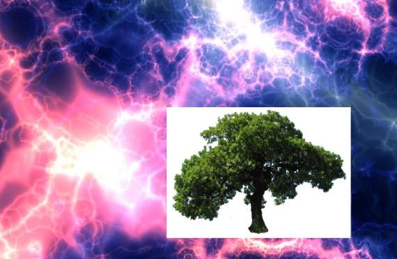
Images and movies. These widgets occupy fixed positions on the screen and are not interactive. For example, you may want a video looping continuously in the background or you may want to use a background image as wallpaper. However, you can position hotspots in the Main layer directly above areas in your background image to make the image appear to be interactive.
-
An annotation widget. This defines the color and timeout for annotations drawn on the screen with an infrared pen.
Menu access gate
The Menu access gate holds an optional PIN lock for the tap-and-hold gesture that opens menus from the Menu layer. When a PIN lock is set here, visitors must enter the PIN before a menu opens. Leave it empty for no gate. See Screensaver.
Themes
A theme is a collection of attribute values for MT Showcase widgets. Every app gets its own theme when you create it, and all widgets in the app take their attribute values from it by default. Themes are managed on the Defaults page. See Themes.
Why use a theme? Themes provide consistent widget appearance and behavior across an app. They also simplify the process of creating apps, because you can assign the same theme to several apps.
Consider an image viewer widget. By default, an image viewer has no toolbar or title bar. But if you want the images in your app to have title bars and toolbars, you can enable these features for the image viewer in the app's theme. All image viewer widgets in your app will automatically inherit a toolbar and title bar. This approach is far quicker than individually configuring each image viewer.
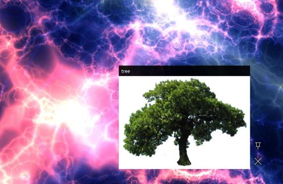
Of course, there may be occasions when you do not want a widget to use a theme. (For example, you may want to suppress title bars and toolbars for videos playing in the background layer.) If so, you can always override the theme and apply custom attribute values to any widget in your app. To override the theme, you set the attribute directly on the widget in the app's structure or content set, which switches off its Use Default toggle.
Note
If neither the widget nor the theme sets an attribute, the widget uses its built-in default value.
Service sets
A service set defines a specific administrative setup for an MT Showcase app. You manage service sets on the Services page. Every new app gets its own service set, with an email sending service and a data gathering service already in it. Each MT Showcase installation can support multiple service sets. This allows MT Showcase designers to create multiple versions of an app, all with the same content and theme but each with a unique service set. For example, you may want to deploy the same app in your London and Paris offices but with a different service set in each location that specifies the local SMTP server.
In the current version of MT Showcase, service sets can include the following services. Later versions of MT Showcase may include additional services.
- Email Sending service: Used for sending screen content from MT Showcase to a specified email account. When you add the email sending service to a service set, you must define such attributes as the SMTP host, credentials for an SMTP user, the sender's email address and the email subject.
Note
Visitors can also collect content without giving an email address: a personal space can show an access QR that opens their Personal Folder on their phone. See Audience identity.
-
Data Gathering service: Collects content usage data that can be imported into third party data visualization tools such as Tableau Desktop. Usage data is stored in a SQLite database (
showcase-reporting.db) on the application computer as event records. Example events include hand and finger touches, opening or closing a widget, playing a video, viewing a PDF, browsing to a URL, adding items to a personal space, and emailing items from a personal space. -
Media Server service: stores the address of an external media server. The current release does not send collected items to a media server, so this service has no effect on the wall. Use Personal Folders instead.
Content sets
A content set is a collection of items (images, videos, PDFs, web pages and widgets) that supplies finger menus, rotating menus, teasers and clouds. You manage content sets on the Content Sets page.
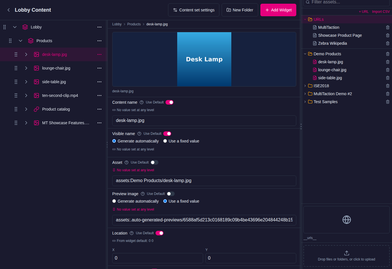
You build a content set by dragging items from the media library into it. Items can be in a flat list, or in folders and subfolders that become the menus and submenus of your app. Drag a whole media library folder in to create a matching menu tree in one step.
You can define several content sets for different widgets, for example one per teaser, and reuse the same content set across apps. See Content Sets.
Media library
The media library holds the images, videos, PDFs, fonts and other files stored on your MT Showcase server. It is the source of the items in content sets and of files that widgets use, such as backgrounds.
The Media Library panel is always available at the side of the Editor. To add files, drag them from your computer onto the panel's upload area. You can organize files into folders, rename them and move them.
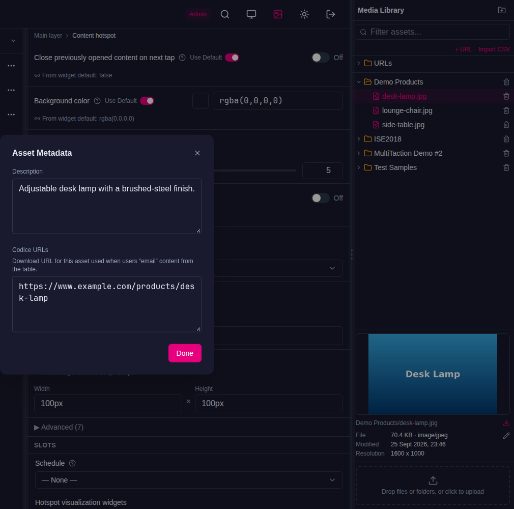
Select an item to preview it. Its details include:
- Asset Metadata: information such as file size and type.
- Description: a note about the item, for example copyright details. It is for your reference only.
- Codice URLs: a web address for the item. If a visitor sends this item from their personal space, the email includes this link instead of the file. Use it for large videos and PDFs that are also published online.
Renaming or moving a file or folder in the media library updates every content set, widget and theme that uses it.
Use a file in a widget
A widget setting that takes a file, such as an Image viewer's Image file, shows Drop asset or type path…. Fill it in either way:
- Drag the file from the Media Library panel onto the field. This is the most reliable way.
- Type the file's path as the media library shows it, for example
Products/desk-lamp.jpg, then press Enter or click outside the field. The path is saved only then, not while you type. Press Esc to abandon what you typed. For a web address, type the whole address, starting withhttps://.
If the media library has no file at the path you typed, the Editor does not save it and shows a message under the field. Check the spelling and the folder, or drag the file in instead. Typed paths need MT Showcase 26.10.0 or later; earlier versions saved a typed path in a form the wall could not open.

Files that will not play well on the wall
Every file is checked when it arrives in the media library, whether you upload it or it comes in with an imported app. A file that is likely to cause problems on the wall gets a badge next to its name:
- Red: the file won't display on the wall. For example, the wall cannot show HEIC photos from an iPhone or AVIF images.
- Amber: the file will display, but may stutter or load slowly. For example, a 6K or 8K video, a very high bitrate video, an Apple ProRes export, or a very large image.
- Grey: the wall shows only part of the file. For example, an animated WebP image shows only its first frame.
Hover over the badge for the reason, or select the file to see the full list in its details. If the file can be fixed, the details include an Optimize this file button.
After an upload, any files with problems stay listed under Needs attention below the upload area, with the reason and a Convert now button. Select X to dismiss the list.
The wall displays these file types:
| Type | Plays well | Flagged |
|---|---|---|
| Images | JPEG, PNG, GIF, BMP, SVG, WebP, TIFF, TGA, ICO | HEIC and AVIF won't display. Images larger than the wall's limit may load slowly. An animated WebP shows only its first frame. |
| Videos | H.264 (MP4 or MOV) within the wall's size and bitrate limits | Apple ProRes, and HEVC or AV1 larger than 1080p, may stutter. So may video above the wall's size, bitrate or 60 frames per second limits. |
HEIC photos
HEIC photos can't be converted yet. Export them as JPEG from the phone or the Photos app before uploading, or set the iPhone to Settings > Camera > Formats > Most Compatible.
Animated WebP images
Static WebP images display normally. An animated WebP shows only its first frame on the wall, and the media library gives it a grey badge: "Animated WebP: only the first frame shows on the wall". Optimize Media Library lists it under Shows only part of it on the wall but offers no conversion. To show the animation, convert it to a video, such as MP4, before you add it. Before MT Showcase 26.10.0, the media library on Windows flagged every WebP image as one that won't display, although the wall shows static WebP images.
Optimize Media Library
Optimize Media Library finds the files in the library that will not play well on the wall, and converts them.
- In the Media Library panel header, select the Optimize Media Library button (the sparkles icon).
- The Editor checks every file in the library and makes any missing previews. A progress bar shows while it works.
- The files with problems are listed in groups: Won't display on the wall, May stutter or load slowly and Shows only part of it on the wall. Each file shows what is wrong, its size, and how many places use it.
- Select Optimize on a file, or Optimize all on a group.
- Confirm the replacement. The list shows each file's progress. You can cancel a file that is waiting or converting.
Optimizing replaces the original file permanently:
- Each file is converted to a version the wall plays smoothly. Videos become H.264 within the wall's limits; WebP, TIFF and AVIF images become JPEG, or PNG if they have transparency.
- The converted file is fully checked before the original is replaced. If the check fails, the original is left untouched, and the reason is shown in the list.
.movand.mp4videos keep their file name. Other files get a new extension, for example.mkvbecomes.mp4and.webpbecomes.jpg. Everything that used the old file is updated to the new one.
Keep your originals
The original file is deleted after a successful conversion. If you need the original, for example a high-resolution master, keep a copy outside Showcase.
Set the limits for this wall
Administrators set the limits that files are checked and converted against, under Admin > Media Quality:
| Preset | Largest video | Video bitrate after optimizing | Video flagged above | Largest image side |
|---|---|---|---|---|
| 4K (default) | 3840 × 2160 | 40 Mbit/s | 60 Mbit/s | 7680 px |
| 1080p | 1920 × 1080 | 15 Mbit/s | 25 Mbit/s | 3840 px |
| Custom | You set each limit. |
Use 1080p for older players, or for walls that play several videos at the same time. Changing the preset updates the badges straight away.
The media library also has a URL Library of web addresses. Use Add URL to add one, or Import URLs from CSV to add many. You can drag URLs into content sets like any other item.
Codice database
You set up Codice cards on the Codice DB page.
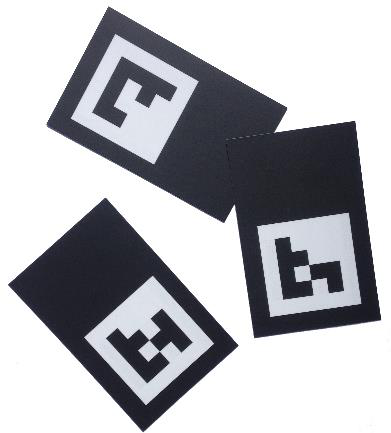
Codices are square 2D markers, each with a unique code number. A Codice card is a Codice printed on paper or card. Each code has a type that decides what the card does:
- Personal: belongs to one person and opens their personal space, where they collect items from the app and send them to themselves.
- Widget Trigger: launches content you design, such as an image, a video or a menu, for anyone who places the card. This is sometimes called Codice content.
- Eraser: erases pen and finger annotations. Codes 611, 612 and 613 are built-in erasers.
- Volume, Admin Override, Jog Wheel, Loupe and Spotlight: control volume, reveal widget controls for staff, scrub through video, magnify, or highlight part of the screen.
See Codice Cards.
Groups and logic
A Group combines the signals of several hotspots, counters or other groups, and reveals content when a condition is met: all of them touched, any of them touched, one at a time, in a set order, and so on. Groups let you build puzzles, selectors and unlockable content without code. See Groups and Logic.
Welcome screen
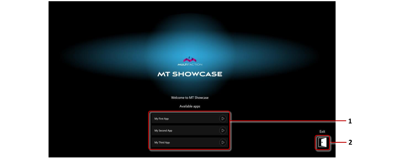
When MT Showcase has no app to show, for example when a player is asked to open an app that no longer exists, it shows the welcome screen. The welcome screen can list the available apps. It offers an Exit button only when MT Showcase was started with the --show-exit option. See App Navigation.