Themes
A theme is a set of default attribute values for widgets. Widgets in an app take their values from the app's theme unless you set a value on the widget itself. Themes are managed on the Defaults page, titled Defaults (Themes).
For how themes fit together with structures and content sets, see Concepts.
Every app has its own theme
When you create an app in App Launcher, MT Showcase also creates a theme with the same name and assigns it to the app. You can start styling an app straight away, and changing one app's theme does not change any other app.
If a theme with that name already exists, the new theme gets a numbered name, such as My App (2), so two apps never end up sharing a theme by accident.
You can still share a theme on purpose: assign the same theme to several apps so they look and behave alike. See Use a different theme for an app.
Deleting an app deletes its theme
When you delete an app, MT Showcase also deletes its structure, theme and service set, unless another app uses them. To keep a theme, assign it to another app first, or export it.
Why use themes
- Faster setup: set a value once in the theme instead of on every widget. For example, style the Menu bubbles component once, and every finger menu bubble in the app follows it.
- Consistency: every widget of a type looks and behaves the same across the app.
- Reuse: share one theme across several apps, for example to apply corporate colors to every app on a site.
How values are inherited
Every attribute takes its value from the first of these layers that sets it:
- The widget itself, in the app's structure or content set.
- The theme's component for that widget type, for example the theme's Video viewer settings.
- The theme defaults: settings that apply to all widgets, such as Widget behavior.
- The widget's built-in default.
In a structure or content set: Use Default
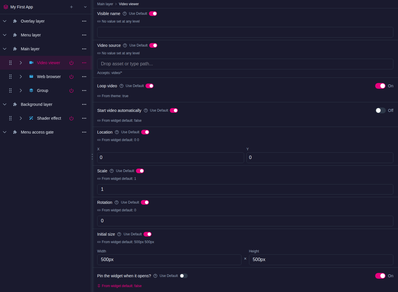
When you edit a widget in a structure or content set, each attribute has a Use Default toggle and a caption that names where the value comes from:
- From theme: value: the app's theme sets this value, and the widget follows it. If you change the theme, the widget changes too.
- From widget default: value: the theme does not set this attribute, so the widget uses its built-in value.
To give one widget its own value, type or pick the new value. Use Default switches off, and the widget now ignores the theme for that attribute. To go back to the theme's value, turn Use Default on again.
In a theme: recommended and customized values
In the theme editor, each attribute shows its recommended value (Recommended: value).
- An attribute the theme does not set follows the recommendation.
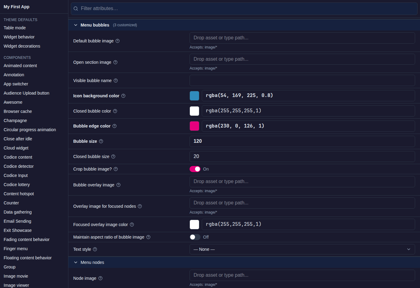
- When you set a value, the attribute is shown in bold, and each component's heading shows how many attributes this theme customizes, for example (3 customized).
- To remove a theme value, click Recommended: value — clear. The attribute then goes back to the system default.
The Defaults page
Click Defaults in the left navigation. The Defaults (Themes) page lists every theme and shows, in Used in, which apps use it.
- New Theme creates an empty theme.
- The row's … menu offers Rename, Duplicate and Delete. Use Duplicate to base a new theme on an existing one.
Click a theme to open the theme editor:
- The contents list on the side has two groups. Theme defaults holds the settings for all widgets, and Components lists every widget type the theme can style. Click an entry to jump to it.
- Use Filter attributes… to find an attribute by name.
- Less-used attributes of each component are collapsed under Advanced (n).
Changes save automatically. A running app picks up theme changes as you make them.
Theme defaults
Theme defaults apply to every widget in the app that uses the theme. There are three sets:
- Table mode: settings for touch tables, where Showcase turns content to face the person who touched it. See Table Mode.
- Widget behavior: how widgets behave by default:
- Pin the widget when it opens?: pins every widget when it opens. Some widgets, such as clouds and web browsers, must be pinned before visitors can use them.
- Maximize widget when it opens?: widgets open maximized. To return a widget to its normal size, visitors tap the dark background beside the maximized widget to show a small Unmaximize button. It hides again after a couple of seconds. See Maximization areas.
- Behavior operators: shared behaviors such as Snap to angle, Size limit and Close after idle. See Widget Customization.
- Sound effects: Widget sounds and Interaction sounds. See Sounds.
- Widget decorations: how widgets look by default, including their Toolbar, their Decorations (such as Title, Caption, Apply an overlay? and Annotation), text style and drop shadow.
Adding behaviors, sounds and decorations
Behavior operators, Sound effects and Decorations can hold several shared widgets. In a theme you can change the settings of the ones the theme already includes, but you cannot add new ones there. To add one, add it to the widget in the structure.
Note
If you pin every widget by default, visitors cannot move or resize widgets unless their toolbar has a Pin button to unpin them.
Example: set a value at three levels
Values set closer to the widget win. This example pins widgets when they open, except video viewers, except one particular video:
| What | Where | Pin the widget when it opens? |
|---|---|---|
| All widgets | Theme > Theme defaults > Widget behavior | On |
| All video viewers | Theme > Components > Video viewer | Off |
| One particular video | Structure > Main layer > that Video viewer | On |
Set the first two in the theme editor. For the one video, select it in the structure and set the attribute there: Use Default switches off, and the caption shows that the widget no longer follows the theme.
Example: style finger menus
This example changes the bubbles, connectors and menu timeout of every finger menu in an app.
- Click Defaults and open the app's theme.
- Menu timeout. Go to Components > Finger menu. Open Advanced and set Menu idle timeout to the number of seconds an unused menu stays open. The default is 10.
- Bubbles. Go to Menu bubbles:
- Set Bubble edge color, the bubble border. Click the swatch to use the color picker, or enter a value such as
#800080,rgba(128,0,128,1)orpurple. - Set Bubble size in pixels, for example
125.
- Set Bubble edge color, the bubble border. Click the swatch to use the color picker, or enter a value such as
- Connectors. Go to Menu bubble connectors, open Advanced, and set Connector color to the same color as the bubble edges.
Every finger menu in every app that uses this theme now follows these settings, unless a menu sets its own values.
Example: add a title bar to an image
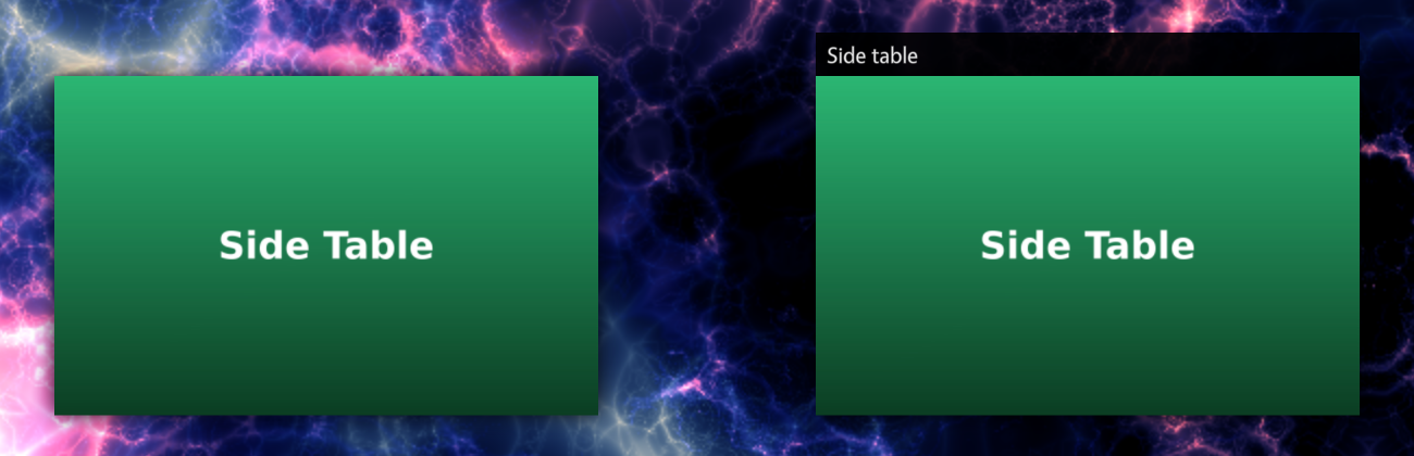
By default, image viewers have no title bar. Because a theme cannot add decorations, add the title bar to the image viewer itself:
- Click Structures and open the structure.
- Select the Image viewer and expand its Decorations row.
- Click Add Widget and add Title.
The image viewer now shows a title bar with the widget's name as it appears in the structure tree. To show a different title, set the widget's Visible name. If the theme already includes a Title decoration, you can change its settings for every widget in the theme's Widget decorations or in the Image viewer component.
Use a different theme for an app
- Click App Launcher.
- Open the app's … menu and choose Edit.
- In the Theme column, choose the theme.
- Click the ✓ (Save) button on the row.
Copy a theme to another server
Export the theme on the Import & Export page and import the file on the other server. See Import and Export.