Rotating Menus
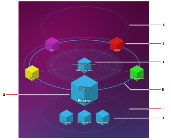
A rotating menu is an oval, animated menu with items orbiting a central node, like satellites around a planet. Visitors tap an orbiting item to open its submenu of images, videos, PDFs and other items.
Like a finger menu, a rotating menu opens when a visitor taps and holds an empty area of the screen, and it can also be launched from a content hotspot or a Codice card. Use it as an alternative to a finger menu.
By default, the central node, orbiting items and submenu items are shown as bubbles, like the ones in a finger menu. Set the menu item type to Menu nodes to show them as cubes instead, in a color you choose or with your own image.
Step 1: Create the content set
A rotating menu needs a content set with three levels:
| Content set level | Becomes in the menu |
|---|---|
| The content set itself (the root) | The central node |
| Folders directly inside it | The orbiting items |
| Items inside those folders | The submenu items |
Put content only inside the folders, not directly in the root.
- Upload the content to the Media Library panel, if it is not there yet.
- Click Content Sets, click New Content Set, enter a name such as Content for Rotating Menus, and confirm. Open the new content set.
- Add one folder per orbiting item. Click New Folder, then use Rename in the folder's … menu to give it the label visitors should see. If your media library already has one folder per section, you can drag those folders into the content set instead.
- Drag the submenu items from the Media Library panel onto each folder.
Labels come from each item's Visible name:
- Central node: the content set's own name. Change it with Content set settings.
- Orbiting items: the folder names.
- Submenu items: the item names. By default, a file's name without its extension.
Changes save automatically. See Content Sets.
Step 2: Add the rotating menu
- Click Structures and select the app's structure.
- On the Menu layer row, open the … menu and choose Add Widget, then select Rotating menu.
- With the rotating menu selected, set its Content slot to Content for Rotating Menus.
Note
Keep one menu in the Menu layer. If the structure already has a finger menu there and you want the rotating menu instead, delete the finger menu. If you keep both, a tap and hold opens only the one placed higher in the Menu layer; see More than one menu in a layer.
On the wall, tap and hold an empty area of the screen. After a brief delay, the menu opens.
Step 3: Style the menu in the theme
The look and behavior of rotating menus are set in the app's theme:
- Click Defaults and open the app's theme.
- Under Components, open Rotating menu and adjust it. For example:
- Color of menu rings: the color of the rings.
- Menu item color: the color of the menu items.
- Submenu location: whether submenus open above, below, left or right of the menu.
- Display location for menu content and Relative or absolute display location?: where opened items appear. By default they open over the submenu; an offset keeps the submenu visible.
- Exclusive mode: keeps one item from the menu open at a time. See Finger Menus: Open one item at a time, which works the same way for rotating menus.
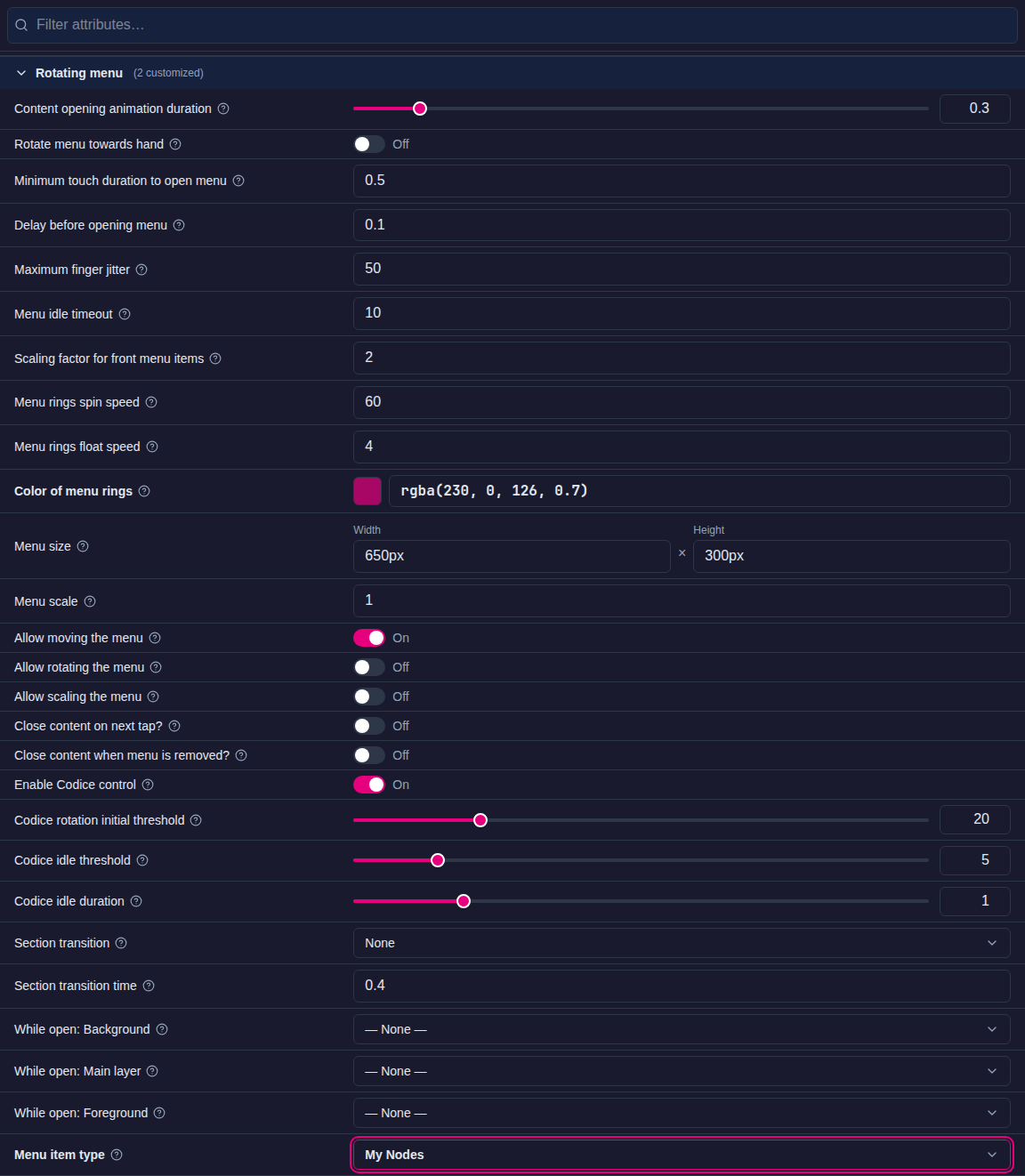
- Under Advanced: Menu rings spin speed and Menu rings float speed (how fast the rings spin and how slowly the halo rings rise and fall), Menu size, and Allow moving the menu, Allow rotating the menu and Allow scaling the menu.
Each attribute's help text describes its values.
Use nodes instead of bubbles
This step is optional.
- In the theme, open Components > Rotating menu.
- On Menu item type, open the drop-down list and choose + Create new....
- Enter a name, for example My Nodes, and confirm. When asked which type to create, choose Menu nodes.
- Edit My Nodes from the Widget Library, or set the defaults for all nodes in the theme's Menu nodes component. By default, nodes are blue cubes. You can change Node color and Node size, set an overlay image for the focused node, or use Node image to replace the cube with your own image. For example, for gold cubes, set Node color to
#FFD700,rgba(255,215,0,1)orgold.
Menu nodes also has an Open section image: an image shown on the central node while a submenu is open, instead of the usual node image.
Each folder can also set its own open image and its own background widgets while it is open. This works the same way as for finger menus; see Finger Menus: Give each section its own image and background.