Content Widgets
This section provides an overview of widgets that display content such as images or videos.
Image viewers
The Image viewer widget displays image files, such as PNG, JPEG, BMP and TIF files.
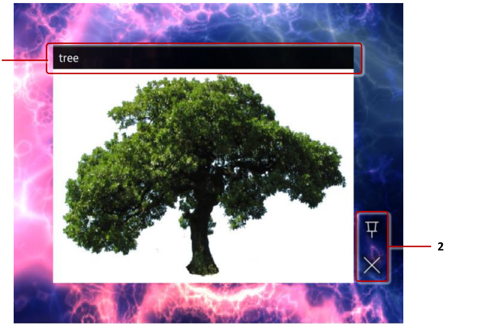
You can add a new Image viewer widget to your app by dragging an image file from the Media Library panel onto a slot in the structure tree, or into a content set. Alternatively, add an empty Image viewer with Add Widget and drag the image file into its Image file attribute. For more information about the media library, see Concepts.
You can configure an initial location and size for the image viewer widget, and choose whether users can move it or not. You can add a toolbar to the widget, and select the available buttons, for example a pin and a close button. You can also add decorations to the image, such as a title bar or a caption. You can even allow users to annotate on top of the image with IR pens.
You can add images directly to the main or background layer in your app's structure, or allow users to launch them from a content hotspot, menu or a Codice card.
You can add hotspots to an image to open additional content when a user taps on a specific part of the image. See Content Hotspots.
Video viewers
The Video viewer widget displays video files such as MP4 files, as well as video streams and video capture devices such as web cameras.
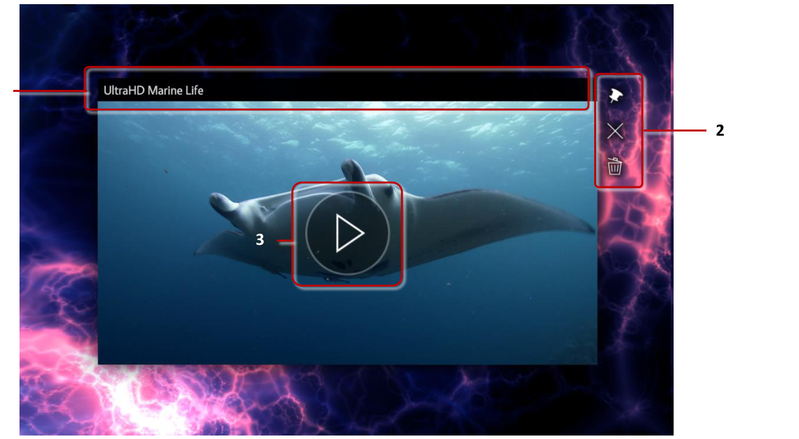
Like Image viewers, you can add Video viewers to your app by dragging a video file from the Media Library panel onto the structure tree or into a content set. Or you can add a new Video viewer widget and fill in its Video source attribute. This is required for video streams and video capture devices.
Video viewers have many of the same configuration options as Image viewers. You can set the video initial location and size, add a toolbar and decorations to the video and allow users to annotate on it. In addition, you can modify attributes specific to videos. You can set the video to automatically start playing when opened and to automatically close after playing or to play in a loop. By default, users can play or pause the video by tapping anywhere on it. Video also displays buttons to play or pause and to mute or unmute it. If needed, you can disable tapping to play the video and hide the buttons.
Video displays a preview image while it is not playing. See the video preview section below for information about customizing the video preview.
You can add hotspots to a video to open additional content when a user taps on a specific area of the video.
Video streams
Aside from displaying video files, Video viewer can also display live video streams. The stream can be a video capture device connected to the PC, such as a web camera. Or it can be an online video stream coming from another machine on the network.
To add a video stream to your app:
- Click Structures and select the app's structure.
- On the Main layer row, open the … menu and choose Add Widget, then select Video viewer.
-
With the video viewer selected, set the following attributes:
-
Video source: Input the path to the video stream. This can be an online video stream, for example
rtsp://10.36.0.122:8554/presentations. Or it can be a capture device: -
Ubuntu examples:
/dev/video0or/dev/v4l/by-path/pci-0000:04:00.0-video-index0 - Windows example:
video=@device_sw_{860BB310-5D01-11D0-BD3B-00A0C911CE86}\{BBABFA61-0001-48CC-9CAB-324ECB2D4C6B}
-
Tip
On Windows, if you also have MT Canvus installed, you can use mt-video-check.exe included with Canvus to get the video input source. Note that the output of mt-video-check.exe is optimized for Canvus. You should replace all double backslashes (\\) in the path with single backslashes (\) to use the path in Showcase Editor.
-
Streaming mode: Normally video viewers buffer the decoded video to ensure smooth playback. This adds latency when the video is a live stream. For optimal experience, enable Streaming mode to skip this buffering.
-
Start video automatically: Enable this attribute to automatically start playing the video instead of waiting for the user to play the video.
-
(Optional) Display video controls and Single tap toggles playback: You can disable these attributes to hide the video control buttons and prevent the user from pausing the video stream.
-
(Optional) Video stream quality settings: You can use the advanced attributes Video stream minimum resolution, Video stream maximum resolution, Video stream minimum frames per second, Video stream maximum frames per second and Prefer uncompressed video stream to fine-tune video stream resolution and quality. Each attribute's help text has the details.
Changes save automatically, and the stream appears on the wall straight away.
Video preview
While a video is not playing, it displays a preview image. By default, this is an automatically chosen frame in the video: the current frame if the video is paused, or a frame 5% from the beginning of the video if the video has played to the end and stopped. Note that when the video is first opened, it is paused on the first frame.
You can customize the preview image. You can set this to be a specific frame in the video, or a completely custom image. If a custom image is used, it is overlaid on top of the video, matching the video resolution.
To customize the preview image:
- Select the Video viewer you want to edit.
- Set the following attributes:
- Preview position: Set the playback position in the video to use as a preview frame. Set the preview position as seconds. Or you can set a relative position as a percentage of the video duration by using calc, for example
calc(100%)to use the last frame of the video as the preview image. - Preview image: You can use this attribute to set a custom image as the video preview. Drag and drop an image file from the media library into the input field.
- (Optional) Preview on pause: Normally when video is paused, the current frame is used as the preview instead of the custom preview position or image. You can enable this attribute to display the custom preview also when the video is paused.
- Preview position: Set the playback position in the video to use as a preview frame. Set the preview position as seconds. Or you can set a relative position as a percentage of the video duration by using calc, for example
Synchronized videos
To keep several videos in step, for example the same film on screens at both ends of a wall, give each Video viewer the same Video sync shared widget. Videos that share a Video sync have their playback state and position synchronized. On each Video viewer, open the Video sync slot's drop-down list and choose the same Video sync, or choose + Create new... on the first one to create it.
Video carousel
The Video Carousel widget plays a folder of videos one after another. Each clip plays once and holds on its last frame until the carousel moves on, so the display never drops to a blank screen between clips. It is well suited to unattended showreels, lobby displays and kiosks.
You add a Video Carousel by adding a new Video carousel widget to your structure or content set with Add Widget, then dragging a media library folder (not a single file) from the media library into the Video folder attribute. Every video in that folder is played in turn; non-video files in the folder (images, PDFs, audio, documents) are ignored, so you can keep mixed media in the same folder without affecting the carousel.
Like other content widgets, you can set the carousel's initial location and size and choose whether users can move it.
Configure the carousel with the following attributes:
- Video folder: The media library folder containing the videos to play. Drag the folder from the media library into the input box.
- Playback order: The order in which the videos play --- Alphabetical or Reverse alphabetical (by file name), Upload date (oldest first, by file modification time), or Random (shuffled).
- After the last video: What happens when the final video finishes --- Loop (return to the first video), Hold (stay on the last video's final frame), or Close (fade out and close the carousel).
- Auto-advance after (seconds): When a video finishes it holds on its last frame; set the number of seconds to wait before automatically advancing to the next video. Set to 0 to never auto-advance, so the carousel waits to be advanced manually.
- Show previous / Show replay / Show next button: On-screen buttons that appear over the held frame, letting a viewer step to the previous video, replay the current one, or advance to the next. Each button can be shown or hidden independently.
- Show scrub bar: Show the playback position (scrub) bar beneath the video.
- Gesture control (hide buttons): Hide the on-screen buttons and navigate by swiping the video instead --- swipe left for the next video, swipe right for the previous, and tap to resume.
- Show select-video button: Show a button that opens a grid of playing video thumbnails; tap a thumbnail to jump straight to that video.
Tip
For a hands-off showreel, set After the last video to Loop, set Auto-advance after to a few seconds, and turn off the on-screen buttons. For an interactive kiosk, leave Auto-advance after at 0 and enable the previous / replay / next buttons (or Gesture control) so visitors can browse at their own pace.
Web browsers
The Web browser widget displays web content, such as web pages and HTML files. It can also display images, videos, text files and PDFs.
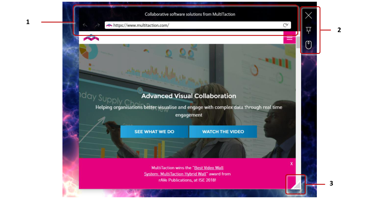
You can set the initial URL for the browser in the MT Showcase Editor. Users can also write a new URL in the browser's address bar. You can hide the address bar by enabling Hide address bar and navigation controls?
The browser must be pinned to interact with the web page content. You can add a toolbar with a pin button to the browser to allow users to pin the browser or enable the Pin the widget when it opens? attribute to automatically pin the browser.
By default, the browser operates in touch mode. But some web pages do not work correctly with multi-touch gestures. You can enable the Emulate mouse attribute to instead emulate mouse input. You can also add a Mouse emulation button to the browser's toolbar to allow users to switch the mode as required.
Web browser cache
By default, all web browsers in Showcase use incognito mode. That is, each browser stores data such as sessions and cookies in a temporary cache, and when a user closes the browser that cache is deleted. But you can configure web browsers in Showcase to use a shared cache.
Why use a shared cache? You can use this feature to streamline the user experience. For example, you might have a company portal that requires a sign-in in your app. You can configure a shared cache for the browser to keep it signed in when the browser is closed and opened again.
To add a browser cache to a web browser:
- Click Structures, select the app's structure, and select the Web browser.
- In its Slots, open the drop-down list on Browser cache and choose + Create new....
- Type a name for the browser cache, for example My Browser Cache, and confirm. The Editor opens the new cache in the Widget Library.
- Set Browser cache persistence:
- Session: Showcase keeps the cache in memory. It is cleared when Showcase shuts down.
- Persisted: Showcase stores the cache on disk. It is kept indefinitely and loaded whenever Showcase starts.
- Click Save. The Editor attaches the cache to the browser and returns to the structure.
The Browser cache is a shared widget, listed in the Widget Library. Choose it on any other browser's Browser cache slot: all browsers using the same Browser cache share their data. You can also set a default Browser cache in a theme.
PDF books and flows
PDF book displays PDF documents as an open book. PDF flow displays PDF documents as a stack of pages.
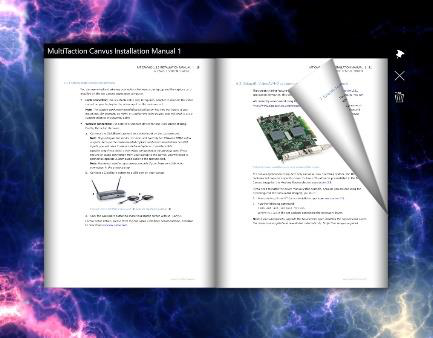
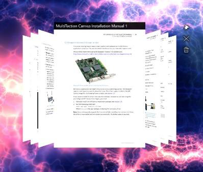
You can add PDF viewer widgets to your app by dragging a PDF file from the Media Library panel onto the structure tree or into a content set. PDFs in a content set open in a PDF book by default; to open one item in a PDF flow instead, change that item's Player type. Or you can add a new PDF book or PDF flow widget to your app and drag and drop a PDF file from the media library to the Book pdf or Source pdf attribute.
PDF viewer widgets have many of the same configuration options as Image and Video viewers. You can set the widget initial location and size, add a toolbar and decorations to the widget and allow users to annotate on it.
Both book and flow must be pinned to turn the PDF document pages. You can add a toolbar with a pin button to the widget to allow users to pin the widget or enable the Pin the widget when it opens? attribute to automatically pin the widget.
Book and flow also have buttons to turn to the previous or next page, and a scroll bar to quickly scroll through the PDF document. Tap anywhere on the widget to display the buttons; they are automatically hidden when the widget has no interaction. You do not need to pin the widget to use the buttons and scroll bar. You can disable displaying the buttons with the Display controls attribute.
Image movies
The Image movie widget displays sequences of image files, such as PNG, JPEG, BMP and TIF files.
You can add a new Image movie widget to your app by dragging a folder from the Media Library panel onto a slot in the structure tree; the Editor asks what to build from the folder, and Image Movie is one of the choices. Alternatively, add an empty Image movie with Add Widget and drag the folder into its Image sequence folder attribute.
Image movie widgets have many of the same general configuration options as Image viewers. You can set the widget initial location and size, add a toolbar and decorations to the widget and allow users to annotate on it.
In addition, you can control how the movie is played. You can set the playback speed and choose a playback mode, such as play the movie in a constant loop, or play the movie once and then automatically close the widget. You can also set the movie in an interactive mode, where the movie doesn't play automatically but the user can scroll through the images. You can do this by setting the Playback speed attribute to 0 and the Enable interactive mode attribute to 1. Lower values scroll more slowly; higher values scroll faster but less precisely. The image movie must be pinned before the user can scroll through the images.
Text viewers
The Text viewer widget displays text files and custom text content defined in Showcase Editor.

You can add a new Text viewer widget to your app by dragging a text file from the Media Library panel onto the structure tree or into a content set. Alternatively, add an empty Text viewer with Add Widget, in a structure or in a content set.
You can set the text for the widget by either dragging and dropping a text file from the media library to the Text file attribute, or by writing text directly to the Text content edit field in the Editor. Text viewer supports only plain text with simple formatting; rich text is not supported.
By default, the Text widget has a transparent background, but you can choose a different background color. You can also customize how the text looks, for example choose the text color and add drop shadows, or even use a custom font file. Add a Text style shared widget to the Text widget to customize how the text is displayed.
You can configure standard widget attributes, such as an initial location and size for the Text viewer widget, and choose whether users can move it or not. You can add a toolbar to the widget, and select the available buttons, for example a pin and a close button. You can also add decorations to the text, such as a title bar or a caption. You can even allow users to annotate on top of the text with IR pens.
You can add text widgets directly to the main or background layer in your app's structure, or allow users to launch them from a content hotspot, menu or a Codice card.
You can add hotspots to a Text widget to open additional content when a user taps on a specific part of the text. See Content Hotspots.
3D model viewers
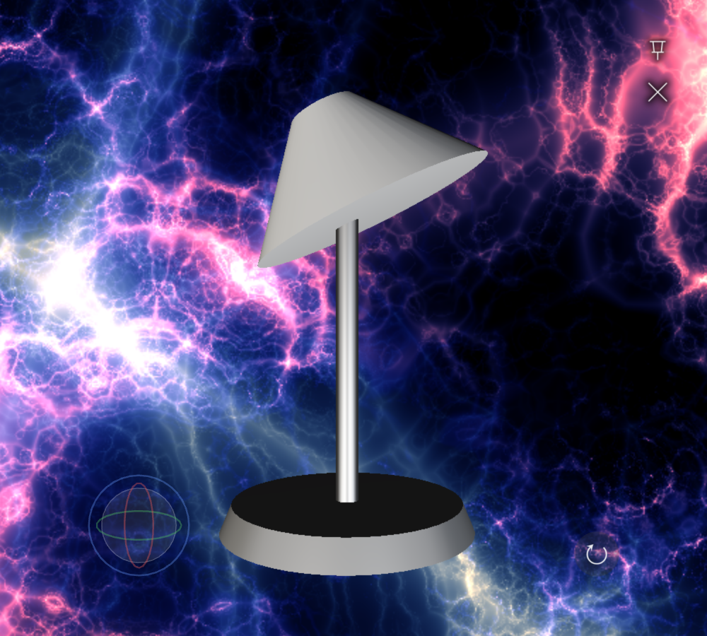
The 3D model viewer displays an interactive 3D model. Supported formats are glTF/GLB, OBJ, STL and FBX. GLB is recommended, because a single GLB file holds the model's geometry, materials and textures; an OBJ model that relies on separate material or texture files may load without its materials.
Upload the model to the Media Library panel, then drag it onto the structure tree or into a content set. 3D models in a content set open in the 3D model viewer. Alternatively, add the widget with Add Widget; it is listed as Model3d. Then drag the model into its 3D model file attribute.
Configure the viewer with these attributes:
- 3D model file: the model to show.
- Auto-rotate: spins the model continuously around its vertical axis. When it is off, visitors rotate the model themselves by dragging.
- Auto-rotate speed (degrees/second): how fast the model spins. The default is 30.
- Backdrop color: the background behind the model. It also lights the model: a dark backdrop darkens the scene, and a colored one tints reflections. Use a fully transparent color to float the model over the app.
The 3D model viewer is pinned when it opens (Pin the widget when it opens? is on by default), so touches rotate the model instead of moving the widget. On the wall, the viewer also shows an orbit gizmo for turning the model and a reset-view button that returns it to its starting view.
Like other content widgets, the 3D model viewer can have a location and size, a toolbar and decorations, and can be launched from a hotspot, menu or Codice card.
Use textured materials
Give models textured materials. Materials that only set a flat base color may not show their color in the viewer, and the model can appear grey.