Toolbars
A toolbar gives a widget buttons, such as Close, Pin and Maximize, plus Color and Clear buttons for annotations. Some widgets need one: a web browser, for example, must be pinned before visitors can use it, and a Pin button lets them pin it.
A toolbar is a shared widget: you create it once, and any widget in any app can use it. Toolbars are listed in the Widget Library.
Add a toolbar to a widget
- Click Structures, select the app's structure, and select the widget.
- In the widget's Slots, open the drop-down list on Toolbar:
- To use an existing toolbar, choose it from the list. You are done.
- To make a new one, choose + Create new..., enter a name such as Pin and Close, and confirm.
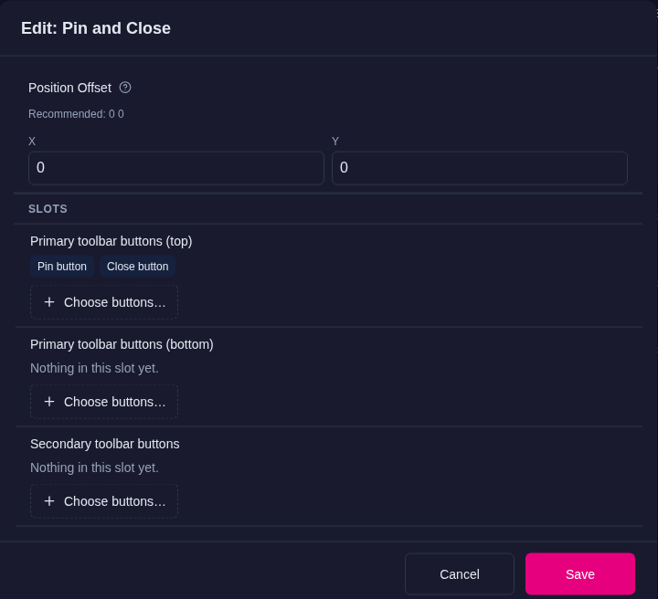
- For a new toolbar, the Editor opens it in the Widget Library (Edit: Pin and Close). On Primary toolbar buttons (top), click Choose buttons….
- In the Buttons in Primary toolbar buttons (top) dialog, tick the buttons you want, for example Close button and Pin button, and click Apply.
- Click Save. The Editor attaches the toolbar to the widget and returns to the structure.
If you close the dialog with Cancel instead, the toolbar is still created and listed in the Widget Library, but the widget does not use it yet. Pick it from the widget's Toolbar list.
To change a toolbar later, click its row under the widget in the structure tree, or open it from the Widget Library. Changes apply to every widget that uses it.
To give every widget in an app the same toolbar, set Toolbar in the theme's Widget decorations defaults. See Themes.
Remove a toolbar a widget inherits
A widget without its own toolbar uses the one its theme gives it. The Toolbar list shows that inherited toolbar with the place it comes from, such as From Widget decorations. To show no toolbar on one widget, choose — None — in its Toolbar list. This works on a widget in a structure, on an item in a content set, and for a whole kind of widget on the Defaults page, for example Video viewer. An item's own Toolbar always replaces the inherited one; from MT Showcase 26.10.1 it no longer appears alongside it.
Toolbar buttons
| Button | What it does |
|---|---|
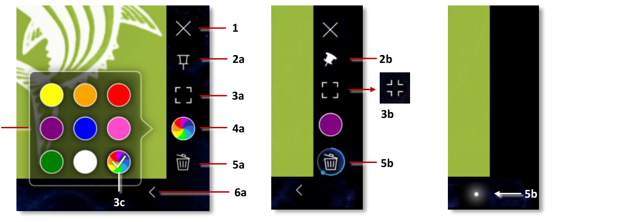
| Close button | Closes the widget. Visitors can also close a widget by dragging it off the screen. |
| Pin button | Pins or unpins the widget. A pinned widget cannot be moved or resized, and touches reach its content. |
| Maximize widget button | Expands the widget to fill the screen or, if one is set up, the nearest maximization area. When maximized, it becomes an Unmaximize button. |
| Annotation color button | Opens a palette of colors for annotations drawn on the widget, including an option for random colors. |
| Annotation clear button | Clears the annotations on the widget. Visitors press and hold it until the circular progress bar completes. |
| Mouse emulation button | Switches a web browser between touch input and emulated mouse input, for web pages that do not work well with touch. |
| Audience Upload button | Shows a QR code that visitors scan to upload a photo or video for moderation. Use it in the primary positions. See Collect and moderate audience uploads. |
The annotation buttons act on the widget's annotations, so use them on widgets that have an Annotation decoration. See Annotations.
Button positions
A toolbar sits on the right-hand side of the widget and has three button positions:
- Primary toolbar buttons (top): always visible, at the top of the toolbar.
- Primary toolbar buttons (bottom): always visible, at the bottom of the toolbar.
- Secondary toolbar buttons: buttons that visitors can hide and show again with a toggle button on the toolbar.
Each position is optional. Fill each one with Choose buttons… as described above.
To move the whole toolbar away from its usual place at the widget's edge, set the toolbar's Position Offset, in pixels (x y). A negative x moves it left, over the widget; a positive y moves it down.