Backgrounds and Animation
You can bring MT Showcase apps to life with animated backgrounds and interactive effects.
The following animated backgrounds are available:
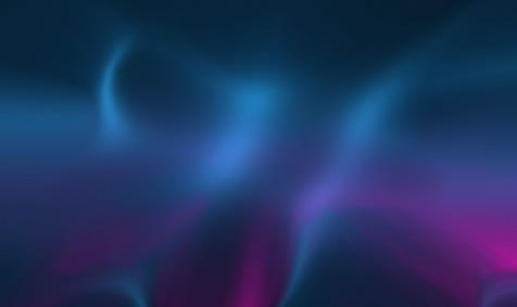
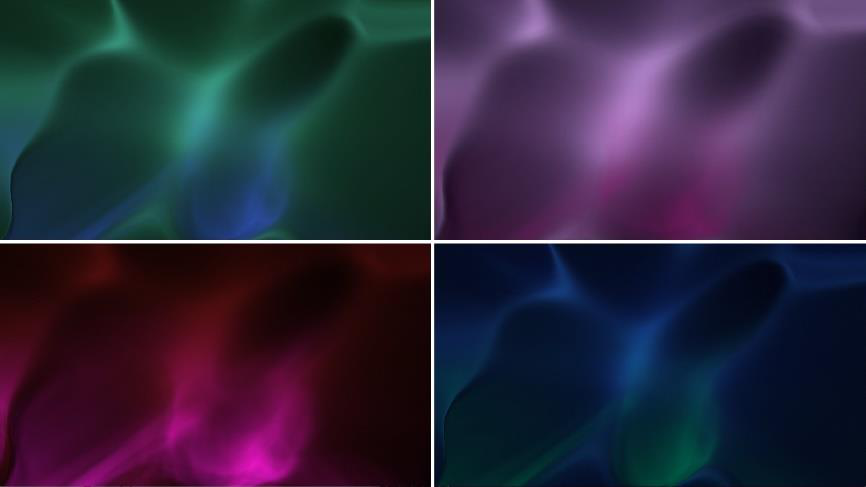
- Awesome: Displays a background of drifting clouds, similar in effect to the Aurora Borealis. By default, the clouds are purple and cyan but you can fully customize the colors and animation speed.
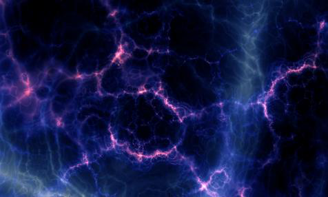
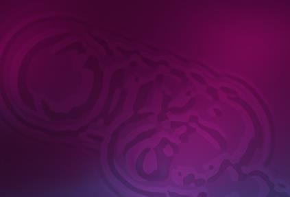
- Shader effect: The default shader resembles the night sky, with dramatic purple and magenta nebulae drifting across the screen, punctuated with cores of bright white light. You can also use your own shader file (Fragment shader file).
- IR Sensor View: Shows the live infrared camera image of the touch tracker, so hands and objects near the screen appear as glowing shapes. You can use a thermal-camera palette or your own colors.
For extra visual impact, you can also add animation effects. These effects are interactive and respond to touches, spreading out from visitors' fingers:
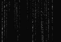
- Champagne: Displays streams of rising bubbles, like in a glass of sparkling wine.
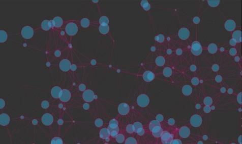
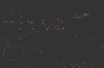
- Particles: Displays small floating circles, randomly connecting to nearby circles.
- Ripple: Displays wavelets, like ripples on a pond.
- Sparkles: Displays swirls of particles. Its effect is like dragging your hand through a sparkling fluid.
Add an animated background
- Click Structures and select the structure.
- On the Background layer row, open the … menu and choose Add Widget, then choose a background: Awesome, Shader effect or IR Sensor View.
- Select the background in the structure tree and set its attributes on the right. For example, change its Animation speed. For the Awesome background, you can also change the colors; see Customize the Awesome colors.
Changes save automatically, and a player running the app shows them straight away.
A different background for each menu section
A finger menu or rotating menu can change the background while one of its folders is open, and change it back when the visitor leaves that folder. Build the background as above, add it to the Widget Library, and choose it on the folder. See Finger Menus: Give each section its own image and background.
Add animation effects
The effects are purely decorative. Add them to the Background layer to show them behind the content in the Main layer, or to the Overlay layer to show them on top of it.
- Click Structures and select the structure.
- On the Background layer or Overlay layer row, open the … menu and choose Add Widget.
- Choose an effect: Champagne, Particles, Ripple or Sparkles.
- Select the effect in the structure tree and set its attributes. For example, change the Particle color and Particle maximum size of Particles, or the Bubble emission rate of Champagne.
Particles limits
The Particles effect draws a connector between every two particles that come close to each other, so its cost grows very quickly. Two settings have limits:
| Setting | Default | Range |
|---|---|---|
| Number of particles | 200 | 0 to 2000 |
| Connection distance (pixels) | 150 | 0 to 200 |
The number of connectors grows with the square of the number of particles and the square of the connection distance. At around 2000 particles the connectors already cover most of the screen, so higher values only make the effect slower and less clear. Much higher values used to stop the player when the app restarted.
From MT Showcase 26.10.0 the limits are enforced for every number setting that has a range, not only for Particles:
- A number typed into a setting's box stays within its range.
- The server refuses a value outside the range and says which setting and which range.
- When you import an app, values outside the range are brought into it, and the import report lists each change.
Customize the Awesome colors
By default, the Awesome background of drifting clouds is purple and cyan, but you can change the colors, for example to match your corporate branding.
- Click Structures and select the structure.
- In the Background layer, select the Awesome background.
-
Set the colors:
- Background color
- Background highlights color
- Foreground color
- Foreground highlights color
Click a color swatch to use the color picker. Highlights usually look best a little lighter than the main color. Because changes reach the wall straight away, you can try combinations while watching the wall.
-
If you need to, adjust Background lightness and how much foreground color the animation uses (Foreground factor and Foreground highlights factor).
Tip
To give every Awesome background in an app the same colors, set them in the app's theme instead: click Defaults, open the theme, and go to Components > Awesome. See Themes.
Animated content
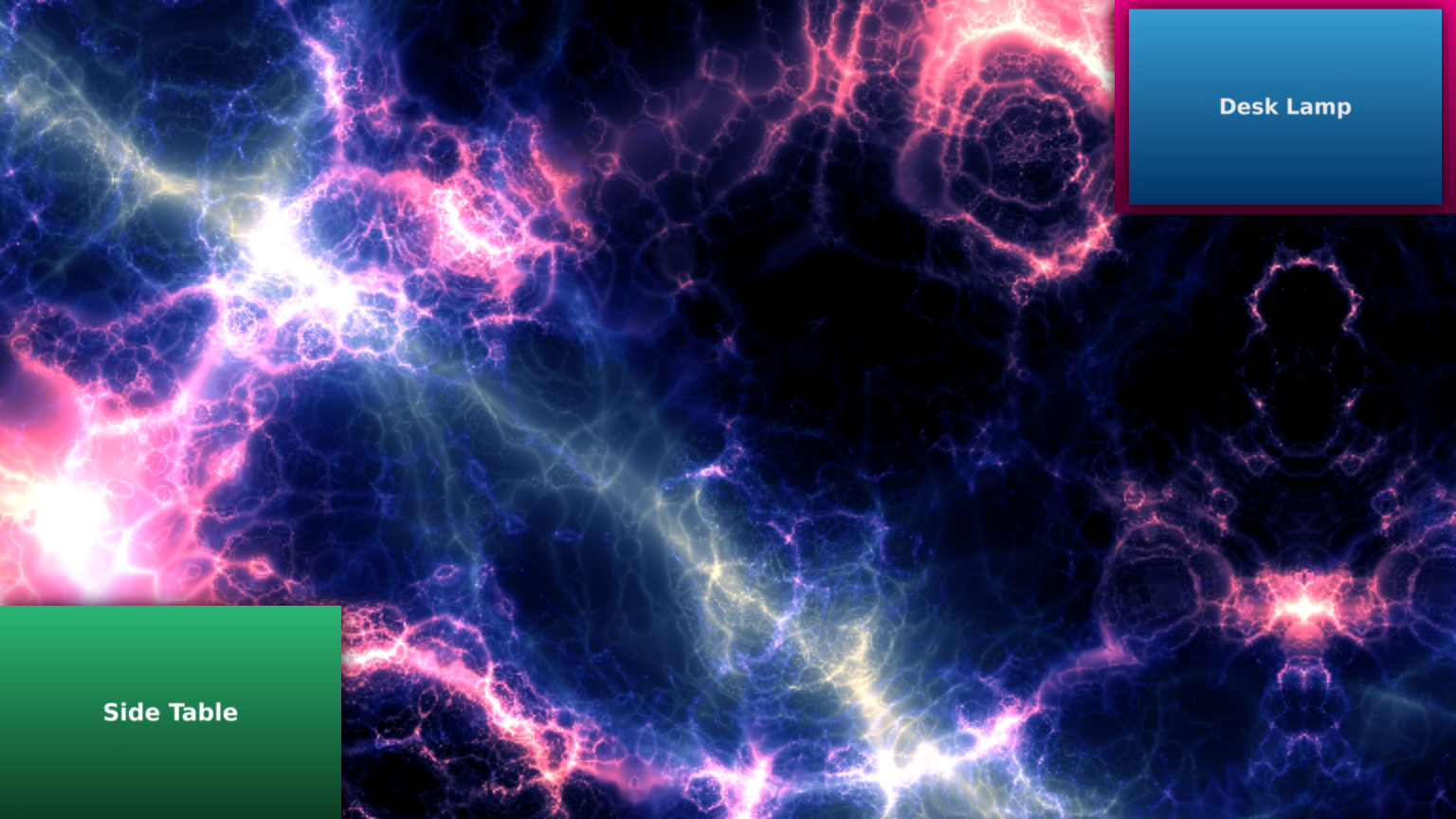
Animated content makes images and videos move by themselves in the Background or Overlay layer. It animates Image viewer, Image movie and Video viewer widgets in one of two ways:
- Floating content behavior: the items float slowly across the screen. Teasers use the same animation.
- Fading content behavior: the items fade in and out at random places on the screen, or only in the screen corners. Each item is animated on its own, so several items are on screen at the same time. With Only use corners, each item reappears in a randomly chosen corner.
Animated items are not interactive. For example, visitors cannot resize an animated image or pause an animated video.
In the Background layer, animated content appears behind the Main layer. In the Overlay layer, it appears on top of everything else. Animated content can also be used as screensaver content.
Add animated content
- Click Structures and select the app's structure.
- On the Background layer or Overlay layer row, open the … menu, choose Add Widget, and add Animated content.
- Select the new Animated content and choose how it moves. In Content animation, pick an existing behavior or create a new one. Choose Fading content behavior or Floating content behavior, and give it a name such as Slow fade.
- Set up the behavior:
- Fading content behavior: Time between animations, Disappearing animation duration, Reappearing animation duration, Enable fade animation, Enable scale animation and Only use corners.
- Floating content behavior: the speed and direction of movement and the shape of the path across the screen.
- On the Animated content widgets slot of the Animated content, open the … menu, choose Add Widget, and add one or more Image viewer, Image movie or Video viewer widgets. Set each one's file.
Behaviors are shared widgets: you can reuse one in several apps from the Widget Library.