Widget Groups
A widget group is a container in the Editor that organizes related widgets and, optionally, combines their signals using a logic mode. Widget groups are useful whenever a single response (a video, a rotating menu, a sound, a cloud of content) should depend on how users interact with several hotspots, not just a single tap.
For example, you can use a widget group to:
- Turn a row of hotspots into a set of radio buttons, where tapping one hotspot deactivates the others.
- Reveal a reward item only after users have tapped three hotspots in a specific order (a mini-puzzle).
- Keep a piece of content visible while any of several hotspots is active, and hide it again only when all of them are released.
- Group widgets purely for organization in the Editor tree, without changing their behavior.
A widget group does not draw anything of its own. It is a transparent container. What users see on screen is whatever you place inside it.
How a Widget Group Is Organized
A widget group has two slots:
- Triggers: the widgets whose signals feed the group. Typically content hotspots, but any widget with a signal (visualization widgets, hotspot images, service-set triggers, and so on) can be added here.
- Outputs: the widgets that appear when the group\'s signal goes HIGH. Outputs are hidden by default and become visible only while the group is active. They are always placed at absolute screen locations.
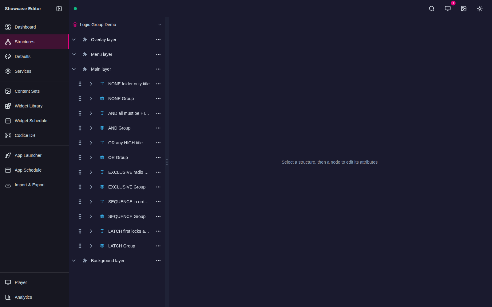
You can see both slots in the Editor tree below. Each column in this example is an independent widget group demonstrating one of the six logic modes.
Note
Only widgets in the Outputs slot are hidden until the group fires. Widgets in the Triggers slot are always visible — they are the thing users tap.
Add a Widget Group
Follow these steps:
-
Click Structures in the left-hand pane.
-
Click the structure you want to edit. The Editing a Structure screen opens.
-
Go to the Main section (or any other section that accepts a widget group) and click the Add a new widget to Main hyperlink.
-
From the pop-up menu, add a Widget Group.
-
In the Widget Group attributes pane, set the general group attributes:
- Location and Size define the group\'s bounding box on screen. Trigger widgets inside the group are positioned relative to the group\'s top-left corner, so it is usually easiest to set Location and Size to cover the full area of the triggers.
- Group Name is a label shown in the Editor tree only. It does not appear on screen.
- Logic mode sets how the group combines the signals from its Triggers. See Logic Modes below.
- Trigger children on group HIGH controls whether the group\'s own signal is broadcast back down to its trigger widgets. See Trigger Children on Group HIGH below.
-
Click Save to add the widget group to your structure.
-
Add widgets to the group:
- Click the triangle next to the Widget Group to expand it. The Triggers and Outputs slots appear.
- Click Add a new widget to Triggers to add a hotspot, hotspot image, visualization widget, or any other widget whose signal should feed the group.
- Click Add a new widget to Outputs to add the widget you want to show when the group fires. This can be any widget you would normally place on the Main layer (image, video, PDF, rotating menu, finger menu, and so on).
-
Click Save to save the complete widget group.
Tip
You can nest widget groups. Because a widget group itself carries a signal, you can place a widget group inside another widget group\'s Triggers slot, and the inner group\'s combined signal will feed the outer group. This lets you build more complex compound logic — for example, "(A and B) or C".
Logic Modes
The Logic mode attribute controls how the group combines its Triggers into a single group signal. The group signal drives two things:
- The visibility of the widgets in the Outputs slot. Outputs are visible while the group signal is HIGH and hidden while it is LOW.
- Optionally, the signal state of the Trigger widgets themselves (see Trigger Children on Group HIGH).
Six logic modes are available.
None (folder only)
The group does nothing to the Trigger signals. It is a pure organizational folder in the Editor tree. Trigger widgets behave exactly as they would outside a group, and widgets in the Outputs slot are hidden; they do not become visible in response to any trigger state.
Use this mode when you want to group related widgets in the Editor for clarity, without changing any behavior.
Exclusive (radio)
At most one Trigger can be HIGH at a time. When a user activates one Trigger, the group automatically deactivates all other Triggers, and the group signal goes HIGH. When the active Trigger is released, the group signal goes LOW.
Use this mode to build radio-button behavior: a row of options where tapping one option deselects the others. For example, three language-selector hotspots where only one language can be active.
AND (all active)
The group signal is HIGH only when all Triggers in the group are HIGH. As soon as any Trigger goes LOW, the group signal goes LOW.
Use this mode to require users to activate multiple hotspots simultaneously before revealing content — for example, "press both buttons at once to unlock this item".
OR (any active)
The group signal is HIGH when any Trigger in the group is HIGH. It goes LOW only when every Trigger is LOW.
Use this mode when several hotspots should each independently keep the same output visible. For example, three hotspots around a product image that all reveal the same detail panel; the panel stays visible as long as any of them is active.
Sequence (in order)
The group signal goes HIGH only when the Triggers are activated one-by-one in the order they appear in the Editor tree (top to bottom). Activating a Trigger out of order resets the sequence and forces all Triggers back to LOW.
Use this mode for puzzle or training interactions where users must discover the correct order of actions.
Latch (first locks)
As soon as any Trigger goes HIGH, the group locks: all Triggers are forced HIGH, and the group signal goes HIGH. The group stays latched until every Trigger has been individually released, at which point the group signal goes LOW.
Use this mode when a first interaction should commit the whole group — for example, starting an exhibit by tapping any one of several "Begin" hotspots, which then reveals the full set of related content until the user resets everything.
Trigger Children on Group HIGH
The Trigger children on group HIGH attribute (default on) controls whether the group\'s signal is broadcast back down to its Trigger widgets when the group goes HIGH.
- On (default): when the group signal goes HIGH, the group also fires the "action-trigger" event on its Triggers. This means each Trigger\'s own per-child outputs (such as an individual visualization or label that reacts to the Trigger\'s signal) also become visible. When the group goes LOW, "action-cancel" is fired on the Triggers so their per-child outputs disappear again.
- Off: the group\'s Outputs slot still mirrors the group signal, but the Triggers do not receive any extra events. Each Trigger\'s per-child outputs follow only that Trigger\'s own signal.
In Exclusive mode, the cancel-others behavior that enforces radio-button state always runs — it is the mechanism that makes Exclusive work at all. The toggle only controls whether additional "action-trigger" / "action-cancel" events are sent on top of that. Leaving the toggle on (the default) means a tapped radio button reveals both the group\'s shared output and its own per-child output, while the previously active radio button hides both of its outputs.
Note
None mode ignores this attribute, because in None mode the group has no signal of its own.
Tip
Turn this toggle off when you want the group\'s Outputs to respond to the combined group signal without the Triggers\' own per-child outputs being driven by the group. This is useful when Triggers already have their own independent outputs that should track the Trigger alone, not the group.
Example: Build a Radio-Button Group
Follow these steps to build a simple three-button radio group that reveals a shared reward while one button is active:
-
In the Main section, add a Widget Group.
-
In the group\'s attributes pane:
- Set Location and Size so the group covers the area where the three buttons will live.
- Set Logic mode to Exclusive (radio).
- Leave Trigger children on group HIGH on (the default).
-
Expand the group and add three Content Hotspot widgets to the Triggers slot. Position each hotspot\'s Location relative to the group\'s top-left corner so they form the row of buttons.
-
For each hotspot, set its Trigger mode to toggle (so a tap toggles the hotspot HIGH and LOW) and give it a visualization widget so users can see the button.
-
Add the reward widget (an image, video, PDF, rotating menu, and so on) to the Outputs slot. Set its Location in absolute screen coordinates — this is where the reward will appear.
-
Save the structure and publish.
At runtime, tapping any one of the three buttons activates it, hides the other two, and reveals the reward. Tapping a different button switches the selection without a separate deselect tap. Tapping the active button again deactivates it and hides the reward.