Toolbars
It's often useful, or even necessary, to add toolbars to widgets in your app. Toolbars can include Close, Pin and Maximize buttons, plus Color and Clear buttons for widget annotations.
Adding a Toolbar
This section briefly summarizes how to add a new or existing toolbar to a widget. For a detailed example on how to add a new toolbar to a web browser, see Getting Started.
To add a toolbar:
Go to the Editing a structure screen and select the widget.
In the widget attributes pane, go to the Toolbar attribute.
Add a new or existing toolbar:
Existing toolbar: Select an existing toolbar from the drop-down menu.
New toolbar: Click the Add button to create a new toolbar. For example, My First Toolbar. Then click the Edit button to add buttons to the toolbar.
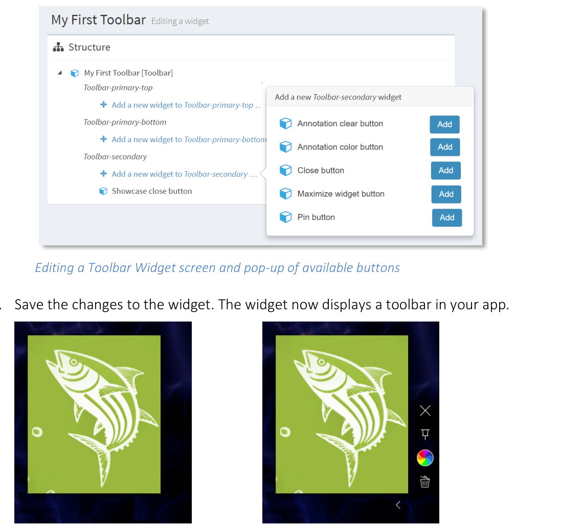
Editing a Toolbar Widget screen and pop-up of available buttons.
Save the changes to the widget. The widget now displays a toolbar in your app.
- align
center
- alt
Image viewer without toolbar
Image viewer without toolbar.
- align
center
- alt
Same widget with toolbar
Same widget with toolbar.
Toolbar Buttons
Widget toolbars can include the following buttons:
Close: Closes the widget.
Tip
You can also remove widgets by dragging them off the screen.
Pin: Pins or unpins the widget.
Maximize: Expands the widget to fill the entire screen or, if configured, the closest maximization area.
Color: Opens a color palette for annotations drawn on the widget. The palette includes an option for random colors.
Clear: Clears any annotations drawn on the widget. Tap and keep pressing this button to clear all annotations on the widget.
Tip
Keep pressing the Clear button until the circular progress bar completes.
Hide: Only available on secondary toolbars. Hides the toolbar. When a toolbar is hidden, this button is replaced by the unhide button (a subtle white dot). Tap the dot to unhide the toolbar.
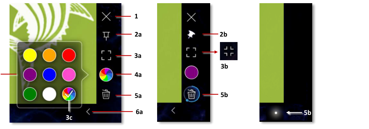
Toolbar buttons and tools. 1 Close button. 2a Pin button. 2b Unpin button. 3a Maximize button. 3b Unmaximize button (available only when widget is maximized). 4a Annotation color button. 4b Annotation color palette. 4c Random color option. 5a Clear button. 5b Circular progress bar (keep pressing until it completes). 6a Hide toolbar button. 6b Unhide toolbar button.
- align
center
- alt
Annotation color palette detail
Annotation color palette detail.
- align
center
- alt
Clear button progress bar detail
Clear button progress bar detail.
Primary and Secondary Toolbars
When you create a new toolbar, you can create a primary or secondary toolbar. Primary toolbars are permanently visible. Secondary toolbars include buttons to hide and unhide the toolbar. Primary and secondary toolbars are both optional.
Toolbar widgets can display buttons in three positions:
Toolbar-primary-top: Buttons are on the top-right of a widget. These toolbars are permanently visible.
Toolbar-primary-bottom: Buttons are on the bottom-right of a widget. These toolbars are permanently visible.
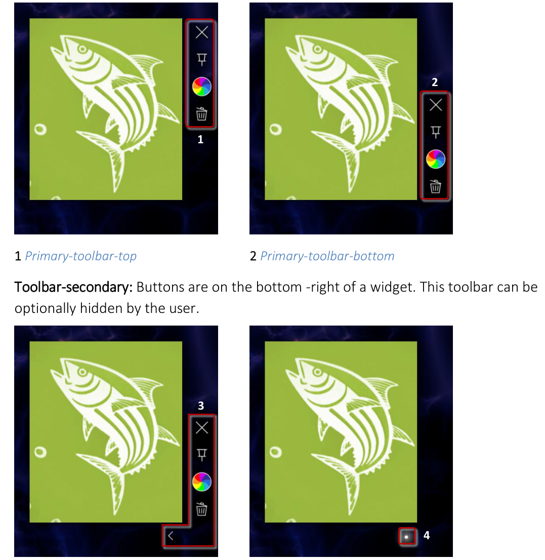
Toolbar-secondary: Buttons are on the bottom-right of a widget. This toolbar can be optionally hidden by the user.
- align
center
- alt
Secondary toolbar with buttons visible
3 Secondary toolbar, buttons visible.
- align
center
- alt
Secondary toolbar with buttons hidden
4 Secondary toolbar, buttons hidden.