Themes
A theme is a collection of attribute values for MT Showcase widgets. If your app uses a theme, all widgets in the app will inherit their attribute values from this theme by default.
For an overview of themes in MT Showcase, see Concepts.
Why use a theme?
Themes are not essential, but we strongly recommend you use them. They offer the following benefits:
Faster setup: Using a theme, it can be far quicker to set up an app. For example, instead of individually configuring each child bubble in a finger menu, you can simply configure the Menu bubbles component in a theme. You only need to do this once. Subsequently, child bubbles in any menu will automatically inherit the attributes defined in the theme's Menu bubbles component.
Consistency: A theme provides consistent widget appearance and behavior across an app. In fact, a theme can provide consistency across multiple apps if they all use the same theme (see 'Re-use' below).
Re-use: Themes simplify the process of creating apps, because the same theme can be used by one or more apps. For example, you may want the finger menus across all your MT Showcase apps to have a consistent look and feel. By using the same theme for all apps, you can ensure that all bubbles and bubble connectors use corporate colors and the central bubble is replaced by your corporate logo.
Theme FAQs
- Can I override a theme?
Yes. When you add a widget to a structure, each widget attribute offers two options:
Value not set: If you choose this option, the attribute will inherit the attribute value defined in the theme. If your app does not use a theme, or if this attribute is not configured in the theme, the attribute will use the out-of-the-box default value.
Use a fixed value: If you choose this option, you can set a custom value for this attribute. This custom value overrides any value defined in the theme. It also overrides the out-of-the-box default value.
- Can I re-use a theme?
Yes. In fact, this is the key advantage of using a theme. If you have multiple apps defined on your MT Showcase server, you can assign the same theme to each app.
- Can I rename a theme?
Yes. In the MT Showcase Editor, go to the Themes screen and simply click the Rename button for the theme you want to rename.
- Can I export and re-import a theme?
Yes. In the MT Showcase Editor, go to the Import & Export screen and select the check box for the theme you want to export. Then click the Export button. To re-import the theme, for example on a different MT Showcase server, go to the Import & Export screen. In the Import a File section, choose the file you previously exported. Then click the Upload button.
Create a new theme
Follow these steps:
Click Themes in the left-hand pane.
In the Themes screen, type the name of your new theme in the input box. For example, My First Theme.
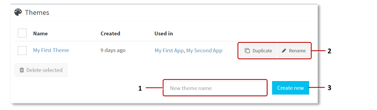
Themes screen. 1 Input box. 2 Duplicate and Rename buttons. 3 Create New button.
Click the Create New button. The Editing a theme screen opens automatically.
Explore the Editing a theme screen. The main pane lists the available components. Expand any component to see its attributes. The right-hand navigation pane contains a hyperlinked list of the available components. Click any component to jump to that component in the main pane.
Experiment with editing a component's attributes. For examples of how to use a theme, see the title bar example and the finger menu example below.
Important
Remember to click the Save button after editing the attributes for any of the components.
Return to the Themes screen. My First Theme is now listed on this page. If required, you can rename the theme. You can also duplicate a theme; this allows you to use an existing theme as a template when setting up a new theme. Click the Duplicate and Rename buttons, as required.
Now you need to add the new theme to your app.
Title bar example
By default, image viewers have no title bar. But if you want the images in your app to have title bars, you can edit the theme so that this feature is enabled for all image viewer widgets. Follow these steps:
Click Themes in the left-hand pane.
In the Themes screen, click the theme you want to edit. For example, My First Theme.
In the Editing a theme screen, go to the Image viewer component.
Tip
Click the hyperlink in the Components pane.
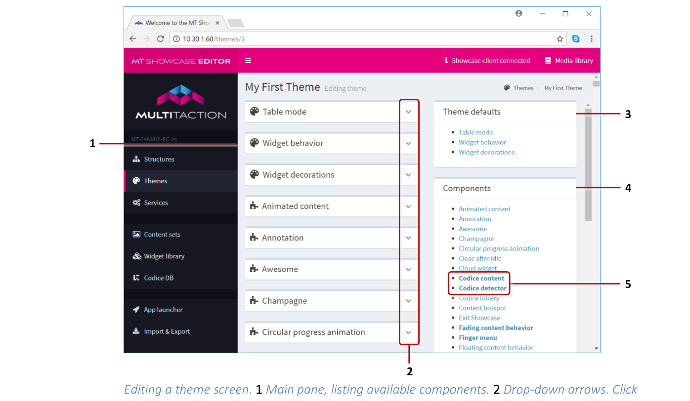
Editing a theme screen. 1 Main pane, listing available components. 2 Drop-down arrows. Click to display the editable attributes. 3 Theme defaults pane. 4 Components pane. Click the hyperlinks to jump to the component attributes. 5 Edited components are shown in bold.
Click the drop-down arrow to display the Image viewer attributes.
Scroll down to the Title attribute.
Select the 'Use a fixed value' option.
Select the Enabled check box.
Click the Save button.
Now all image viewer widgets in your app will automatically inherit a title bar.
Finger menu example
If you add a finger menu to your app (either added directly to the main layer of the structure, or launched from a teaser or content hotspot), you can define the bubbles and bubble connectors. You can also edit the menu's default behavior.
This example shows how to add customized bubbles and connectors to a theme, and how to change the timeouts for finger menus and menu items.
Follow these steps:
Click Themes in the left-hand pane.
In the Themes screen, click the theme you want to edit. For example, My First Theme.
Edit the default menu timeouts. For this example, you will change the default timeout for idle (unused) menus and menu items. When the timeout expires, the menu or menu item closes automatically.
In the Editing a theme screen, go to the Finger menu component.
Tip
Click the hyperlink in the Components pane.
Click the drop-down arrow to display the finger menu attributes.
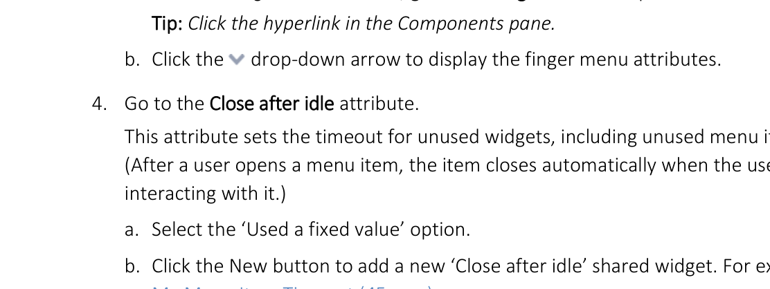
Go to the Close after idle attribute. This attribute sets the timeout for unused widgets, including unused menu items. (After a user opens a menu item, the item closes automatically when the user stops interacting with it.)
Select the 'Use a fixed value' option.
Click the New button to add a new 'Close after idle' shared widget. For example, My Menu Item Timeout (45 secs).
Click the Edit button to display the Editing a widget screen.
Set the timeout and fade duration (in seconds) for unused menu items.
Click Save.
Editing a theme screen, Finger menu component: Close After Idle attribute.
Go back to the Finger menu component in the Editing a theme screen.
Click the Show advanced attributes hyperlink.
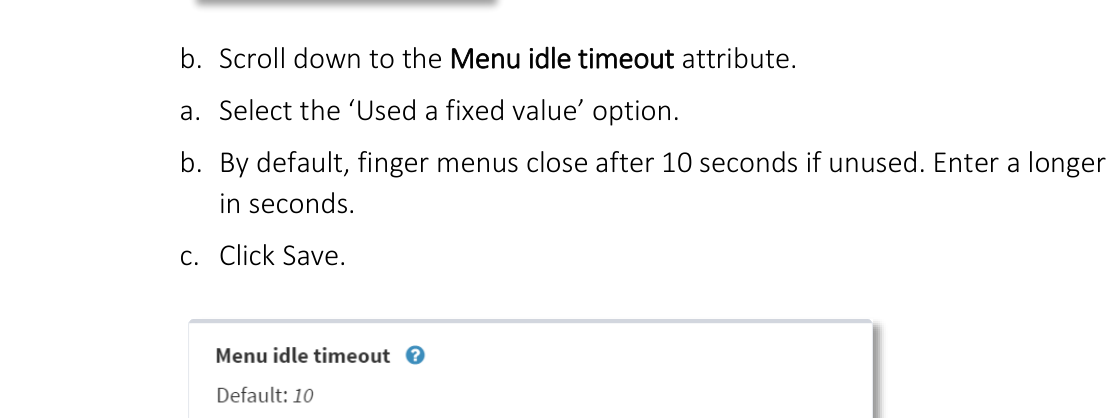
Scroll down to the Menu idle timeout attribute.
Select the 'Use a fixed value' option.
By default, finger menus close after 10 seconds if unused. Enter a longer timeout, in seconds.
Click Save.
Editing a theme screen, Finger menu component: Menu Idle Timeout attribute.
Edit the bubble attributes. For this example, you will set the color and size.
In the Editing a theme screen, go to the Menu bubbles component.
Click the drop-down arrow to display the menu bubble attributes.
Scroll to the Bubble edge color attribute.
Select the 'Use a fixed value' option.
Enter the color for the bubble edges (i.e., the bubble border). For example, for a purple bubble edge, click the preview swatch to open a color picker or enter one of the following values:
RGBA:
rgba(128,0,128,1)Hex:
#800080Name:
purple
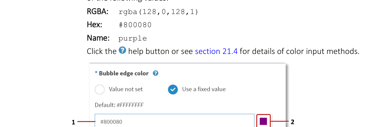
Editing a theme screen, Menu Bubbles component: Bubble Edge Color attribute. 1 Input box. 2 Preview swatch.
Scroll to the Bubble size attribute.
Select the 'Use a fixed value' option.
Enter the bubble size in pixels. For example, to slightly increase the default size, enter 125.
Click the Save button.
Edit the bubble connector attributes. For this example, you will set the connector color to match the bubble color.
In the Editing a theme screen, go to the Menu bubble connectors component.
Click the drop-down arrow to display the connector attributes.
Click the Show advanced attributes hyperlink.
Scroll to the Connector color attribute.
Select the 'Use a fixed value' option.
Enter the same color that you used for the bubble edges in step 6e.
Click the Save button.
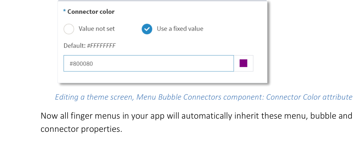
Editing a theme screen, Menu Bubble Connectors component: Connector Color attribute.
Now all finger menus in your app will automatically inherit these menu, bubble and connector properties.
Add a theme to your app
Follow these steps:
Click App launcher in the left-hand pane.
Click the Edit button for your app. For example, My First App.
In the Theme column, choose My First Theme from the drop-down list.
Click the Save button for My First App.
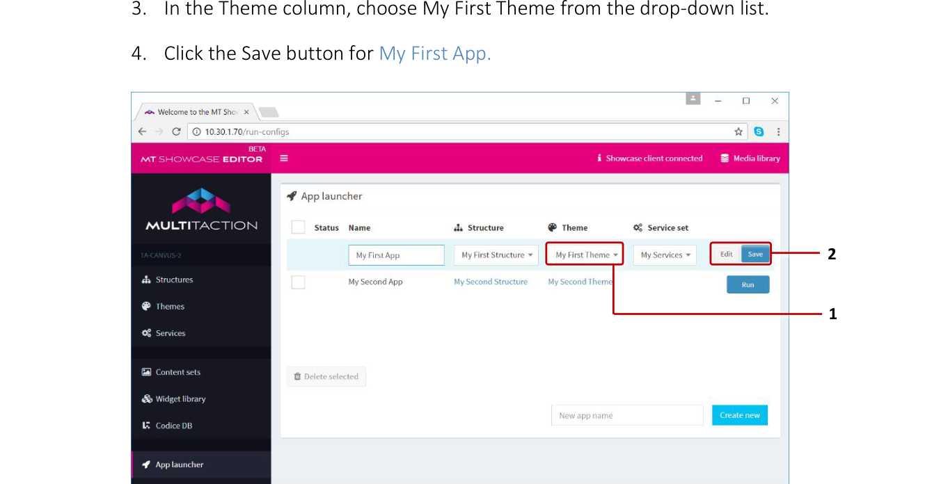
App launcher screen. 1 Theme drop-down list. 2 Edit and Save buttons.
Edit an existing theme
Follow these steps:
Click Themes in the left-hand pane.
In the Themes screen, click the theme you want. The Editing a theme screen opens automatically.

Themes screen. 1 Theme name. Click to edit the theme.
Set up theme defaults
Each theme includes three sets of default attributes:
Table mode: You can configure MT Showcase to run on touchscreen tables by enabling table mode. In this mode, MT Showcase automatically detects which side of the table the user is on when they tap a widget, open a menu, or place a Codice card on the screen. It then rotates screen content to face the user.
Widget behavior: You can configure default behavior for widgets in your app:
Pin the widget when it opens: Certain widgets, such as the cloud and browsers, must be pinned before users can use them. This attribute ensures that all widgets are automatically pinned when they open.
Note
If you enable this theme default, users cannot move or resize widgets unless you also add a toolbar with a Pin button, enabling them to unpin the widget.
Maximize widget when it opens: If enabled, all widgets, including menu items, expand to fill the entire screen when they open. (To reset a widget to its normal size, users tap the edge of the screen to display the Unmaximize button.)
Snap to angle: You can constrain the incremental rotation of widgets so they automatically re-adjust themselves to a fixed angle of rotation. The effect is similar to a boat righting itself after keeling over.
Size limit: This attribute sets a minimum and maximum size for widgets. If a user makes a widget too big or too small, it automatically resizes.
Close after idle: This attribute sets the timeout for any unused widget, including unused menu items. If no user has interacted with a widget before the timeout expires, the widget closes automatically.
Widget sounds and Interaction sounds: These attributes play sounds (WAV files) when a widget opens and closes, or when a user touches the widget with their hand or infrared pen. They can also loop a sound continuously while a widget is open, or while an app is running.
Widget decorations: You can configure the default appearance of widgets in your app:
Toolbar, Caption and Title: These attributes are self-explanatory. If enabled, all widgets display these attributes by default.
Apply an overlay: This attribute displays a 'Pin to interact' overlay over each widget. (Widgets such as clouds, browsers and PDF documents must be pinned before users can use them.)
Annotation: This attribute applies an annotation overlay to each widget. This overlay allows users to annotate the widget using an infrared pen or their finger.
Edit the theme defaults
Follow these steps:
Click Themes in the left-hand pane.
In the Themes screen, click the theme you want. The Editing a theme screen opens automatically.
In the Editing a theme screen, go to the Theme defaults pane and click the item you want. (In the main pane, the default set expands automatically to display the default attributes.)
Edit the default attribute and click the Save button.
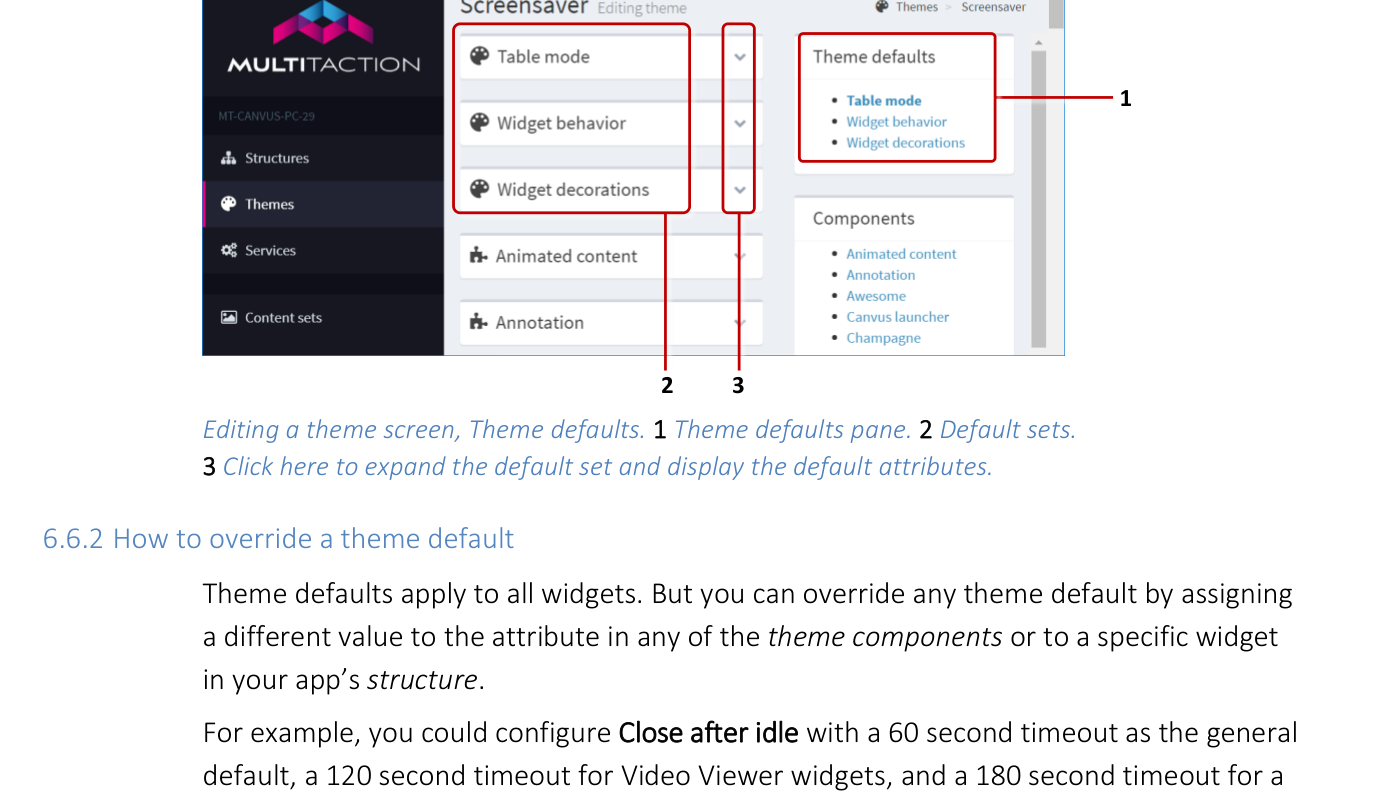
Editing a theme screen, Theme defaults. 1 Theme defaults pane. 2 Default sets. 3 Click here to expand the default set and display the default attributes.
How to override a theme default
Theme defaults apply to all widgets. But you can override any theme default by assigning a different value to the attribute in any of the theme components or to a specific widget in your app's structure.
For example, you could configure Close after idle with a 60 second timeout as the general default, a 120 second timeout for Video Viewer widgets, and a 180 second timeout for a specific Video Viewer widget in your app. To do this, edit the following attributes in your app's theme and structure:
Type of default |
Attribute location |
Attribute value |
|---|---|---|
General timeout for all widgets |
Theme > Theme Defaults > Widget Behavior > Close After Idle |
60 seconds |
Default timeout for Video Viewers |
Theme > Components > Video Viewer > Close After Idle |
120 seconds |
Timeout for specific Video Viewer |
Structure > Main > Video Viewer > Close After Idle |
180 seconds |