Finger Menus
The following sections describe how to create a basic finger menu and the content set that supplies the menu.
A finger menu displays when a user taps and holds an empty area of the screen. They can also be launched from content hotspots or with a Codice card. A finger menu is a circular animated menu, with child bubbles radiating from a central bubble. Child bubbles represent individual menu items and can display thumbnail images. (Separate widgets control the appearance and behavior of the individual bubbles and the connectors that radiate out from the central bubble to the child bubbles.)
Note
These sections do not describe how to leverage menu settings defined in a theme; that is covered in Themes.

Example finger menu. 1 Central bubble. 2 Child bubble. In this example, the bubbles display thumbnails (or 'preview images') of the menu items. Tap any child bubble to display the menu item. 3 Bubble connector. 4 Bubble background color. 5 Bubble visible name.
Set up a content set
Before creating a menu, you must create the content set that supplies the menu with media such as images. To include images, videos or PDFs in your content set, you must first add them to your media library. You can then populate the content set with items in your media library.
Follow these steps:
Drag content into the media library
Click the Media Library button to open the media library pane.
Drag some content into the media library from Windows Explorer. For example, drag a folder that contains images.
(Optional) You can rename items in the media library, organize items into subfolders, and preview images. Right-click items to rename them. Right-click the root folder to create a new subfolder. To preview an image, select it then click the Asset Preview tab.
Click the Media Library button again to close the media library pane.
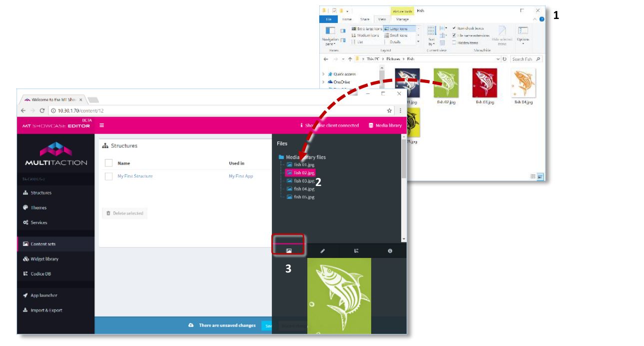
MT Showcase Editor, Media library. Drag and drop images from Windows Explorer (1) into the media library (2). Preview items in the media library by clicking the Asset Preview tab (3).
Create a content set
Click Content sets in the left-hand pane.
Click the Create New button.
Enter the name of the new content set. For example, Content for Menus. The Content Set screen appears.
Drag items into the content set
Click the Media Library button to open the media library pane.
Drag images from the media library to the root folder of the new content set. (The root folder shows the name of the content set, Content for Menus).
Close the media library pane.
Click the Save button to save the changes to the content set.
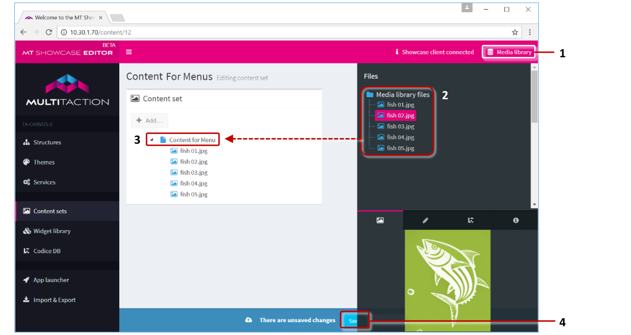
MT Showcase Editor, Editing a content set. Click the Media Library button (1) to show or hide the media library. Drag items from the media library (2) onto the content set root folder (3). Then hide the media library to show the Save button (4) and save the changes.
Now you have created and populated your content set, you can add a finger menu to your app's structure.
Add a finger menu to your app's structure
Now you need to add a finger menu to the structure you created earlier (see Getting Started). Then you need to configure the menu to use the new content set, Content for Menus.
Follow these steps:
Click Structures in the left-hand pane.
Click My First Structure. The Editing a Structure screen opens.
Go to the Menu section and click Add a new widget to Menu.
From the pop-up menu, add a Finger menu.
Tip
Click the Add button. In the right-hand Finger menu pane, click the drop-down arrow to show a description and preview image of a finger menu.
In the Finger menu attributes pane, select Content for Menus from the Content Set dropdown menu.
Click the Save button to add the menu to My First Structure.
This completes the minimal setup for the finger menu; you do not need to edit any of its other attributes to get the menu working.
You can customize how the finger menu looks. Continue to the next section.
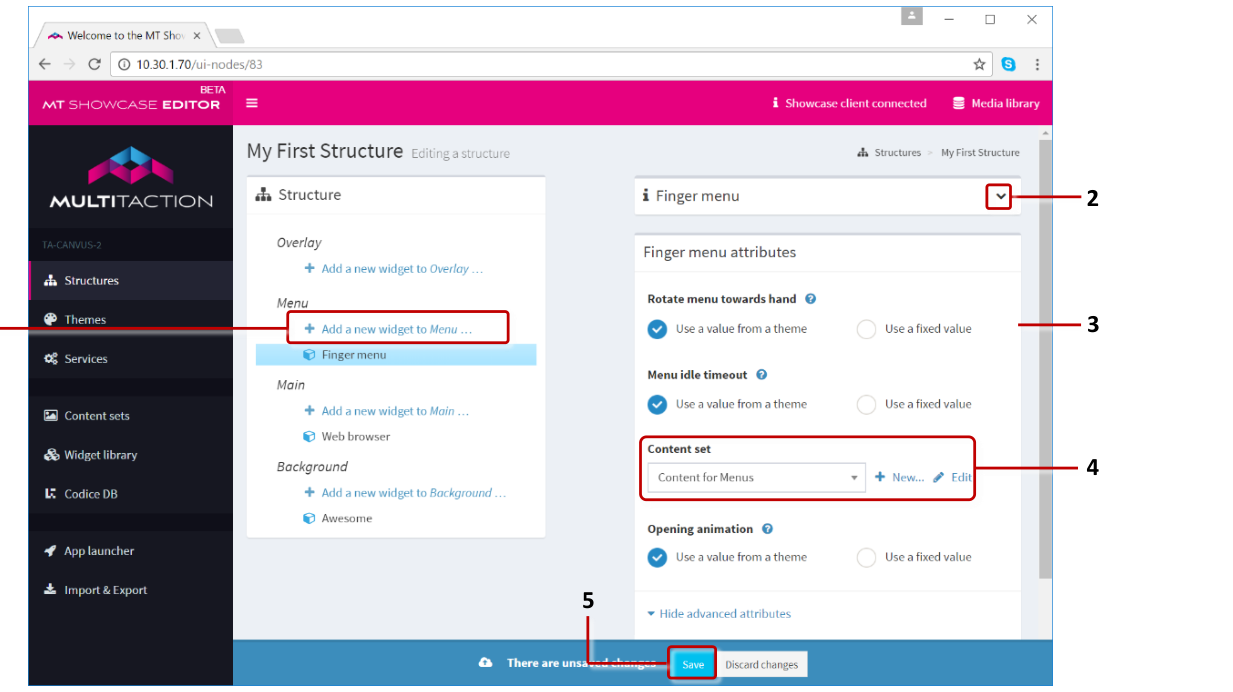
MT Showcase Editor, Editing a Structure screen. 1 'Add a new widget to Menu' hyperlink. 2 Finger menu pane. Click the arrow to display a description and preview image. 3 Finger menu attributes pane. 4 Content Set dropdown menu with Add and Edit buttons. 5 Save button.
Edit the content set
In this section, you are going to open the Editing a content set screen. From here, you will be able to configure the appearance and behavior of the new finger menu.
Follow these steps:
In the Editing a Structure screen, click the new Finger menu widget.
In the Finger menu attributes pane, go to the Content Set attribute.
Click the Edit button to display the Editing a content set screen.
To configure the central bubble in your finger menu, continue to the next section.
Configure the central bubble
In this section, you will edit the relevant attributes for the central bubble in your finger menu. As part of this procedure, you will create a shared widget. This will be a Menu bubbles widget.
Follow these steps:
In the Editing a content set screen, click the root folder in your content set (labelled Content for Menus). The root folder represents the central bubble in your finger menu.
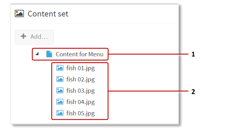
Example content set. 1 Root folder. 2 Individual items in content set.
In the right-hand attributes pane, go to the Widget attributes section and click the Finger menu tab. This tab lists all the attributes, or configurable properties, of the central bubble. For each attribute, you have two options:
Use a value from a theme: When this option is selected, the attribute inherits its value from a theme. If no theme has been created, the attribute inherits the default value.
Use a fixed value: When this option is selected, the attribute uses a custom value provided by you.
For simple menus, you can leave most attributes to 'use a value from a theme'.
(Optional) Go to the Preview image attribute and specify a thumbnail image for the teaser bubble. Click the Media Library button to open the media library. Then drag the image you want into the Preview image field.
Go to the Menu item type attribute.
Select 'Use a fixed value'.
Click + New...
Add the Menu bubbles widget.
Enter a name, e.g., My First Bubbles.
Click Save.
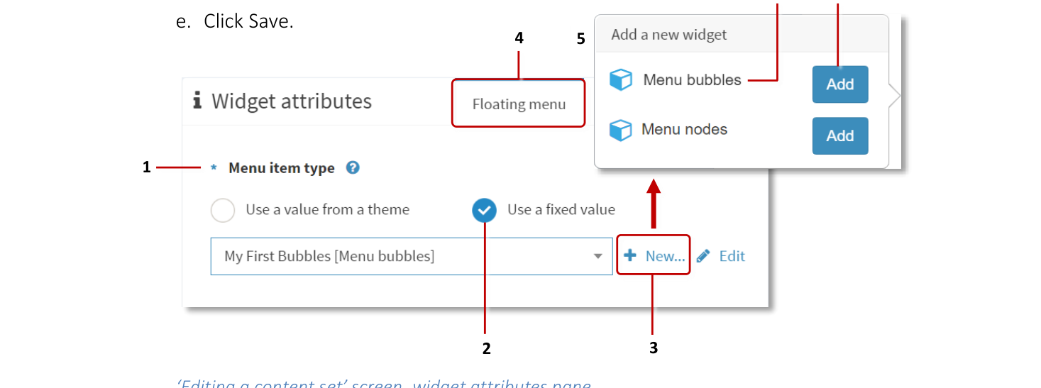
'Editing a content set' screen, widget attributes pane. 1 Menu Item Type attribute. 2 Use a fixed value check box. 3 New button. 4 Finger menu tab. 5 Add a new widget popup. 6 Menu bubbles widget. 7 Add button.
Note
You have now created a new Menu bubbles shared widget. This widget is now listed in the widget library.
Edit the Menu bubbles widget
Go to the Menu item type attribute, click Edit.
In the Menu bubbles attributes pane, go to Icon background color attribute.
Select 'Use a fixed value'.
By default, bubble background color is light purple. Specify a new background color. For example, for a transparent bubble background, click the preview swatch to open a color picker or enter one of these in the input box:
RGBA:
rgba(0,0,0,0)Hex:
#00000000Name:
transparent
Click Save.
This completes the setup for the central bubble. To edit the attributes of the child bubbles, continue to the next section.
Configure the child bubbles
As part of this procedure, you will create another shared widget. This will be a Bubble connector type widget. You will also reuse the Menu bubbles widget that you created in the previous section.
In the Editing a content set screen, click the first item below the root folder in your content set. This item represents the first child bubble in your finger menu.
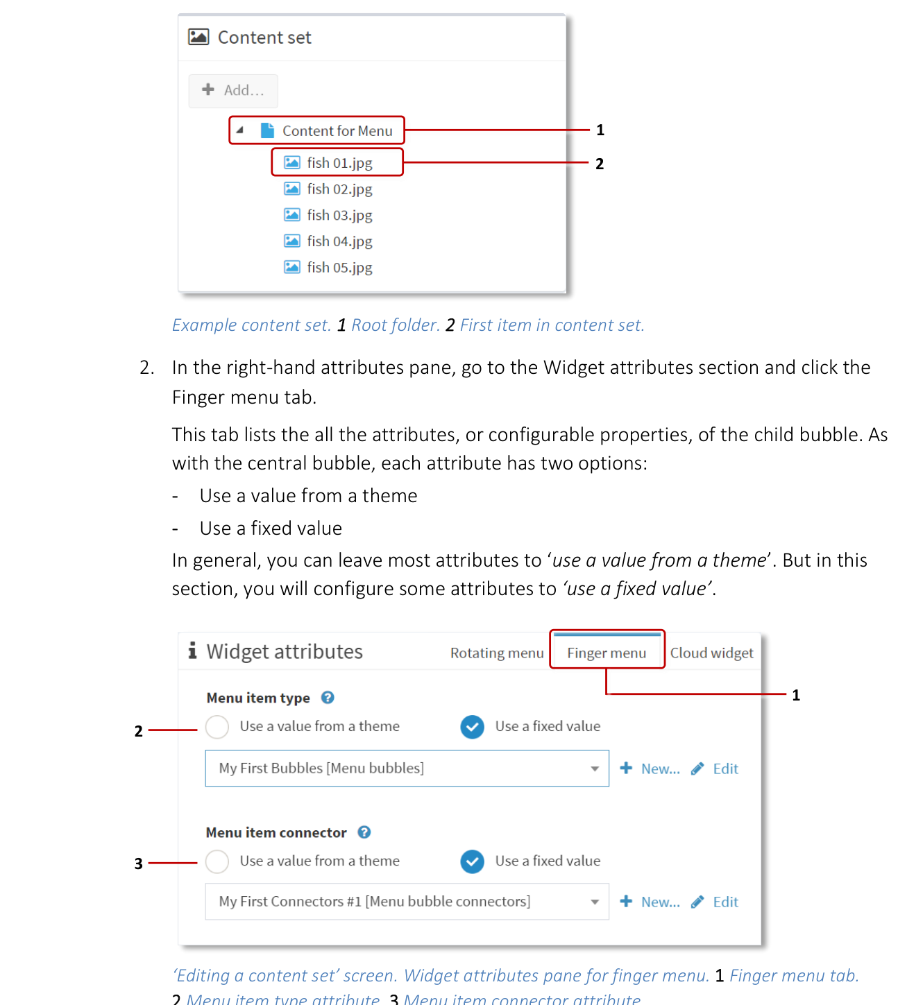
Example content set. 1 Root folder. 2 First item in content set.
In the right-hand attributes pane, go to the Widget attributes section and click the Finger menu tab. This tab lists all the attributes, or configurable properties, of the child bubble. As with the central bubble, each attribute has two options:
Use a value from a theme
Use a fixed value
In general, you can leave most attributes to 'use a value from a theme'. But in this section, you will configure some attributes to 'use a fixed value'.
Go to the Menu item type attribute.
Select 'Use a fixed value'.
From the drop-down menu, choose the Menu Bubbles widget you created in the previous section, i.e., My First Bubbles.
Click Save.
Go to the Menu item connector attribute.
Click the New button.
Add the Menu Bubble Connectors widget.
Enter a name, e.g., My First Connectors.
Click Save.
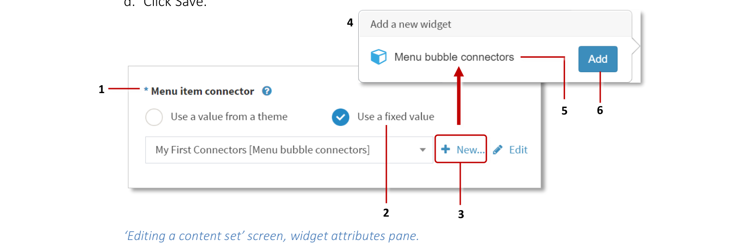
'Editing a content set' screen, widget attributes pane. 1 Menu Item Connector attribute. 2 'Use a fixed value' check box. 3 New button. 4 Add a new widget popup. 5 Menu bubble connectors widget. 6 Add button.
To get a finger menu working, you do not need to edit any attributes of the new My First Connectors widget. But for illustration purposes, in this step you will edit the connector color.
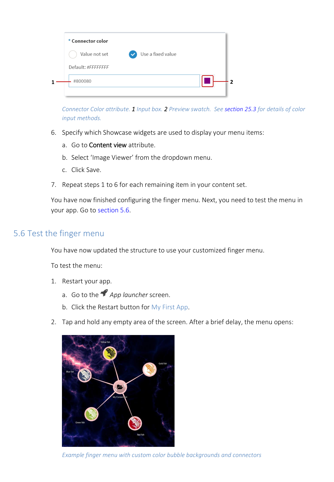
Go to the Menu item connector attribute and click Edit.
In the Menu bubble connectors attributes pane, go to Connector color attribute.
Select 'Use a fixed value'.
By default, bubble connectors are white. Specify a new connector color. For example, for a purple bubble connector, click the preview swatch to open a color picker or enter one of these in the input box:
RGBA:
rgba(128,0,128,1)Hex:
#800080Name:
purple
Click Save.
Note
You have now created a new Menu Bubble Connectors shared widget. This widget is now listed in the widget library.
Specify which Showcase widgets are used to display your menu items:
Go to the Content view attribute.
Select Image Viewer from the dropdown menu.
Click Save.
Repeat steps 1 to 6 for each remaining item in your content set.
You have now finished configuring the finger menu. Next, you need to test the menu in your app.
Test the finger menu
You have now updated the structure to use your customized finger menu.
To test the menu:
Restart your app.
Go to the App launcher screen.
Click the Restart button for My First App.
Tap and hold any empty area of the screen. After a brief delay, the menu opens.
Finger menu attribute detail.
Next steps
The previous sections described the minimum steps necessary to create a finger menu in your app. But the MT Showcase Editor offers a rich selection of options to customize the appearance and behavior of these menus in your app.
Explore the available bubble and connector attributes
We recommend that you browse and experiment with the available attributes for your new My First Bubbles and My First Connectors widgets.
For example, you can configure the bubble label, size and color. You can also specify whether to display thumbnail images on the bubbles. For the bubble connectors, you can specify the color, thickness, how much the connector bends, and even a 'texture' image. In all cases, click the help button to see the attribute help.
Tip
You can browse the attributes for these shared widgets in the Widget Library; go to the Menu bubbles and Bubble connector type sections.