Content Widgets
This section provides an overview of widgets that display content such as images or videos.
Image Viewers
The Image viewer widget displays image files, such as PNG, JPEG, BMP and TIF files.
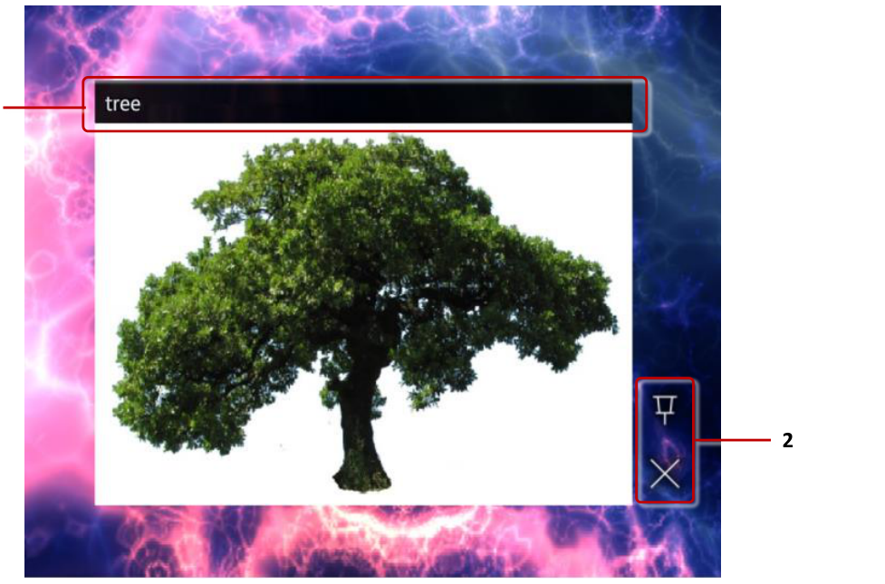
Image viewer widget. 1 Image title. 2 Toolbar with pin and close buttons.
You can add a new Image viewer widget to your app by dragging and dropping an image file from the media library to a structure or content set in the MT Showcase Editor. Alternatively, you can create a new empty Image viewer widget in a structure and drag and drop the image file into the Image file attribute, or create a new File asset node in a content set and drag and drop the image file into the Asset field. For more information about the media library, see Concepts.
You can configure an initial location and size for the image viewer widget, and choose whether users can move it or not. You can add a toolbar to the widget, and select the available buttons, for example a pin and a close button. You can also add decorations to the image, such as a title bar or a caption. You can even allow users to annotate on top of the image with IR pens.
You can add images directly to the main or background layer in your app's structure, or allow users to launch them from a content hotspot, menu or a Codice card.
You can add hotspots to an image to open additional content when a user taps on a specific part of the image.
Video viewers
The Video viewer widget displays video files such as MP4 files, as well as video streams and video capture devices such as web cameras.
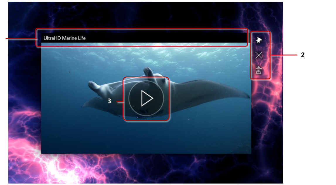
Video viewer widget. 1 Video title. 2 Toolbar with pin, close and clear annotations buttons. 3 Video play button.
Like Image viewers, you can add Video viewers to your app by dragging and dropping a video file from the media library to your app's structure or a content set. Or you can add a new Video viewer widget to your app and fill in the Video source attribute. This is required for video streams and video capture devices.
Video viewers have many of the same configuration options as Image viewers. You can set the video initial location and size, add a toolbar and decorations to the video and allow users to annotate on it. In addition, you can modify attributes specific to videos. You can set the video to automatically start playing when opened and to automatically close after playing or to play in a loop. By default, users can play or pause the video by tapping anywhere on it. Video also displays buttons to play or pause and to mute or unmute it. If needed, you can disable tapping to play the video and hide the buttons.
Video displays a preview image while it is not playing. See the video preview section below for information about customizing the video preview.
You can add hotspots to a video to open additional content when a user taps on a specific area of the video.
Video streams
Aside from displaying video files, Video viewer can also display live video streams. The stream can be a video capture device connected to the PC, such as a web camera. Or it can be an online video stream coming from another machine on the network.
To add a video stream to your app, follow these steps:
Click Structures in the left-hand pane.
Click My First Structure. The Editing a Structure screen opens.
Go to the Main section and click Add a new widget to Main.
From the pop-up menu, add a Video viewer.
In the Video viewer attributes pane, set the following attributes:
Video source: Input the path to the video stream. This can be an online video stream, for example
rtsp://10.36.0.122:8554/presentations. Or it can be a capture device:Ubuntu examples:
/dev/video0or/dev/v4l/by-path/pci-0000:04:00.0-video-index0Windows example:
video=@device_sw_{860BB310-5D01-11D0-BD3B-00A0C911CE86}\{BBABFA61-0001-48CC-9CAB-324ECB2D4C6B}
Tip
On Windows, if you also have MT Canvus installed, you can use
mt-video-check.exeincluded with Canvus to get the video input source. Note that the output ofmt-video-check.exeis optimized for Canvus. You should replace all double backslashes (\\) in the path with single backslashes (\) to use the path in Showcase Editor.Streaming mode: Normally video viewers buffer the decoded video to ensure smooth playback. This adds latency when the video is a live stream. For optimal experience, enable Streaming mode to skip this buffering.
Start video automatically: Enable this attribute to automatically start playing the video instead of waiting for the user to play the video.
(Optional) Display video controls and Single tap toggles playback: You can disable these attributes to hide the video control buttons and prevent the user from pausing the video stream.
(Optional) Video stream quality settings: You can use the advanced attributes Video stream minimum resolution, Video stream maximum resolution, Video stream minimum frames per second, Video stream maximum frames per second and Prefer uncompressed video stream to fine-tune video stream resolution and quality. Click the help button for details.
Click Save to save your changes.
Video preview
While a video is not playing, it displays a preview image. By default, this is an automatically chosen frame in the video: the current frame if the video is paused, or a frame 5% from the beginning of the video if the video has played to the end and stopped. Note that when the video is first opened, it is paused on the first frame.
You can customize the preview image. You can set this to be a specific frame in the video, or a completely custom image. If a custom image is used, it is overlaid on top of the video, matching the video resolution.
To customize the preview image, follow these steps:
Select the Video viewer you want to edit.
In the Video viewer attributes pane, set the following attributes:
Preview position: Set the playback position in the video to use as a preview frame. Set the preview position as seconds. Or you can set a relative position as a percentage of the video duration by using calc, for example
calc(100%)to use the last frame of the video as the preview image.Preview image: You can use this attribute to set a custom image as the video preview. Drag and drop an image file from the media library into the input field.
(Optional) Preview on pause: Normally when video is paused, the current frame is used as the preview instead of the custom preview position or image. You can enable this attribute to display the custom preview also when the video is paused.
Click Save to save your changes.
Web browsers
The Web browser widget displays web content, such as web pages and HTML files. It can also display images, videos, text files and PDFs.

Web browser widget. 1 Address bar. 2 Toolbar with close, pin and toggle mouse emulation mode buttons. 3 Resize handle.
You can set the initial URL for the browser in the MT Showcase Editor. Users can also write a new URL in the browser's address bar. You can hide the address bar by enabling Hide address bar and navigation controls?
The browser must be pinned to interact with the web page content. You can add a toolbar with a pin button to the browser to allow users to pin the browser or enable the Pin the widget when it opens? attribute to automatically pin the browser.
By default, the browser operates in touch mode. But some web pages do not work correctly with multi-touch gestures. You can enable the Emulate mouse attribute to instead emulate mouse input. You can also add a Mouse emulation button to the browser's toolbar to allow users to switch the mode as required.
Web browser cache
By default, all web browsers in Showcase use incognito mode. That is, each browser stores data such as sessions and cookies in a temporary cache, and when a user closes the browser that cache is deleted. But you can configure web browsers in Showcase to use a shared cache.
Why use a shared cache? You can use this feature to streamline the user experience. For example, you might have a company portal that requires a sign-in in your app. You can configure a shared cache for the browser to keep it signed in when the browser is closed and opened again.
For example, to add a browser cache to the web browser in My First Structure, follow these steps:
Edit the browser attributes:
Click Structures in the left-hand menu.
Click the My First Structure hyperlink.
In the Main section, click the Web browser widget.
Add a Browser cache.
In the Web browser attributes pane, go to the Browser cache attribute.
Click the New button.
Type a name for the browser cache. For example, My Browser Cache.
Click the Save button.
Edit the Browser cache.
Click the Edit button to display the Editing a widget screen.
In the Editing a widget screen, go to the right-hand attributes pane.
Set the Browser cache persistence. This attribute determines how long the cache is persisted. If you choose Session, Showcase stores the cache in memory. When Showcase is shut down, the cache is cleared. If you choose Persisted, Showcase stores the cache on disk. The cache persists indefinitely and is loaded from disk whenever Showcase is launched.
Click the Save button.
Note
You have now created a new Browser cache shared widget. This widget is now listed in the widget library and can be assigned to any other browser in your app. All browsers using the same Browser cache share data. You can also set a default Browser cache in a theme.
PDF books and flows
PDF book displays PDF documents as an open book. PDF flow displays PDF documents as a stack of pages.
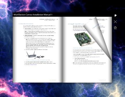
PDF Book widget.

PDF Flow widget.
You can add PDF viewer widgets to your app by dragging and dropping a PDF file from the media library to your app's structure or a content set. Or you can add a new PDF book or PDF flow widget to your app and drag and drop a PDF file from the media library to the Book pdf or Source pdf attribute.
PDF viewer widgets have many of the same configuration options as Image and Video viewers. You can set the widget initial location and size, add a toolbar and decorations to the widget and allow users to annotate on it.
Both book and flow must be pinned to turn the PDF document pages. You can add a toolbar with a pin button to the widget to allow users to pin the widget or enable the Pin the widget when it opens? attribute to automatically pin the widget.
Book and flow also have buttons to turn to the previous or next page, and a scroll bar to quickly scroll through the PDF document. Tap anywhere on the widget to display the buttons; they are automatically hidden when the widget has no interaction. You do not need to pin the widget to use the buttons and scroll bar. You can disable displaying the buttons with the Display controls attribute.
Image movies
The Image movie widget displays sequences of image files, such as PNG, JPEG, BMP and TIF files.
You can add a new Image movie widget to your app by dragging and dropping a folder from the media library to a structure or content set in the MT Showcase Editor. Alternatively, you can create a new empty Image movie widget in a structure and drag and drop the folder into the Image sequence folder attribute. For more information about the media library, see Concepts.
Image movie widgets have many of the same general configuration options as Image viewers. You can set the widget initial location and size, add a toolbar and decorations to the widget and allow users to annotate on it.
In addition, you can control how the movie is played. You can set the playback speed and choose a playback mode, such as play the movie in a constant loop, or play the movie once and then automatically close the widget. You can also set the movie in an interactive mode, where the movie doesn't play automatically but the user can scroll through the images. You can do this by setting the Playback speed attribute to 0 and the Interactive mode attribute to 1. The image movie must be pinned before the user can scroll through the images.
Text viewers
The Text viewer widget displays text files and custom text content defined in Showcase Editor.

Text viewer with custom text and transparent background.
You can add a new Text viewer widget to your app by dragging and dropping a text file from the media library to a structure or content set in the MT Showcase Editor. Alternatively, you can create a new empty Text viewer widget in a structure, create a new File asset node in a content set or create a new Widget node in a content set and create a named Text widget for it.
You can set the text for the widget by either dragging and dropping a text file from the media library to the Text file attribute, or by writing text directly to the Text content edit field in the Editor. Text viewer supports only plain text with simple formatting; rich text is not supported.
By default, the Text widget has a transparent background, but you can choose a different background color. You can also customize how the text looks, for example choose the text color and add drop shadows, or even use a custom font file. Add a Text style shared widget to the Text widget to customize how the text is displayed.
You can configure standard widget attributes, such as an initial location and size for the Text viewer widget, and choose whether users can move it or not. You can add a toolbar to the widget, and select the available buttons, for example a pin and a close button. You can also add decorations to the text, such as a title bar or a caption. You can even allow users to annotate on top of the text with IR pens.
You can add text widgets directly to the main or background layer in your app's structure, or allow users to launch them from a content hotspot, menu or a Codice card.
You can add hotspots to a Text widget to open additional content when a user taps on a specific part of the text.