Rotating Menus
Rotating menus are oval animated menus, with items orbiting a central node. The effect is similar to satellites orbiting a planet. Users can tap an orbiting item to open a submenu of items such as images, videos and PDFs.
Rotating menus display when a user taps and holds an empty area of the screen. They can also be launched when a user taps a content hotspot or holds a Codice marker against the screen. Rotating menus are a direct alternative to finger menus.
By default, the central node, orbiting items and submenu items are all shown as bubbles, like the ones in your finger menu. If you set the menu item type to 'nodes', they display as blue cubes but you can specify custom cube colors or custom images.
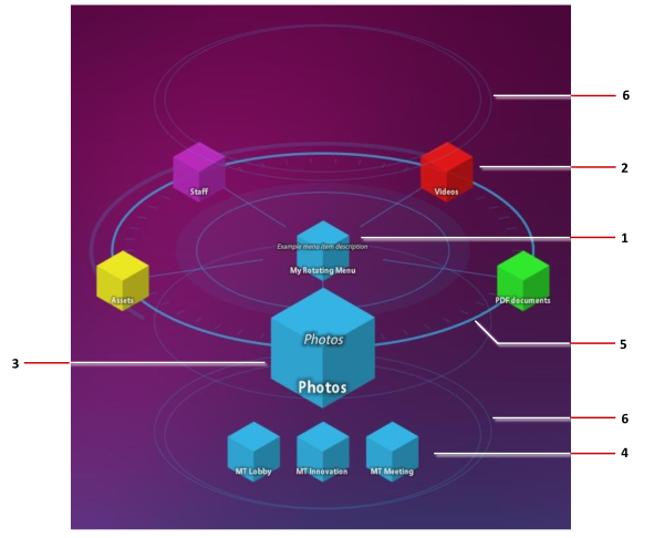
Example rotating menu. 1 Central node. Users can drag the central node to move the menu. 2 Orbiting items, or 'orbiters'. These orbit the central node. Tap any orbiting item to open a submenu. 3 As orbiting items approach the user, they get bigger for emphasis. 4 Submenu items. These contain the actual menu content such as images, videos, and PDFs. 5 Rings and spokes spin slowly around the central node. 6 Halo rings above and below the rotating menu gently rise and fall.
Set Up a Content Set
Before creating a rotating menu, you must create the content set that supplies the menu with content such as images, videos or PDFs.
Unlike finger menus and teaser menus, content sets for a rotating menu must adhere to a specific three-tier format. Specifically, the actual menu items --- images, videos or PDFs --- must be in subfolders immediately below the root-level folder. You cannot add content directly to the root-level folder.
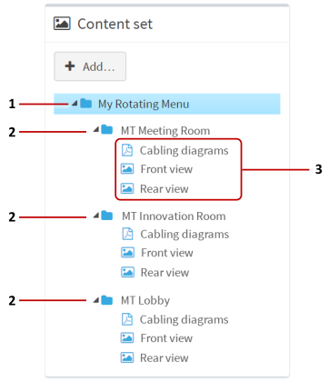
Example content set for rotating menu. 1 Root level folder. This folder is the central node in the rotating menu. 2 Subfolders. These subfolders correspond to items orbiting the central node. 3 Submenu items. These items are displayed in a submenu when a user taps an orbiting item.
Follow these steps:
If you have not already done so, drag the content you want into the media library. You can then populate the content set with items from your media library.
Create a new content set. You can adapt an existing content set to meet the required format, but you may find it easier to simply create a new one specifically for rotating menus. Click Content sets in the left-hand pane.
In the Content Set screen:
Select Folder from the drop-down menu at the bottom of the screen. This menu sets the node type (folder, image, widget, and so on) for the root node of the new content set.
In the name box, enter a name for the new content set. For example, Content for Rotating Menus.
Click the Create New button.
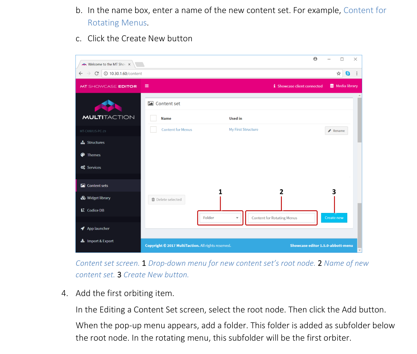
Content set screen. 1 Drop-down menu for new content set's root node. 2 Name of new content set. 3 Create New button.
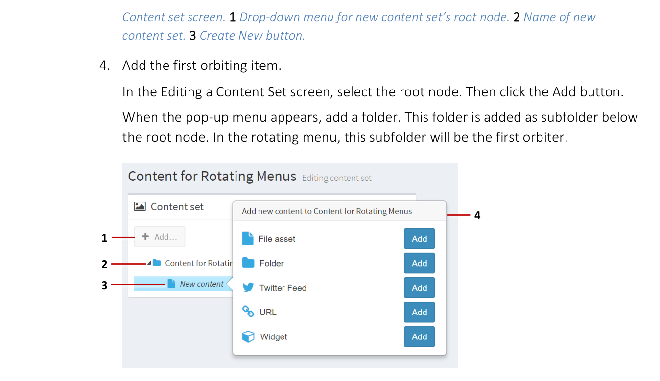
Add the first orbiting item. In the Editing a Content Set screen, select the root node. Then click the Add button. When the pop-up menu appears, add a folder. This folder is added as subfolder below the root node. In the rotating menu, this subfolder will be the first orbiter.

1 Add button. 2 Content set root node. 3 New folder added as a subfolder below the root node. 4 Pop-up menu.
Now add the submenu items for this orbiter. To do this, drag items from the media library into the subfolder you just created.
Editing a content set. 1 Right-click context menu. 2 Visible name attribute.
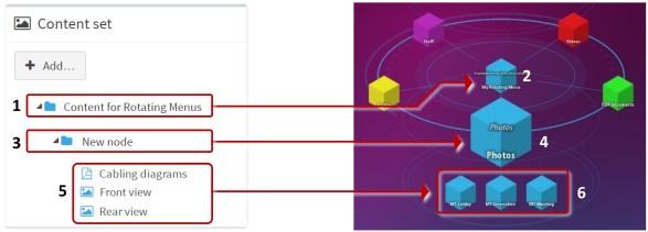
Content set three-tier format. The root folder of the content set (1) maps to the menu's central node (2). The subfolder (3) maps to an orbiter in the rotating menu (4). Items in the subfolder (5) appear as the items in the submenu (6).
Repeat step 4 for each orbiter in your rotating menu.
Add submenu items for each orbiter. That is, repeat step 5 for each subfolder you added to the content set.
(Optional) For greater visual impact, you can set matching colors for each orbiter and its submenu. Follow these steps:
First, set the orbiter color. Select the subfolder you want and edit the Menu item color attributes in the content set.
Now set the color for the submenu items. Select each subfolder item and set the same Menu item color as for the subfolder. To do this quickly, you can copy and paste the rgba color value from the subfolder to the subfolder items.
Now edit the labels for the following menu items:
Central node: The root folder name in the content set appears as the central node name in the rotating menu. By default, the root folder name is the name of the content set. To edit this name, right-click the root folder and choose Rename. Or edit the Visible name attribute in the right-hand Content [Folder] attributes pane.
Orbiters: Subfolder names in the content set appear as orbiter labels in the rotating menu. By default, each new subfolder is named New node. To edit these names, right-click the submenu and choose Rename. Or edit the Visible name attribute in the right-hand Content [Folder] attributes pane.
Submenu items: Item names in the content set appear as submenu labels in the rotating menu. By default, an item's name is simply its file name without the filename extension. To change a submenu item's label, right-click the item in the content set and choose Rename. Or edit the Visible name attribute in the right-hand Content [File asset] attributes pane.

Renaming items in a content set. Right-click an item and choose Rename (1) or edit the Visible name attribute (2).
(Optional) Add brief descriptions for the orbiters and, if required, the central node. To add descriptions, edit the Menu item description attribute in the right-hand Content [Folder] attributes pane.
Orbiter descriptions display when you open an orbiter's submenu. By default, these display below the rotating menu, but you can adjust this by editing the Description Location attribute.
You can also add a description for the central node, but note this description is always visible. By default, it displays below the central node, potentially obscuring any orbiter descriptions. To remedy this, adjust the Description Location.
Note
The Description Location attribute adjusts where descriptions are displayed for the central node and orbiters. You can set a default Description Location in your theme (go to the Rotating menu component, then click the Show advanced attributes hyperlink). Or you can set a Description Location for individual folders and subfolders in the content set. Click the help button if you need details.
Click the Save button to save the changes to the content set.
Configure the Rotating Menu to Use Nodes
This task is optional.
By default, items in a rotating menu display as bubbles. However, you can also configure menu items to display as nodes (cubes or custom images). First, you must configure your rotating menu to use nodes as the menu type. Then you will need to create a Menu Nodes widget. The easiest way to perform these tasks is to use a theme.
Follow these steps:
Click Themes in the left-hand pane.
In the Themes screen, click the theme you created previously.
In the Editing a theme screen, go to the Rotating menu component.
Now create a Menu nodes widget for rotating menus.
Go to the Menu item type attribute.
Select Use a fixed value and then click the New button.
In the Add new widget pop-up, add the Menu nodes widget.
Enter a name, for example My Nodes.
Click Save to add the new Menu Nodes widget to rotating menus in your theme.
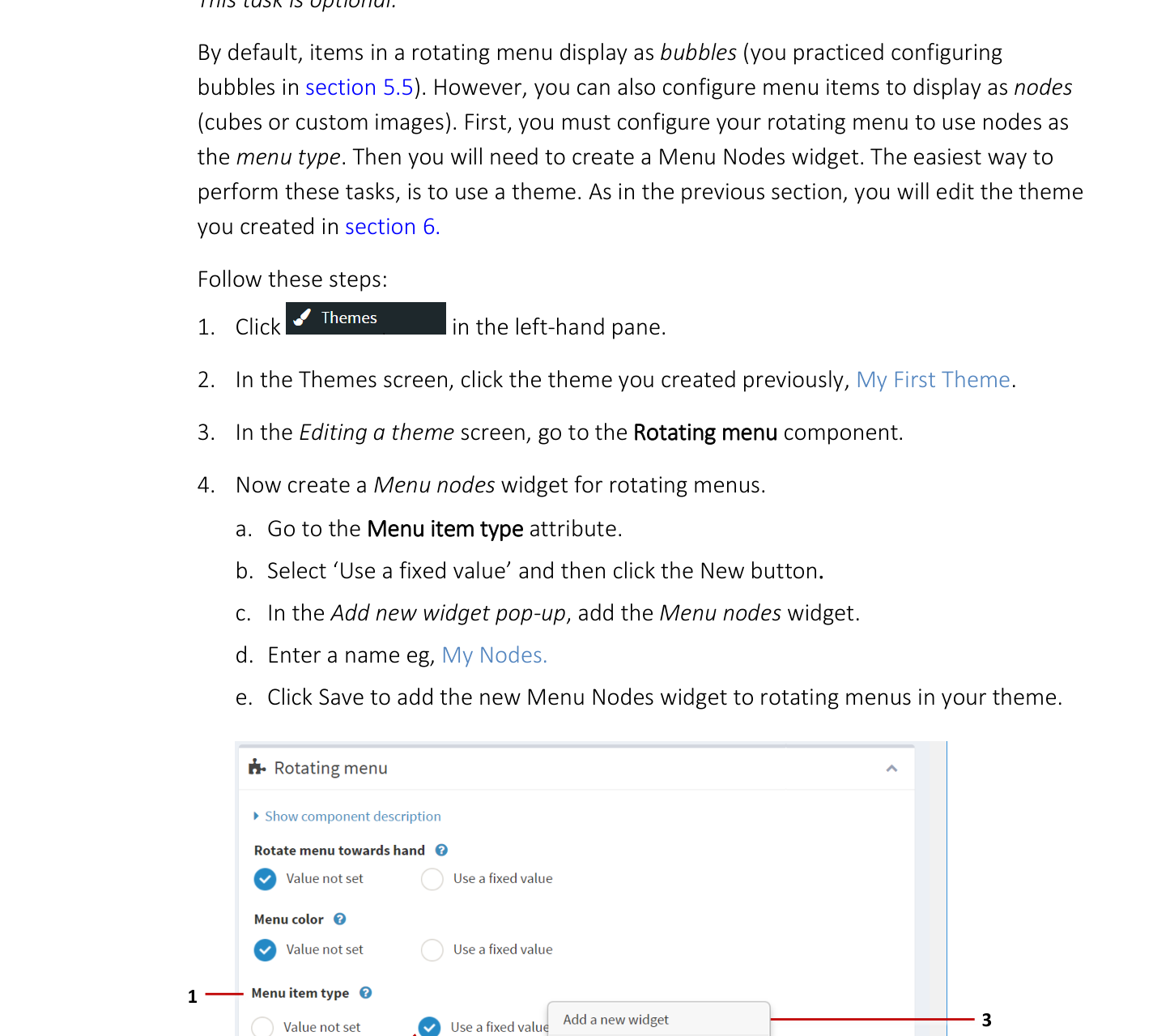
Editing a theme screen, Rotating menu component. 1 'Menu item type' attribute. 2 'Use a fixed value'. 3 Add a new widget pop-up. 4 Available menu node types. 5 New and Edit buttons.
Now configure the new Menu Nodes widget.
Still in the Editing a theme screen, go to the Menu item type attribute.
Select My Nodes from the drop-down menu and click the Edit button.
In the Editing a widget screen, edit the node attributes as required. By default, nodes display as blue cubes. You can change the default cube color or size. You can also define an overlay (used to highlight menu items with a colored outline). You can even specify a different image instead of the default cube image. In all cases, click the help button to see the attribute help.
For example, to specify gold cubes, set the Menu item color attribute to
#FFD700orrgba(255,215,0,1)orgold.Click Save to save the changes to the Menu Nodes widget.
Click the Back button in your browser to return to the Editing a theme screen.
Click Save to save the changes to your theme.
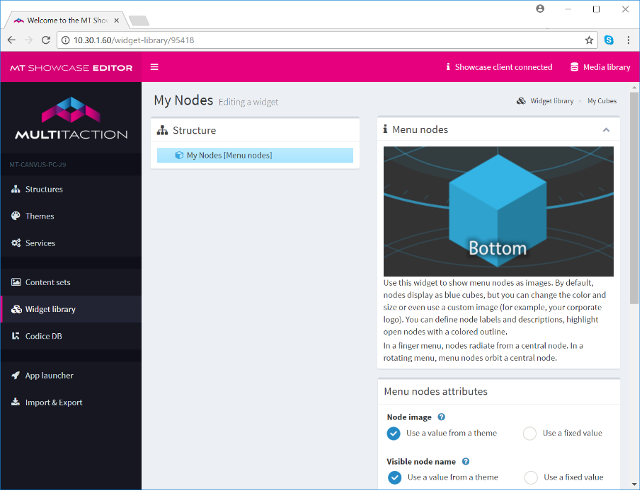
Editing a widget screen, Menu Node widget.
Tip
This section showed how to set up a Menu Nodes widget with gold cubes. If you want different colored orbiters and submenus in your rotating menu, you can simply edit the Menu item color attribute for each subfolder and subfolder item in your content set.
Add a Rotating Menu to Your App's Structure
Now you need to add a rotating menu to your app's structure. Then you need to configure the menu to use the new content set.
Follow these steps:
Click Structures in the left-hand menu.
Click the structure you want to use. Or create a new structure.
Note
You may prefer to create a new structure instead of using an existing one. This is because only one menu can be active in an app's Menu layer; see step 6.
In the Editing a Structure screen, go to the Menu layer.
Click Add a new widget to Menu.
From the pop-up menu, add a Rotating menu. A preview image of a rotating menu now displays in the right-hand pane.
(Applies only if your structure already has a finger menu defined) You must delete the existing finger menu before adding a rotating menu. This is because the first-defined menu (chronologically) is always the active menu. It is not sufficient to simply re-order the menus so that the rotating menu is topmost.
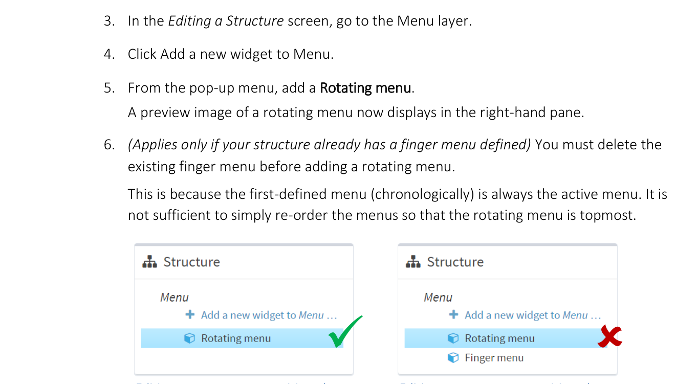
Editing a structure screen, Menu layer. Left: Correct setup --- only one menu is defined. Right: Incorrect setup --- the menu that was added first, regardless of display order, is always the active menu.
In the Rotating menu attributes pane, select your content set from the Content Set dropdown menu.
Click the Save button to add the menu to your structure.
Add a Theme to Your App
Although themes are optional, we strongly recommend that your app uses a theme to define the basic appearance and behavior of your rotating menu.