This section describes how to set up a teaser.
A teaser is a menu launcher. It can be a single bubble drifting slowly across the screen,
'wobbling' briefly at regular intervals to attract users' attention, or a single bubble that
fades in and out, reappearing at random screen locations. In both cases, users can tap the
teaser to open a regular finger menu or teaser menu.
For greater impact, you can specify multiple instances of a teaser drifting across the
screen at the same time, and you can use a custom image or video instead of a bubble.
Set Up a Content Set
As with finger menus, teasers require a content set to supply them with media such as
images. For example, the teaser can re-use an existing content set. This will mean that the
teaser inherits the same appearance as the central bubble in the finger menu you created
previously.
But what if you wanted your teaser to have its own unique appearance? The solution is to
create a unique content set for your teaser menu. Follow these steps:
Drag some content into the media library from Windows Explorer. For example, drag
a folder that contains images.
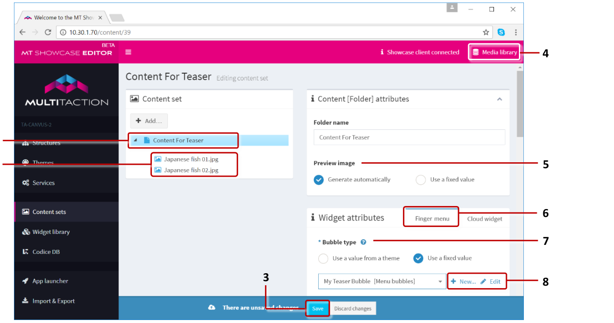
Click Content sets in the left-hand pane.
Create a new content set. For example, Content for Teaser.
Now add items to the new content set. In the Editing a content set screen:
Drag items from the media library into the new content set.
Close the media library and save the changes.
(Optional) Specify a thumbnail image for the teaser bubble.
Still in the Editing a content set screen, click the root folder in your content set
(labelled Content for Teaser). The root folder represents the teaser bubble.
Go to the Preview image attribute and select Use a fixed value.
Click the media library button, then drag an image from the media library into the
Preview image field.
Now create a Menu bubbles widget for the new content set.
In the Widget attributes pane, go to the Finger menu tab.
Go to the Bubble type attribute.
Select Use a fixed value and then click the New button.
Add the Menu Bubbles widget.
Enter a name, for example My Teaser Bubble.
Click Save.
Now configure the teaser bubble.
Still in the Editing a content set screen, go to the Bubble type attribute.
Select My Teaser Bubble from the drop-down menu and click the Edit button.
Edit the bubble attributes as required. For example, edit the Bubble size and
Bubble edge color attributes to change the teaser bubble size and color.
Click Save.
Add a Teaser to Your App's Structure
Now you need to add a teaser to your app's structure. Then you need to configure the
teaser to use a content set.
Follow these steps:
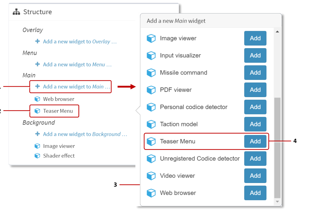
Click Structures in the left-hand pane.
Click your structure. The Editing a Structure screen opens.
Go to the Main section and click Add a new widget to Menu.
From the pop-up menu, add a Teaser menu.
Click the Save button to add the teaser to your structure.
Now you need to set up the teaser. Go to the next section.
Set Up the Teaser
In this section, you will edit the essential attributes for the teaser. As part of this
procedure, you will create two shared widgets, a Finger menu and a Teaser operator.
You will also assign a content set to the teaser.
Note
A teaser operator controls how a teaser floats across the screen, including its speed,
direction, and animation properties. If you do not specify a teaser operator, the teaser will
use default values (for example, it will slowly float diagonally downwards, left to right).
Follow these steps:
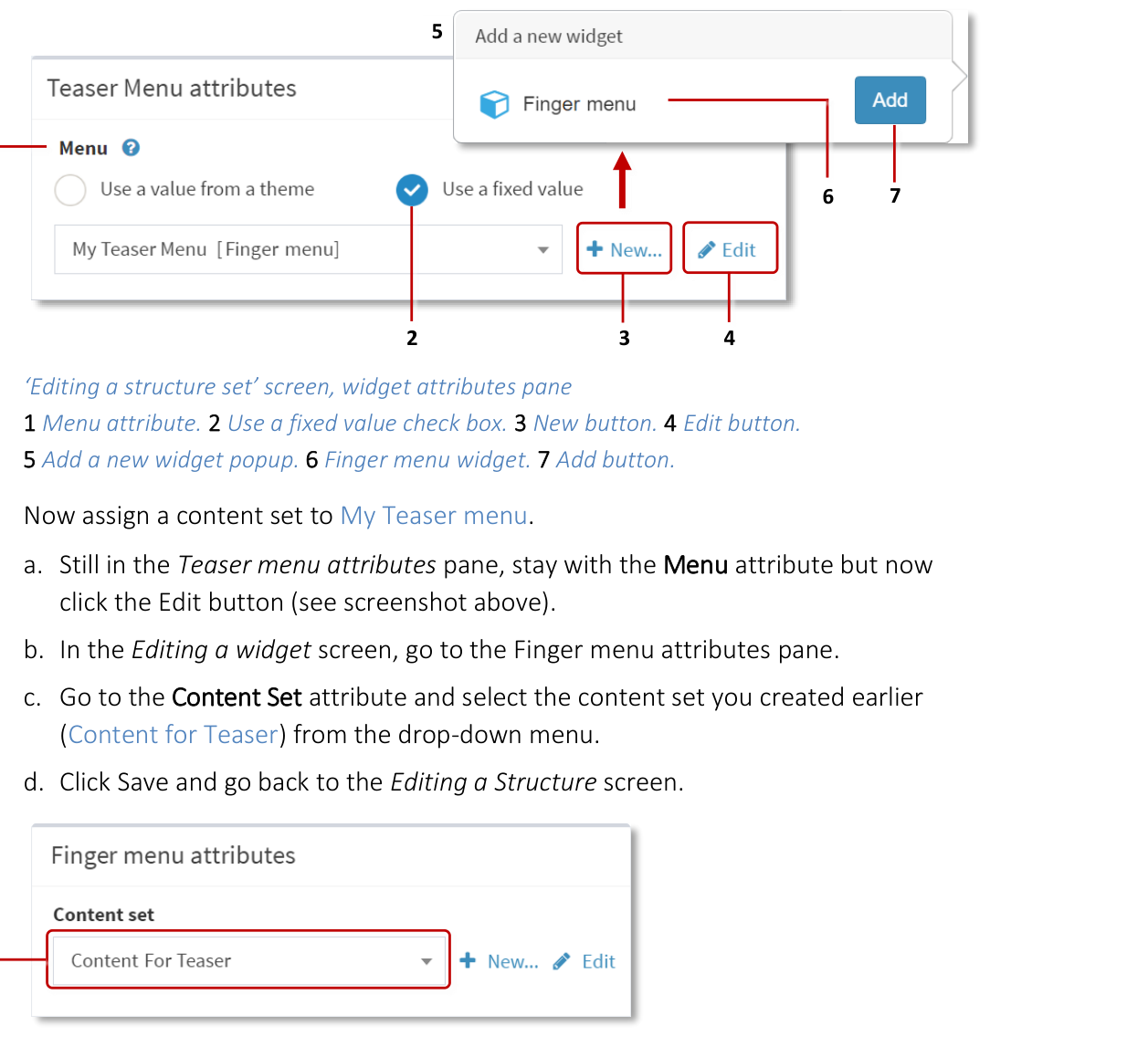
In the Editing a Structure screen, click the new Teaser menu widget.
In the Teaser menu attributes pane, go to the Menu attribute.
Select Use a fixed value and click the New button.
Add the Finger menu widget.
Enter a name, for example My Teaser menu.
Click Save.
Now assign a content set to your teaser menu.
Still in the Teaser menu attributes pane, stay with the Menu attribute but now
click the Edit button.
In the Editing a widget screen, go to the Finger menu attributes pane.
Go to the Content Set attribute and select the content set you created earlier
from the drop-down menu.
Click Save and go back to the Editing a Structure screen.
- align
center
- alt
Editing a widget screen showing Finger menu attributes with Content Set dropdown
Editing a widget screen, Finger menu attributes. 1 Drop-down menu for Content Set attribute.
- align
center
- alt
Content Set attribute detail
Content Set attribute detail.
Now set the teaser behavior. Two behaviors are supported:
Floating content behavior: The teaser floats slowly across the screen, animating
briefly at regular intervals.
Fading content behavior: The teaser fades in and out rhythmically, appearing at
random screen locations.
Follow these steps:
Go back from the Editing a widget screen to the Editing a Structure screen.
In the Teaser menu attributes pane, go to the Teaser behavior attribute.
Select Use a fixed value and click the New button.
Add Floating content behavior or Fading content behavior.
Enter a name. For example, My Teaser Behavior.
Click Save.
(Optional) Finally, you can specify a visualization widget, replacing the traditional
teaser bubble with a custom image or video.
By default, a teaser is a single bubble, but you can instead specify an image, image
movie or video. For example, you could use your logo as the teaser. When the user
taps the image or video, the teaser menu launches as normal.
Still in the Teaser menu attributes pane:
Go to the Teaser visualization widget attribute.
Select Use a fixed value. Then click New.
Enter a name, for example My Teaser Image. Then click Save.
Still in the Teaser visualization widget attribute, click Edit.
The Editing a widget screen appears.
Now specify which image or video to use. If you added the:
Image Viewer widget, edit the Image file attribute.
Image Movie widget, edit the Image sequence folder attribute.
Video Viewer widget, edit the Video source attribute.
For images and image movies, you do not generally need to change any other
attributes (although you may want to change the size or playback speed).
For videos, we strongly recommend you enable the Start video automatically,
Loop video and Mute video attributes.
Click Save to save changes to the Teaser visualization widget.
Note
In this section, you created a new Finger menu shared widget and either a Fading
content behavior or Floating content behavior shared widget. These widgets are now
listed in the widget library.
Test the Teaser
You have now updated the structure to use your new teaser. To test the teaser:
Go to the App launcher screen.
Click the Restart button for your app.
The teaser appears automatically and starts floating across the screen. When you tap
the teaser, the teaser menu opens (a regular finger menu).
Now you can customize the appearance and behavior of the teaser. Go to the next section.
Next Steps
The previous sections described the minimum steps necessary to add a teaser to your
app. But the MT Showcase Editor offers a rich selection of options to customize the
teaser appearance and behavior.
Customize the General Teaser Attributes
You rarely need to change the general teaser attributes. However, there is one general
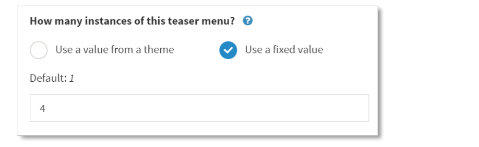
attribute that you may want to edit. The How many instances... attribute lets you add
multiple instances of the same teaser menu to your app for greater visual impact.
Other general teaser attributes let you customize the size and location of the 'teaser
spawning area' and specify whether the teaser menu is open when it first appears on
screen (by default, it is closed).
Follow these steps:
In the Editing a Structure screen, click the new Teaser menu widget.
In the Teaser menu attributes pane, you have already specified the Menu and
Teaser behavior attributes. Now explore the other available attributes. For example,
set the How many instances... attribute to 4 to create four instances of the same
teaser menu.
Note
You can also create multiple different teaser menus in your app, where each teaser
opens a different menu and, optionally, has a different appearance and behavior.
Go back to the Editing a Structure screen.