Content Hotspots
A content hotspot is a special area of the screen that supports custom user interactions. When users tap a content hotspot, items such as an image, video or PDF are displayed. You can even launch a finger menu or rotating menu from a hotspot.
You can add content hotspots directly to the Main layer in your app. You can also add content hotspots to images (hotspot images) and videos (hotspot videos). You can add hotspot images and videos directly to the Main layer in your app, to menus and to Codice content.
Adding a content hotspot directly: With this method, the hotspot has a fixed size and location. The hotspot is only visible to users if you use a visualization widget or a background color. This type of hotspot is suitable if you want hotspots in specific areas of the screen, for example, above areas of your app's background image.
Adding a hotspot image directly: With this method, an Image Viewer widget in the Main layer of your app becomes a hotspot image. Users can move, rotate and resize the image as normal, but an item launches if they tap a hotspot on the image. A single hotspot image can include multiple hotspots, with each hotspot launching a separate item.
Adding a hotspot image to a menu: With this method, hotspot images are opened from a menu. That is, a menu item opens an Image Viewer widget. Users can then tap hotspots on the image to launch items.
Adding a hotspot image to Codice content: With this method, hotspot images are opened with a Codice card. That is, a user places a Codice card on the screen to open an Image Viewer widget. The user can then tap hotspots on the image to launch items.
In all cases, you can set the hotspot size, location and (optionally) background color, plus the items that display when a user taps the hotspot.
For content hotspots and hotspot images, you can also assign a visualization widget (an image or video) to help users locate the hotspot and suggest the item that will be launched. The visualization widget displays above the hotspot but does not affect user interaction with the hotspot. For example:
Content hotspots: An app includes a grid of hotspots to launch PDF product brochures for a range of graphics cards. Each hotspot uses a photo of the relevant graphics card as its visualization widget.
Hotspot images: An app for a university includes a hotspot image of a campus map. A hotspot is defined for each faculty on the map, with images used as visualization widgets to alert users to the presence of hotspots.
Add a Content Hotspot Directly to the Main Layer
This section applies to Content Hotspot widgets added directly to the Main layer of your app's structure.
Add a Content Hotspot to Your App
Follow these steps:
Click Structures in the left-hand pane.
Click the structure you want to use. The Editing a Structure screen opens.
Go to the Main section and click the Add a new widget to Main hyperlink.
From the pop-up menu, add a Content Hotspot.
In the Content Hotspot attributes pane, set the general hotspot attributes:
Hotspot location and Hotspot size define the hotspot area. However, these attributes are optional if you prefer to use hotspot visualization widgets to define the 'tappable' hotspot area.
Background color is designed to help app designers visualize the hotspot area while setting up the hotspot. Typically, you revert to the default (transparent) background color when finalizing the app.
(Optional) If required, adjust the Contents opening animation duration attribute. This determines how quickly (or slowly) items take to fully open when a user taps the hotspot. You can set a duration of 0.1 to 2.0 seconds.
Click the help button if you need details.
(Optional) If you intend to add multiple hotspots to your app, you may want to give distinctive names to each hotspot in the Editor. To rename a hotspot, right-click the Content hotspot widget and click Rename.
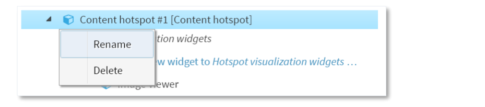
Drop-down menu for content hotspot widget.
Click the Save button to add the content hotspot to your structure.
Now set up the content hotspot appearance and behavior.
Set Up the Content Hotspot
Now you need to specify which items display when a user taps the hotspot, and which images or movies (if any) are used as the hotspot background. Follow these steps:
Go to the Main section of the Editing a Structure screen.
Click the triangle next to the Content Hotspot widget. The widget expands to reveal three widget lists:
Hotspot visualization widgets
Widgets launched from hotspot around tap location
Widgets launched from hotspot at absolute screen locations
(Optional) Add a visualization widget. To help users locate the hotspot, you can add a visualization widget. This widget (an image or movie) serves as a background for the hotspot. In addition:
Visualization widgets can foreshadow the hotspot's content.
Visualization widgets are interactive. Users can tap a visualization widget to launch hotspot content in the same way as they can tap the hotspot area.
Visualization widgets can be used to extend the interactive hotspot area. You can position a visualization widget anywhere on the screen. Even if it is not within the hotspot area, the visualization widget is still interactive and part of the hotspot.
Note
When you set the Location attribute of the visualization widget, its location co-ordinates are relative to the top-left corner of the hotspot area, not the top-left corner of the screen.
To add visualization widgets, follow these steps:
Click the Add new widget to Hotspot visualization widgets hyperlink.
Add the widget you want. Choose from Image Viewer, Image Movie or Video Viewer.
In the right-hand pane, set attributes for the new widget. In particular, set the Location and Size attributes.
Click Save to save the visualization widget for your hotspot.
Add the widget that opens when a user taps the hotspot. This can be any widget normally found in the Main or Menu layers of an app (such as a video, PDF, browser or finger menu). To specify this widget, you must add it to one of the Widgets launched from lists. There are two lists, each with its own interpretation of the widget's Location attribute:
Widgets launched from hotspot around tap location: Use this list if you want a widget to open close to where the user taps the screen. For this list, the widget's Location attribute is relative to the touch event.
Widgets launched from hotspot at absolute screen locations: Use this list if you want a widget to open at a specific screen location. For widgets in this list, the widget's Location attribute is relative to the top left corner of the screen.
Tip
You can use the absolute screen locations list to launch multiple widgets from a single hotspot, with each widget opening at a different screen location. For example, you can set up a hotspot to open a product movie and PDF brochure side-by-side.
To add the widget that opens from the hotspot:
Click the Add hyperlink for widgets from the hotspot.
Add the widget you want.
Set the Location attribute. See above for details of how this location is interpreted.
Set the remaining attributes for the new widget.
Click Save to save the hotspot setup.
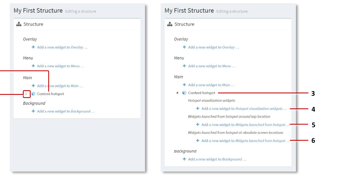
Setting up a content hotspot. 1 Content hotspot widget added to Main layer.
- align
center
- alt
Expanded content hotspot widget showing widget lists and hyperlinks
Setting up a content hotspot. 2 Triangle for content hotspot widget --- click to reveal widget lists. 3 Expanded content hotspot widget. 4 Hyperlink to add hotspot visualization widgets. 5 Hyperlink to add widgets that open around the tap location. 6 Hyperlink to add widgets that open at absolute screen locations.
Add a Hotspot Image Directly to the Main Layer
This section applies to Image Viewer widgets in the Main layer of your app's structure.
If you want to add a hotspot to an image in your app, you must first add an image to your app. Then you add one or more content hotspots to the image. Finally, you must set up the content hotspots (that is, you need to specify which item displays when a user taps a hotspot).
Add an Image to Your App
Follow these steps:
Click Structures in the left-hand pane.
Click the structure you want to use. The Editing a Structure screen opens.
In the Main section, go to the Image Viewer widget you want to use. (Choose an existing Image Viewer or add a new one.)
Click the triangle next to the Image Viewer widget. The widget expands to reveal a widget attachments list and the Add a new widget to widget attachments hyperlink.

Adding a content hotspot to an image. 1 Editing a structure screen. 2 Image Viewer added to Main layer. 3 Image viewer triangle --- click to reveal widget attachments list. 4 Hyperlink to add 'new widget to widget attachments'.
Add Hotspots to the Image
You now need to add content hotspots to the Image Viewer widget. This task is described in the "Add Hotspots to the Image" section below.
Set Up the Hotspot Image
Finally, you need to specify which items display when a user taps the hotspot image. This task is described in the "Set Up the Hotspot Image" section below.
Add Hotspot Images to a Menu
This section applies to hotspots on images launched from a menu node. The menu node can be in a finger menu, rotating menu, or teaser menu.
You can add 'hotspot images' to menu items. That is, when a user taps a menu item, an image opens. This image contains one or more content hotspots. If the user then taps the image, further items open, such as images, videos, PDFs or browsers or even another menu.
To add hotspot images to a menu, you must first add the hotspot images to a content set. Then you must add a menu to your app and configure the menu to use this content set.
Add Images to Your Content Set: Recommended Method
This method adds a widget to a menu node in the content set, and then designates the widget as an 'Image Viewer with a Content Hotspot attachment'. The advantage of this method is that your hotspot image is a shared widget that you can re-use in other content sets and menus.
Follow these steps:
If you have not already done so, drag the images you want into the media library.
Edit the content set you want to use.
Click Content sets in the left-hand pane.
Click the content set you want to use.
In the Content Set screen:
Select the root node.
Click the Add button and add a widget.
Select the new widget.
Now set the widget type. This must be an Image Viewer widget. In the right-hand Content [Widget] attributes pane:
Set a visible name. This name will display in your app as the label for the menu item.
Go to the Widget attribute and click the New button.
Add an Image Viewer and give it a name. For example, My Hotspot Image.
Click the Save button to save the Image Viewer widget to your content set.
Still in the Content [Widget] attributes pane, return to the Widget attribute and this time click the Edit button. The Editing a widget screen displays.
Now continue to the "Add Hotspots to the Image" section below.
Add Images to Your Content Set: Alternative Method
This method adds images from the media library directly to menu nodes in the content set. It then adds content hotspots to these images. The advantage of this method is that it is quick and simple. The disadvantage is that you cannot re-use the hotspot image in other menus or content sets.
Follow these steps:
If you have not already done so, drag the images you want into the media library.
Edit the content set you want to use.
Click Content sets in the left-hand pane.
Click the content set you want to use.
Note
The content set must have a 'Folder' root node.
In the Content Set screen:
Select the root node.
Click the media library button to open the media library pane.
Drag images from the media library into the new content set. Each image will be a menu node (that is, an item in the menu).
Close the media library and save the changes.
Still in the Content Set screen, select the menu node that you want to convert to a hotspot image.
In the widget attributes pane:
Click the Rotating menu tab or Finger menu tab, as required.
Go to the Content Viewer attribute.
Choose Image viewer from the drop-down list and click Save.
Still in the Content Viewer attribute, click the Edit button. The Editing a widget screen displays.
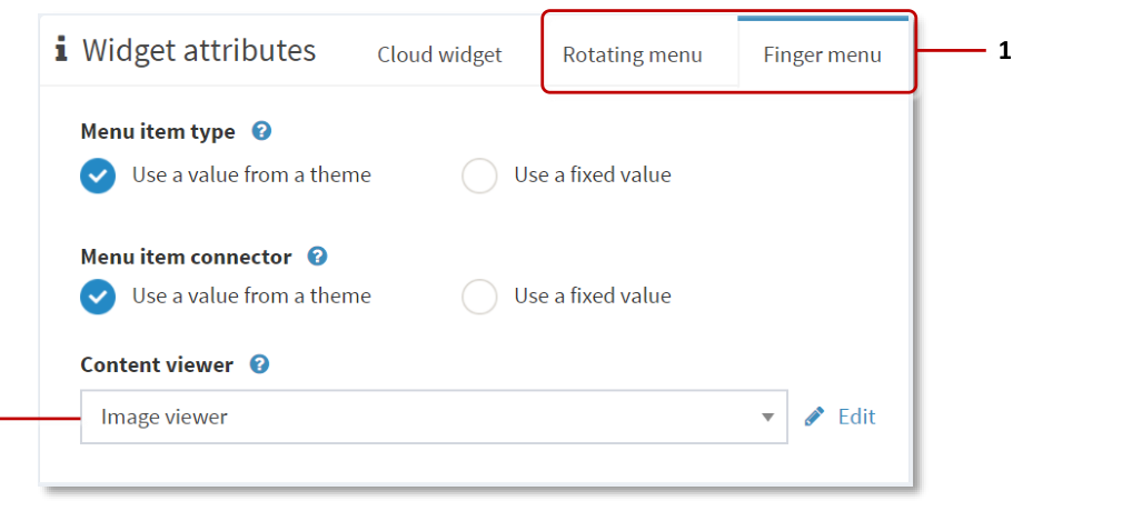
Widget attributes pane. 1 Menu tabs. 2 Content viewer attribute.
Now continue to the "Add Hotspots to the Image" section below.
Add Hotspot Images to Codice Content
This section applies to hotspots on images launched from a personal marker (a Codice card).
Codice content refers to the item that opens automatically when a user presents a personal marker (holds it against the screen). This item could be an image, video or even a web site.
To set up a hotspot image as Codice content, you must first assign a normal image to a specific Codice code. Then you add one or more content hotspots to the image. Finally, you must set up the content hotspot.
Add an Image to Codice Content
You set up Codice content in the Codice Database screen. Follow these steps:
Open the Codice Database screen and select the marker that you want to launch a hotspot image. Then edit the marker's Codice content.
In the Editing a structure screen, you need to add the hotspot image to a Widgets launched list. These widgets open when a user presents the relevant marker. There are two widget lists, each with its own interpretation of the widget Location attribute:
Widgets launched around Codice marker: For a widget in this list, the Location attribute is relative to the position of the marker on the screen. Use this list if you want the hotspot image to open close to the marker.
Widgets launched at absolute screen locations: For a widget in this list, the Location attribute is relative to the top left corner of the screen. Use this list if you want the hotspot image to always open at the same location on the screen.
In the Editing a structure screen:
Click either of the two Add a new widget hyperlinks.
Add the image you want to use as a hotspot image.
Set the Location attribute. See above for details of how this location is interpreted.
Set the remaining attributes for the new hotspot image.
Click the Save button.
Add Hotspots to the Image (General Procedure)
After adding an image to your app, content set or Codice content, you must add a Content Hotspot widget to the image's list of attachments. Follow these steps:
Make sure you have completed the required preliminary steps for your use case (adding directly to Main layer, to a menu, or to Codice content).
If you have not already done so, assign an image file to the Image Viewer widget:
Select the Image Viewer widget.
In the right-hand Image viewer attributes pane, go to the Image file attribute.
Click the media library button to open the media library pane.
Drag an image from the media library into the Image file attribute.
Close the media library and save the changes.

Adding a content hotspot to an image. 1 Image Viewer triangle --- click to reveal the widget attachments list. 2 Hyperlink to add 'new widget to widget attachments'. 3 Content hotspot added to widget attachments list.
Click the triangle next to the Image Viewer widget. The widget expands to reveal a widget attachments list.
Click the Add a new widget to widget attachments hyperlink.
From the pop-up menu, add a Content Hotspot.
In the Content Hotspot attributes pane, set the hotspot location and size:
Hotspot location: This location is relative to the location of the image. Set the location
0,0if you want to align the hotspot location exactly with the image's current location on the screen.Hotspot size: Set the size to
calc(100%),calc(100%)if you want to make the entire image a single 'tappable' hotspot area.
Click the help button for details about the other attributes.
Note
You can define multiple hotspots on a single image, each with its own location and size; see step 8.
Click the Save button to save the image as a hotspot image.
(Optional) If you want to add multiple hotspots to the image, repeat steps 4 to 7 for each hotspot that you want to add. When defining the hotspot locations and sizes, make sure the hotspots do not overlap.
Set Up the Hotspot Image (General Procedure)
Now specify which items display when a user taps a hotspot on the image. Follow these steps:
Make sure you have converted the image to a hotspot image.
Click the Content hotspot that you added previously. The widget expands to reveal three widget lists:
Hotspot visualization widgets
Widgets launched from hotspot around tap location
Widgets launched from hotspot at absolute screen locations
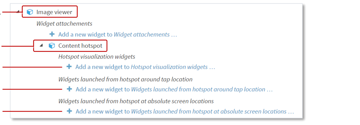
Setting up a hotspot image. 1 Image Viewer widget. 2 Content Hotspot widget. 3 Hyperlink to add hotspot visualization widget. 4 Hyperlink to add widgets that open around the tap location. 5 Hyperlink to add widgets that open at absolute screen locations.
(Optional) Add a visualization widget. To help users locate the hotspots on your image, you can add a visualization widget. In addition:
Visualization widgets can foreshadow the hotspot's content.
Visualization widgets are interactive. Users can tap a visualization widget to launch hotspot content in the same way as they can tap the image hotspot.
Visualization widgets can be used to extend the interactive area of the hotspot.
Note
When you set the Location attribute of the visualization widget, its location co-ordinates are relative to the top-left corner of the hotspot area, not the top-left corner of the screen.
To add a visualization widget, follow these steps:
Click the Add new widget to Hotspot visualization widgets hyperlink.
Add an Image Viewer widget.
In the right-hand Image viewer attributes pane, set attributes as required. In particular, set the Location, Size and Image file attributes.
Click Save to save the visualization widget for your hotspot image.
Add the widget that opens when a user taps the hotspot on the image. This can be any widget normally found in the Main or Menu layers of an app (such as a video, PDF, browser or finger menu).
To specify this widget, you must add it to one of the Widgets launched from lists. There are two lists, each with its own interpretation of the widget Location attribute:
Widgets launched from hotspot around tap location: Use this list if you want a widget close to where the user taps the screen. For widgets in this list, the widget's Location attribute is relative to the touch event.
Widgets launched from hotspot at absolute screen locations: Use this list if you want a widget to open at a specific screen location. For widgets in this list, the widget's Location attribute is relative to the top left corner of the screen.
Tip
You can use the absolute screen locations list to launch multiple widgets from a single hotspot, with each widget opening at a different screen location.
To add a widget to these lists, follow these steps:
Click the required Add new widget to Widgets launched from hotspot hyperlinks.
Add the widget you want.
Set the Location attribute. See above for details of how this location is interpreted.
Set the remaining attributes for the new widget.
Click Save to save the new hotspot on the image.
(Optional) If you added multiple hotspots to the image, repeat steps 2 to 5 for each hotspot in the image.
(Applies only if adding a hotspot image to a menu) If you want to convert another menu node to a hotspot image, repeat the relevant steps from the content set setup and then repeat this section for each node.
(Applies only if adding a hotspot image to a menu) Now add a menu to your app and then assign the 'hotspot content set' to that menu.
Add Multiple Hotspots to an Image
If required, you can define multiple hotspots on a single image. To help users locate the hotspots, you can also add a visualization widget to each hotspot.
In the first example below, a hotspot image has a single hotspot extending over the entire image. The user can tap the image anywhere to launch the hotspot content.
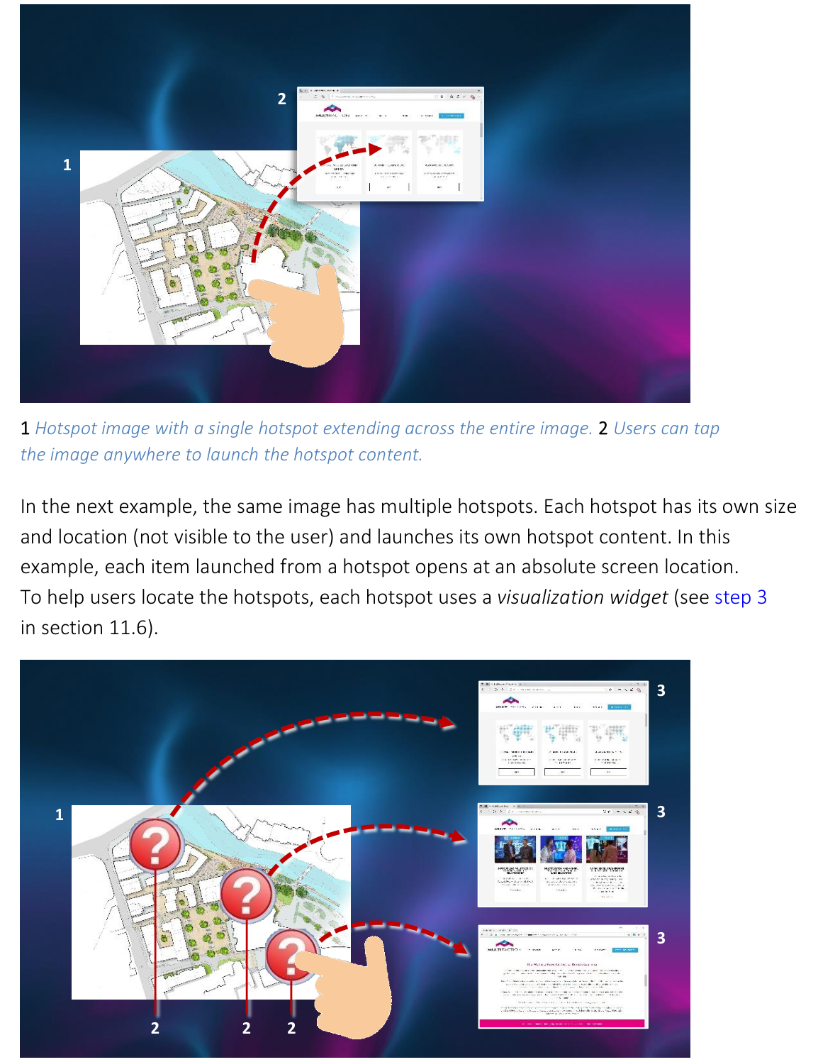
1 Hotspot image with a single hotspot extending across the entire image. 2 Users can tap the image anywhere to launch the hotspot content.
In the next example, the same image has multiple hotspots. Each hotspot has its own size and location (not visible to the user) and launches its own hotspot content. To help users locate the hotspots, each hotspot uses a visualization widget.
- align
center
- alt
Hotspot image with three hotspots and visualization widgets
1 Hotspot image with three hotspots. 2 Visualization widgets identify the hotspots to users. 3 Each hotspot launches a different item. In this example, the items open at absolute screen locations.
Add Multiple Content Hotspots
Applies to content hotspots and image hotspots added directly to your app. Follow these steps:
Add the content hotspots or hotspot images to your app.
Set the size and location of each content hotspot. In the Content Hotspot attributes pane:
Go to the Hotspot location attribute and set the location coordinates of the hotspot top-left corner.
Go to the Hotspot size attribute and set the hotspot width and height, in pixels.
Important
Make sure the hotspots do not overlap.
Set up each content hotspot.
Example: To set up four hotspots in a grid with a 50-pixel border between them, use these attribute values:
Hotspot |
Hotspot location |
Hotspot size |
|---|---|---|
Hotspot #1 |
50, 50 |
450 x 450 px |
Hotspot #2 |
550, 50 |
450 x 450 px |
Hotspot #3 |
50, 550 |
450 x 450 px |
Hotspot #4 |
550, 550 |
450 x 450 px |
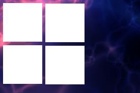
Four hotspots arranged in a grid layout with 50-pixel borders.
Test the Content Hotspot
You have now updated the structure to use your content hotspot. To test the hotspot:
Restart your app.
Go to the App launcher screen.
Click the Restart button for your app.
Tap the hotspot screen region. When you tap the hotspot, the 'launched widget' that you added previously now opens.
Tip
If you used a visualization widget, you can use the image or video to infer the hotspot boundaries.