Widget Customization
This section introduces common customization you can add to most widgets in MT Showcase.
Drop Shadows
You can add a drop shadow to widgets such as image viewers and web browsers to simulate 3D depth, giving the impression that the widget is raised above the background.
You can customize the size, position and color of the drop shadow. The default color is black, but white or pale gray may be more effective on darker backgrounds.
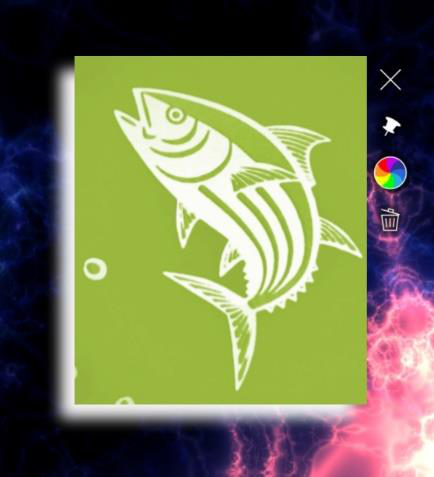
Image viewer widget with a white drop shadow. In this example, the shadow is offset by 20 pixels below and to the left of the widget.
To add a drop shadow:
Click Structures in the left-hand pane.
Click the structure you want to edit. For example, My First Structure. The Editing a Structure screen opens.
Go to the Main section and click the widget you want to edit. The following widget types support drop shadows:
Book
Image viewer
Video viewer
Web browser
In the widget attributes pane, click the Show advanced attributes hyperlink.
Show advanced attributes hyperlink.
Edit the drop shadow attributes as required.
For example, to add a white drop shadow, set the Drop shadow color attribute to
rgba(255,255,255,1)or#FFFFFForwhite. Click the help button or see the Colors section below for details of color input methods.Click the Save button.
Size Limits
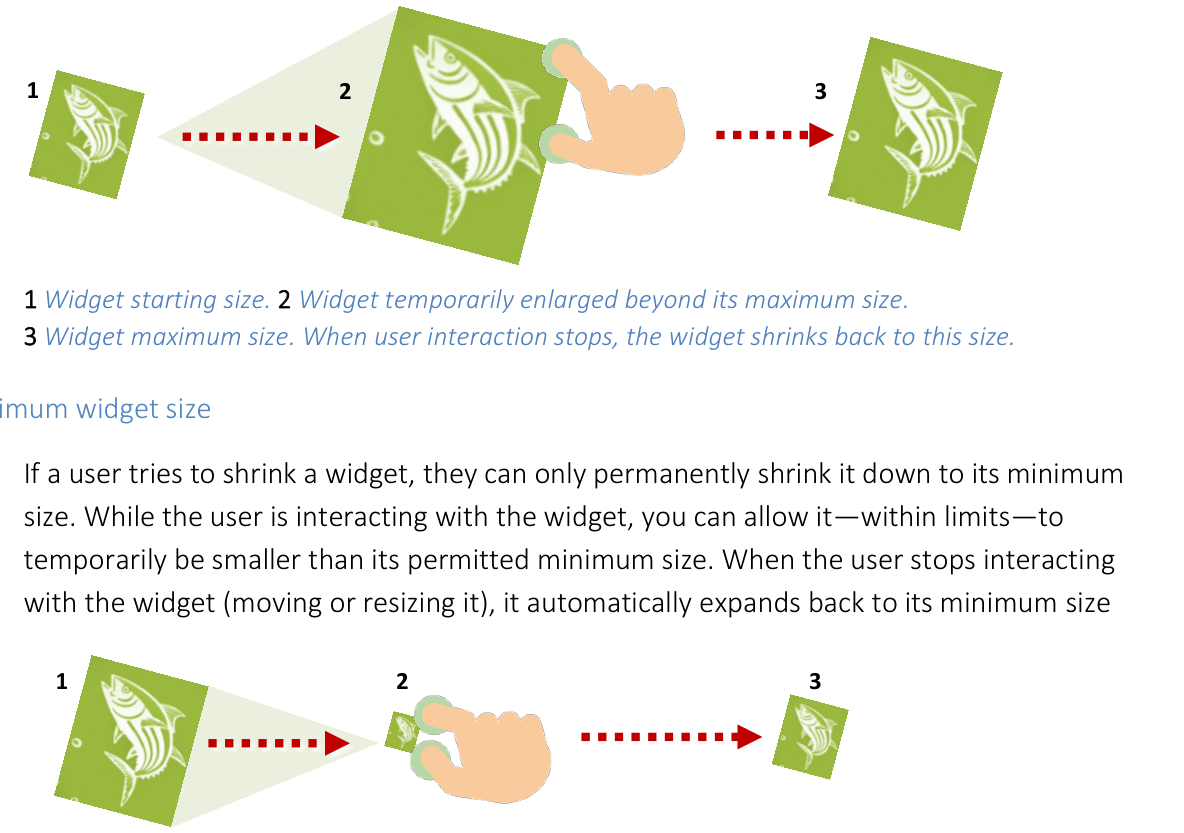
You can set a maximum and minimum size for widgets. If a user makes a widget too big or too small, the widget automatically resizes. This is useful to prevent users inadvertently super-sizing a widget so it covers the whole screen or making a widget too small to be usable. For example, to prevent widgets being bigger than a single screen, you can set the maximum size to 1920 x 1080 pixels.
Maximum Widget Size
If a user tries to enlarge a widget, they can only permanently enlarge it up to its maximum size. While the user is interacting with the widget, you can allow it -- within limits -- to temporarily exceed its permitted maximum size. When the user stops interacting with the widget (moving or resizing it), it automatically shrinks back to its maximum size.
Note
This effect of temporarily overriding the maximum size gives widget interactions a more natural feel. If you were to set a "hard" maximum size, users might wrongly infer that the resizing feature was faulty.
- align
center
- alt
Maximum widget size behavior
1 Widget starting size. 2 Widget temporarily enlarged beyond its maximum size. 3 Widget maximum size. When user interaction stops, the widget shrinks back to this size.
Minimum Widget Size
If a user tries to shrink a widget, they can only permanently shrink it down to its minimum size. While the user is interacting with the widget, you can allow it -- within limits -- to temporarily be smaller than its permitted minimum size. When the user stops interacting with the widget (moving or resizing it), it automatically expands back to its minimum size.
- align
center
- alt
Minimum widget size behavior
1 Widget starting size. 2 Widget temporarily shrunk below its minimum size. 3 Widget minimum size. When user interaction stops, the widget expands back to this size.
Set the Maximum and Minimum Sizes
For example, to assign a size limit widget to the web browser in My First Structure, follow these steps:
Edit the widget attributes:
Click Structures in the left-hand menu.
Click the My First Structure hyperlink.
In the Main section, click the Web browser widget.
Add a new size limit widget.
In the Web browser attributes pane, go to the Size limit attribute.
Click the New button.
In the Add a new widget pop-up, click the Add button.
Add a new widget pop-up for "Size limit".
Type a name for the new size limit widget. For example, My Size Limit.
Click the Save button.
Edit the new size limit widget.
Click the Edit button to display the Editing a widget screen.
In Editing a widget screen, go to the right-hand attributes pane.
Set the Minimum size. Enter the minimum width and height. For example, enter
10cm 10cmto prevent widgets having a width or height of less than 10 centimeters.Set the Maximum size. Enter the maximum width and height. For example, enter
1920px 1080pxto set a maximum widget size that matches the size of a single MultiTaction Cell in landscape mode. If a user tries to make a widget bigger than this, it will shrink back to its permitted maximum.Set the Maximum size multiplier. You can allow users to make widgets bigger than their permitted maximum size while they interact with the widget. This multiplier defines how much a widget can exceed its maximum size. For example, a multiplier of
1.6means a widget can expand 60% beyond its normal maximum size. When the user stops interacting with the widget, it shrinks back.
Click the Save button.
Note
You have now created a new Size limit shared widget. This widget is now listed in the widget library and can be assigned to any other widget in your app. You can also set default Size limit values in a theme.
Snap to Angle
By default, you can freely rotate any screen item. But in some cases, you may want to constrain the incremental rotation so that a rotated widget automatically re-adjusts itself to a fixed angle of rotation. For example, you may want to ensure that a Video Viewer widget or a Web Browser widget always returns to zero degrees (its correct orientation) if it is rotated by a user.
The snap to angle shared widget meets this requirement by causing a rotated widget to automatically right itself to a preferred angle of rotation. (The effect is similar to a boat righting itself after keeling over.)
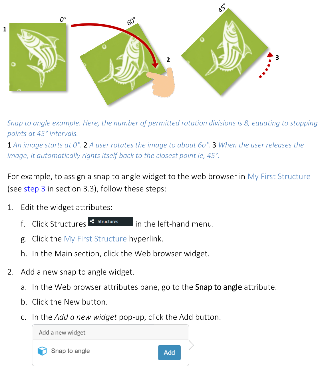
Snap to angle example. Here, the number of permitted rotation divisions is 8, equating to stopping points at 45-degree intervals. 1 An image starts at 0 degrees. 2 A user rotates the image to about 60 degrees. 3 When the user releases the image, it automatically rights itself back to the closest point (45 degrees).
For example, to assign a snap to angle widget to the web browser in My First Structure, follow these steps:
Edit the widget attributes:
Click Structures in the left-hand menu.
Click the My First Structure hyperlink.
In the Main section, click the Web browser widget.
Add a new snap to angle widget.
In the Web browser attributes pane, go to the Snap to angle attribute.
Click the New button.
In the Add a new widget pop-up, click the Add button.
Type a name for the new snap to angle widget. For example, My 45 Degree Angle Snap.
Click the Save button.
Edit the snap to angle widget.
Click the Edit button to display the Editing a widget screen.
In Editing a widget screen, go to the right-hand attributes pane.
Set the Rotation divisions. This attribute determines the number of possible "permitted angles" if you rotate a widget through a full circle (360 degrees). To calculate the interval between permitted angles, divide 360 by the number of rotation divisions. For example, if you specify 4 rotation divisions, the permitted angles are at 90-degree intervals (0, 90, 180, 270). Likewise, if you specify 2 rotation divisions, the permitted angles are 0 and 180. And if you specify 1 rotation division, the widget will always correct itself to 0 degrees. Click the help button for details.
Set the Duration of adjustment to snap angle. When the user releases a rotated widget, it automatically adjusts its rotation to the nearest permitted angle. This attribute determines how quickly (or slowly) that adjustment takes.
Click the Save button.
Note
You have now created a new Snap to angle shared widget. This widget is now listed in the widget library and can be assigned to any other widget in your app. You can also set default Snap to angle values in a theme.
Colors
Many MT Showcase widgets have color attributes. That is, you can define the attribute's color. For example, you can define the color of bubbles and connectors in a finger menu, on-screen annotations, drop shadows, particles in the Sparkles animation, and items in the Input visualizer.
In all cases, you have four methods for specifying color:
RGBA values: Enter an RGBA color in the input box. For example, you can specify solid purple as
rgba(128,0,128,1).Native format: Whichever color method you use, MT Showcase always translates the specified color to its RGBA equivalent value and displays this RGBA value in the MT Showcase Editor.
Transparency: The "a" element in the RGBA value represents the alpha channel (also called the opacity channel). Its possible values range from 0 to 1. When its value is 0, the color is fully transparent (invisible); when its value is 1, the color is fully opaque (solid).
Hex codes: Enter a hex code, or hex triplet, in the input box. Remember to add a leading
#character. For example, you can specify purple as#800080. You can only specify solid colors using hex codes; you cannot specify transparent or semi-transparent colors. You can, however, edit the alpha channel after MT Showcase translates the hex code to an RGBA value.CSS color names: Enter the color name, for example
purpleordarkmagenta. Color names are not case-sensitive. Named colors are always solid; you cannot specify transparent or semi-transparent colors. You can, however, edit the alpha channel after MT Showcase translates the color name to an RGBA value.Color picker: Click the preview swatch to open a color picker. Click the color you want, then click outside the picker to close it.
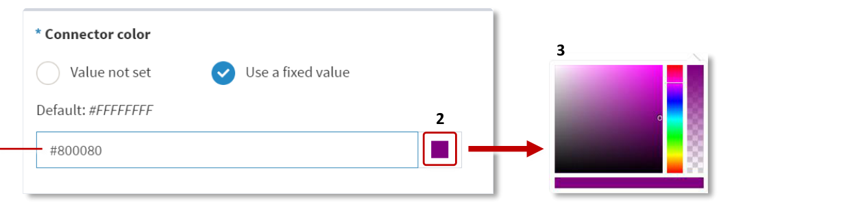
Color attribute input box.
- align
center
- alt
Menu bubble widget connector color attribute with color picker
Menu bubble widget, connector color attribute. 1 Input box (accepts RGBA values, hex codes and color names). 2 Preview swatch. 3 Color picker.
Text Style
You can add a Text style shared widget to your Showcase app to customize how text in various widgets is displayed. You can set a text style in theme defaults, affecting all widgets that display text, or add a custom text style to a specific widget in your app. Note that some widgets, for example the widget caption bar, do not have configurable attributes but will still use the text style defined in theme defaults.
You can use a custom font in your app by dragging and dropping an OpenType or TrueType font file from the media library to the Font file attribute. You can choose the font size and color, and choose to make the font style italic or the font weight bold. You can also customize the font render width to make the text characters appear thicker or thinner.
You can add stroke around the text characters by setting a stroke color and a stroke width and add glow by setting a glow amount and a glow color. You can also add drop shadows to the text, and choose the shadow color, blur and offset.
You can customize how the text is aligned in a text box by choosing a vertical and horizontal text alignment and a text wrap mode.

Custom text style applied to Menu bubbles in a Finger menu.