Other Features
This section briefly introduces some other useful features in the MT Showcase Editor.
Advanced Content Sets
Note
For an overview of content sets, see the content sets documentation.
A content set supplies the items that are displayed by a finger menu, teasers or clouds. They typically include images, videos and PDFs from the media library, arranged in a flat structure. To add these items to a content set, simply drag items from the MT Showcase media library.
However, content sets can also include URLs, Twitter feeds, and widgets such as clouds and the Exit Showcase widget. Items in a content set can also be organized hierarchically to reflect the menus and submenus that you want in your app.
To add advanced features, you click the Add button in the Editing a content set screen.
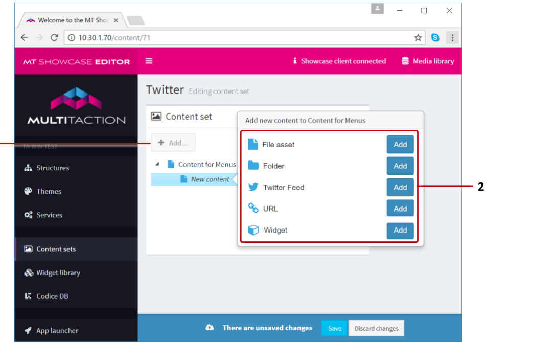
Editing a content set screen. Adding advanced items. 1 Add button. 2 Add new content pop-up menu.
Folders and Subfolders
If your MT Showcase media library already contains items organized into the correct folders and subfolders, simply drag the folder directly into the root folder of your content set to automatically create a corresponding menu structure.
Alternatively, follow these steps to create a new folder structure:
In the Editing a content set screen, click the root folder.
Click the Add button.
From the pop-up Add new content menu, add a folder. The folder is added to the content set as a subfolder.
(Optional) By default, the subfolder is named New node. But you can rename the subfolder to reflect its contents. For example, My Images Subfolder.
Add or drag items into the subfolder.
Click Save to save the content set.
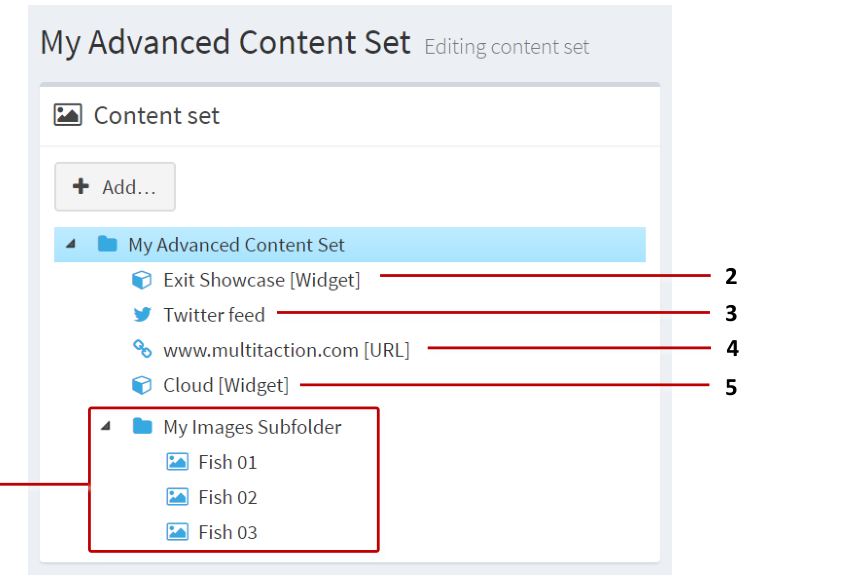
Example advanced content set with subfolder. 1 Subfolder and items for submenu. 2 Exit Showcase widget. 3 Twitter feed. 4 URL. 5 Cloud widget.
Add a URL
You can add a specific URL to your content set. The URL automatically opens in a web browser. Follow these steps:
In the Editing a content set screen, click the root folder.
Click the Add button.
From the pop-up Add new content menu, add a URL. The URL is added as a new item in the content set.
Rename the new widget. For example, MyURL.com.
Configure the URL. In the right-hand Content Attributes pane:
Set the Visible name. For example, MyURL.com.
Set the URL field. For example,
www.multitaction.com.
Click Save to save the content set.
Add a Twitter Feed
You can add a Twitter feed to your app based on search terms defined by you. For example, you can add a Twitter feed that displays tweets relating to MultiTaction iWall or @multitaction.
Add a Widget
You can add a wide range of widgets to a content set. You typically use this feature to add items such as a cloud, an Exit Showcase widget or an Input Visualizer.
Cloud: Add a cloud widget to a content set.
Exit Showcase: Add an Exit Showcase widget to a content set.
Input Visualizer: You may want to add an Input Visualizer to a content set for administrative purposes.
Note
You can use this feature to add almost any widget to your content set, such as an Image Viewer or Video Viewer. But if you want to add items such as images, videos or PDFs to your content set, it is easier to drag them directly from the media library.
Widget Example: Add an Input Visualizer to a Content Set
Follow these steps:
In the Editing a content set screen, click the root folder.
Click the Add button.
From the pop-up Add new content menu, add the Widget. The widget is added as a new item in the content set.
Rename the new widget. For example, Input Visualizer.
Configure the new widget to be an Input Visualizer. In the right-hand Content Attributes pane:
Set the Visible name to Input Visualizer.
Go to the Widget field and click the New button.
In the Add a new widget pop-up, add the Input Visualizer widget.
Click Save to save the content set.
Animated Content
The "Animated content" feature allows you to apply animation to images or videos in the Overlay or Background layers of your app. Specifically, you can apply animation to Image viewer, Image movie, and Video viewer widgets.
This feature supports two types of animation:
Floating images or videos: The image widget or video widget floats slowly across the screen. (Teaser menus also use this animation style.)
Fading images or videos: The image widget or video widget pulses rhythmically, fading in and out, at random screen locations, or random locations inside the screensaver area; or in the screen corners.
In both cases, the images or videos are non-interactive. For example, users cannot resize animated content images or pause animated content videos.

Animated content example. Here, the animated content comprises an Image Viewer widget that fades in and out at the screen corners.
Add Animated Content to Your App
Follow these steps:
Click Structures in the left-hand pane.
Click the structure you want to edit. For example, My First Structure. The Editing a Structure screen opens.
Go to the Background section and click Add a new widget to Background. Or go to the Overlay section and click Add a new widget to Overlay.
Note
You can add animated content to the Overlay or Background layers. Overlay animated content displays on top of content in the Main and Background layers. Background animated content displays behind content in the Main and Overlay layers.
From the pop-up widget menu, choose Animated content.
Add a content animation widget to your structure:
In the Animated content attributes pane, select a Content animation widget.
Click the New button.
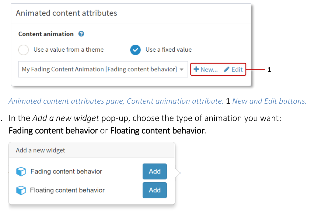
Animated content attributes pane, Content animation attribute. 1 New and Edit buttons.
In the Add a new widget pop-up, choose the type of animation you want: Fading content behavior or Floating content behavior.
Type a name for the new Content animation widget. For example, Fading Content Animation.
Click the Save button.
Edit the new content animation widget:
Still in the Animated content attributes pane, click the Edit button to display the Editing a widget screen.
Edit the attributes for your content animation widget. If you added:
Fading content behavior: The available attributes determine how often images or videos appear and disappear and whether they fade in and out, and expand or shrink, as they appear and disappear. Note also the Only use corners attribute; if this attribute is enabled, items only appear in the screen corners.
Floating content behavior: The available attributes cover the speed and direction of widget movement, the "shape" of the widget undulations across the screen, and so on.
Click the Save button.
Now set up the content that you want to animate. Go to the next section.
Set Up the Animated Content
Follow these steps:
In the Editing a Structure screen, click the triangle next to the Animated content widget that you added above. The widget expands to reveal the Add a new widget to Animated content hyperlink.
Click the Add a new widget hyperlink.
Add the widget(s) you want. Choose from Image Viewer, Image Movie or Video Viewer.
Set the attributes for the new widget(s).
Tip
You can add multiple images or videos to a single animated content widget.
Click Save to save the animated content.
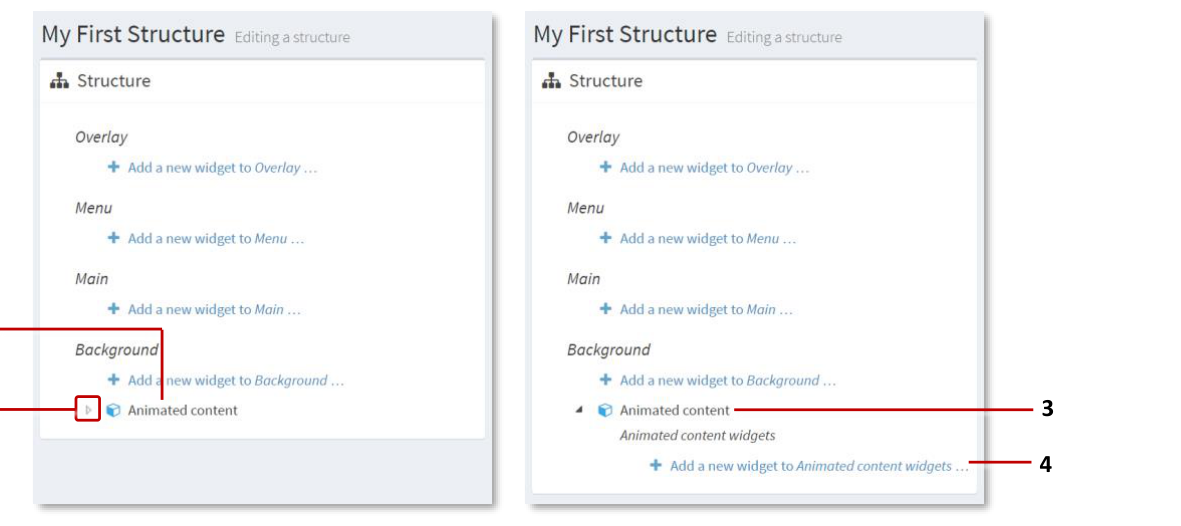
Setting up animated content. 1 Animated content widget added to Background layer. 2 Triangle -- click to reveal widget hyperlink. 3 Expanded animated content widget. 4 "Add a new widget to Animated content" hyperlink.
App Switcher Widget
To allow users to easily switch to a different app, you can include an App switcher widget in your app. You can include this widget in, for example, a finger menu, a content hotspot, or as Codice content. For example, you could set up a "switch" hotspot in the corner of your video wall screen.
By default, MT Showcase displays a confirmation dialog when it switches apps. But you can optionally configure the widget so that MT Showcase switches immediately, without prompting users to confirm or cancel the app switch.
Note
Typically, you set up the app switcher to switch to a specific app. But you can instead set up the app switcher to display the welcome screen, allowing users to choose which app they switch to.
- align
center
- alt
Switch app confirmation dialog
Switch app confirmation dialog.

Switch app confirmation dialog.
Create an App Switcher Content Hotspot
Follow these steps:
Add a hotspot to your app's structure:
When you set the general hotspot attributes in the Content Hotspot attributes pane:
Set the Hotspot location and Hotspot size to define a 100 x 100 pixel hotspot in the lower right screen corner. For example, on a MultiTaction Meeting Room video wall (with three Cells in portrait mode), set the Location to
3160 1820and the Size to100 100.Set the Background color for the Exit Showcase hotspot to white, i.e.,
rgba(255,255,255,1).
(Optional) Right-click the content hotspot widget and click Rename. Enter a new name for the hotspot, such as Switch apps.
Click the Save button to add the content hotspot menu to your app's structure.
Add the App switcher widget to the hotspot.
Click the Add hyperlink for the Widgets launched from hotspot around tap location list.
Add the App switcher widget.
Add a new widget pop-up menu. 1 App switcher widget.
Set up the app switcher. You must now specify which app to switch to. You can also play sounds to accompany the app switch and, if required, suppress the confirmation dialog. Go to the right-hand App switcher attributes pane and follow the instructions in the Set Up the App Switcher section.
This completes the setup for adding the App switcher widget to a content hotspot.
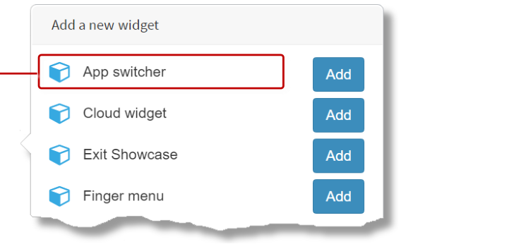
Add the App Switcher Widget to a Finger Menu
To add the App switcher widget to a finger menu, you simply edit the content set that "supplies" the menu. For this example, you will edit the Content for Menus content set. The finger menu will then automatically include an App switcher menu item.
Follow these steps:
Click Content sets in the left-hand pane.
Click the Content for Menus content set.
Add a new widget to the content set.
In the Editing a content set screen, click the root folder.
Click the Add button.
From the pop-up Add new content menu, add the Widget. The widget is added as a new item in the content set.

Editing a content set screen. Adding a widget to a content set. 1 Add button. 2 Rename the new content set item. 3 Pop-up "Add new content" menu. 4 Add a Widget to the content set.
Configure the new widget to be an App switcher widget. In the right-hand Content Attributes pane:
Set the Visible name. This is the name for the new menu item that users will see. Enter a short descriptive name such as Switch apps or Show App #2.
Go to the Widget field and click the New button.
In the Add a new widget pop-up, add the App switcher widget.
Enter a new name for the app switcher widget. For example, My app switcher.
Click Save to save the content set.
You must now specify which app to switch to. You can also play sounds to accompany the app switch and, if required, suppress the confirmation dialog. Still in the right-hand Content Attributes pane:
Go to the Widget field and click the Edit button.
The Editing a widget screen now displays. Follow the instructions in the Set Up the App Switcher section.
This completes the setup for adding the App switcher widget to a finger menu.
Add the App Switcher Widget to Codice Content
You can add the app switcher to Codice content so that MT Showcase automatically switches apps when a user presents a Codice card (holds it against the screen).
Briefly, you need to:
Click Codice Database in the left-hand pane.
In the Codice Database screen, go to the Personal Markers pane.
Specify the marker that you want to associate with the app switcher.
Click the Create codice content hyperlink.
Add the App switcher to the Widgets launched list.
Set up the app switcher; see the Set Up the App Switcher section.
Click the Save button.
Create a Collection of Linked Apps
Using app switcher widgets, you can create a collection of linked apps. Users can tap strategically organized app switchers to navigate around the collection.
For example, you can create a master app that features app switcher widgets, allowing users to navigate to the app they want. In the example below, the master app has a finger menu of app switchers linked to child apps. Each child app has an app switcher content hotspot that links back to the master app.

Example collection of linked apps. 1 App switchers as finger menu items in master app. 2 App switchers as content hotspots in child apps.
Note
An alternative, simpler approach is to simply list the available apps on the welcome screen; see Welcome Screen with App List below.
Set Up the App Switcher
By default, the app switcher widget causes MT Showcase to display a confirmation dialog when it switches apps. You can configure the size and location of the dialog, and you can play sounds to accompany the app switch. Alternatively, you can configure the app switcher to switch apps immediately, without displaying the confirmation dialog.
You can also specify a "none" app switcher that simply switches back to the welcome screen.
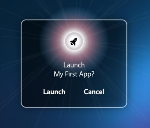
Switch app confirmation dialog.
After adding an app switcher to a content hotspot or a menu, you can set up the app switcher by editing its attributes in the Editing a widget screen. Follow these steps:
Go to the right-hand App switcher attributes pane.
Go to the Target app attribute:
Select "Use a fixed value".
From the drop-down menu, choose the app you want to switch to. Or select "None" to switch back to the MT Showcase welcome screen, allowing users to choose which app to launch.
(Optional) Disable the Show confirmation before switch attribute. This suppresses the confirmation dialog, causing MT Showcase to switch apps immediately.
Edit the other attributes as required. For example, you can set Interaction sounds that play when the app switcher activates.
Save the changes to the app switcher app.
Exit Showcase Widget
To allow users to easily quit from MT Showcase, you can include the Exit Showcase widget in your app. You can include this widget in, for example, a finger menu, a content hotspot, or as Codice content. For example, you could set up a "quit" hotspot in the corner of your video wall screen.
By default, MT Showcase displays a confirmation dialog when it exits. But you can optionally configure the widget so that MT Showcase exits immediately, without prompting users to confirm or cancel the exit.
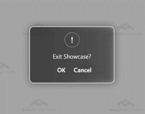
Exit Showcase confirmation dialog.
Create an Exit Showcase Content Hotspot
Follow these steps:
Add a hotspot to your app's structure:
When you set the general hotspot attributes in the Content Hotspot attributes pane:
Set the Hotspot location and Hotspot size to define a 100 x 100 pixel hotspot in the lower right screen corner. For example, on a MultiTaction Meeting Room video wall (with three Cells in portrait mode), set the Location to
3160 1820and the Size to100 100.Set the Background color for the Exit Showcase hotspot to white, i.e.,
rgba(255,255,255,1).
(Optional) Right-click the content hotspot widget and click Rename. Enter a new name for the hotspot, such as Exit Showcase.
Click the Save button to add the content hotspot menu to your app's structure.
Add the Exit Showcase widget to the hotspot.
Click the Add hyperlink for the Widgets launched from hotspot around tap location list.
Add the Exit Showcase widget.
Add a new widget pop-up menu. 1 Exit Showcase widget.
(Optional) Disable the exit confirmation dialog. By default, MT Showcase displays a confirmation dialog when it exits. But you can optionally configure MT Showcase to exit immediately, without prompting users to confirm or cancel the exit.
In the Editing a structure screen, click the Exit Showcase widget you added above.
Go to the right-hand Exit Showcase attributes pane.
Disable the Show confirmation before exit attribute.
Save the changes.
This completes the setup for adding the Exit Showcase widget to a content hotspot.
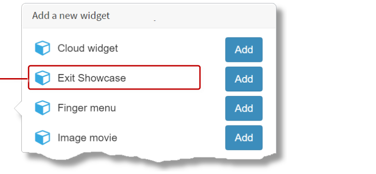
Add the Exit Showcase Widget to a Finger Menu
To add the Exit Showcase widget to a finger menu, you simply edit the content set that "supplies" the menu. For this example, you will edit the Content for Menus content set. The finger menu will then automatically include the Exit Showcase menu item.
Follow these steps:
Click Content sets in the left-hand pane.
Click the Content for Menus content set.
Add a widget to the content set.
In the Editing a content set screen, click the root folder.
Click the Add button.
From the pop-up Add new content menu, add the Widget. The widget is added as a new item in the content set.
Rename the new widget to Exit.
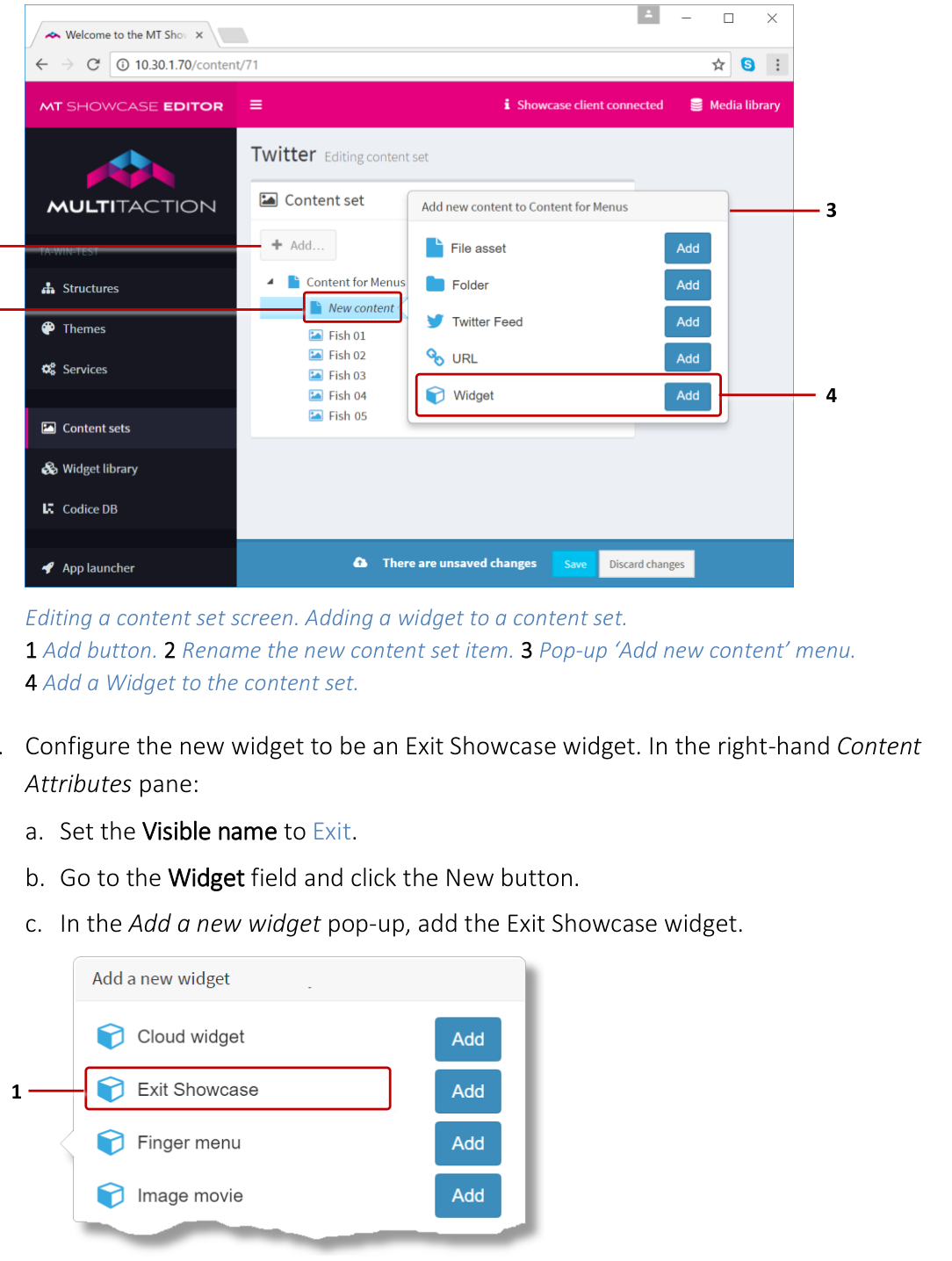
Editing a content set screen. Adding a widget to a content set. 1 Add button. 2 Rename the new content set item. 3 Pop-up "Add new content" menu. 4 Add a Widget to the content set.
Configure the new widget to be an Exit Showcase widget. In the right-hand Content Attributes pane:
Set the Visible name to Exit.
Go to the Widget field and click the New button.
In the Add a new widget pop-up, add the Exit Showcase widget.
Enter a new name for the Exit Showcase widget. For example, My Exit Showcase.
Click Save to save the content set.
(Optional) Disable the exit confirmation dialog. By default, MT Showcase displays a confirmation dialog when it exits. But you can optionally configure MT Showcase to exit immediately, without prompting users to confirm or cancel the exit. Still in the right-hand Content Attributes pane:
Go to the Widget field and click the Edit button.
In the Editing a widget screen, go to the right-hand Exit Showcase attributes pane.
Disable the Show confirmation before exit attribute.
Save the changes.
This completes the setup for adding the Exit Showcase widget to a finger menu.
Maximization Areas
A maximization area is an area on the screen that displays maximized widgets. An app can include multiple maximization areas.
When a widget is maximized (for example, when a user taps the Maximize toolbar button), it floats to the nearest maximization area and scales up to fill the area. If no maximization area is defined, the widget scales up to fill the entire screen. Note that when widgets are scaled, they retain their width-height ratio.
Why define a maximization area? They are mainly used on video walls that include a breakout display (a screen that is physically separate from the main video wall). In this situation, they allow widgets to be maximized on the main video wall only, without extending onto the breakout display. They are also useful if you want a non-default background color or timeout for maximized widgets.
Note
While maximized, a widget is pinned and cannot be unpinned. Consequently, users cannot move a maximized widget, for example, to interact with other items hidden below the maximized widget.
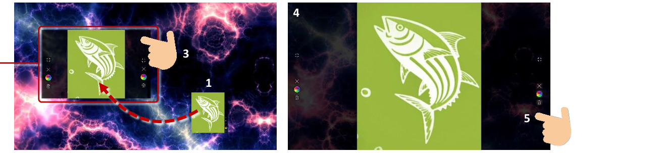
Example maximization area. 1 Original Image Viewer widget -- if a user maximizes this image, it floats to the nearest maximization area and scales to fill the area. 2 Maximization area with default background color. 3 To unmaximize a widget, users tap either edge of the maximization area to display the Unmaximize button and (if configured) the widget toolbar. 4 If no maximization area is defined in the app, maximized images or videos expand to fill the entire screen area, including any breakout displays.
How to Maximize and Unmaximize a Widget
You can configure an app to maximize automatically by enabling the Maximize widget when it opens attribute. All content widgets (for example, Image viewers, Video viewers and Web browsers) have this attribute. This attribute is also available as a theme default.
Alternatively, users can manually maximize a widget if you include a Maximize button in the widget's toolbar.
To reset a maximized widget to its normal size, users tap the edge of the maximization area to display the Unmaximize button. This button will always display, even if the maximized widget has no toolbar.
Add a Maximization Area
Follow these steps:
Click Structures in the left-hand pane.
Click the structure you want to edit. For example, My First Structure. The Editing a Structure screen opens.
Go to the Overlay section and click Add a new widget to Overlay.
From the pop-up widget menu, choose Maximization area.
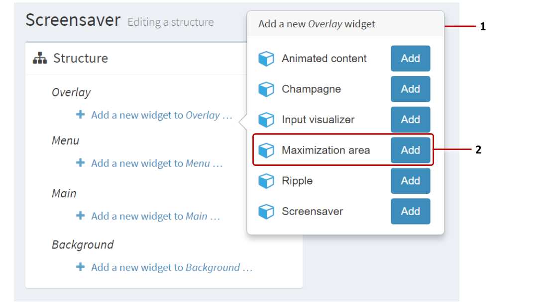
Editing a structure screen. 1 Pop-up menu of Overlay widgets. 2 Maximization area widget and Add button.
In the Maximization area attributes pane, set the size and location attributes:
Size and Location: These attributes are self-explanatory.
Background color: (Optional) While a widget is maximized, you can configure the maximization area to display with a colored background. The default color is semi-transparent black, i.e.,
rgba(0,0,0,0.8).Toolbars timeout: Set the timeout for idle toolbars in the maximization area. If a toolbar is not used before the timeout expires, it closes. For widgets that have no toolbar, this timeout also applies to the Unmaximize button.
(Optional) If you intend to add multiple maximization areas to your app, you may want to give distinctive names to each area in the Editor. To rename an area, right-click the Maximization area widget and click Rename.
Click the Save button.
Opening Animations
There are two types of opening animation in MT Showcase:
Opening animation: This refers solely to an animation that plays when a user opens a finger menu. Two opening animations are supported:
Circular: This animation shows a circular progress bar when a user taps the screen to open a finger menu. You can specify the color of the progress bars.
Stars: This animation shows a spinning spiral of small stars when a user taps the screen to open a finger menu. You can specify the color of the stars and spiral rotation speed.
Content opening animation: This refers to the visual effect of a widget fading in and expanding when it opens from a finger menu or content hotspot, or when a user opens some Codice content. You can control the speed of this animation to give your apps a slick, professional feel or a smooth, graceful feel. To control the animation speed, you simply set the duration of the animation. If you want items to open quickly, set a short duration (e.g., 0.3 seconds). If you want smoother, more graceful behavior, set a longer duration (e.g., 2 seconds).
The following sections describe how to set animations for finger menus, content hotspots, and Codice content.
Finger Menu Animations
You can choose which opening animation plays (Circular or Stars) when the finger menu opens. You can also specify how long menu items take to open.
Note
Finger menus are described in the finger menu documentation.
This section describes how to set up opening animations by editing an app directly. But you can also set up opening animations in a theme. Open the theme you want, go to the finger menu component, and repeat the instructions below.
To edit a finger menu directly, follow these steps:
Click Structures in the left-hand pane.
Click the structure that contains the finger menu you want to edit. For example, My First Structure. The Editing a Structure screen opens.
Go to the Menu section and click the Finger menu widget.
In the right-hand attributes pane, go to the Finger menu attributes section.
Go to the Opening animation attribute and click the New button.
In the Add a new widget pop-up, click an Add button to select the animation you want, Circular or Stars.
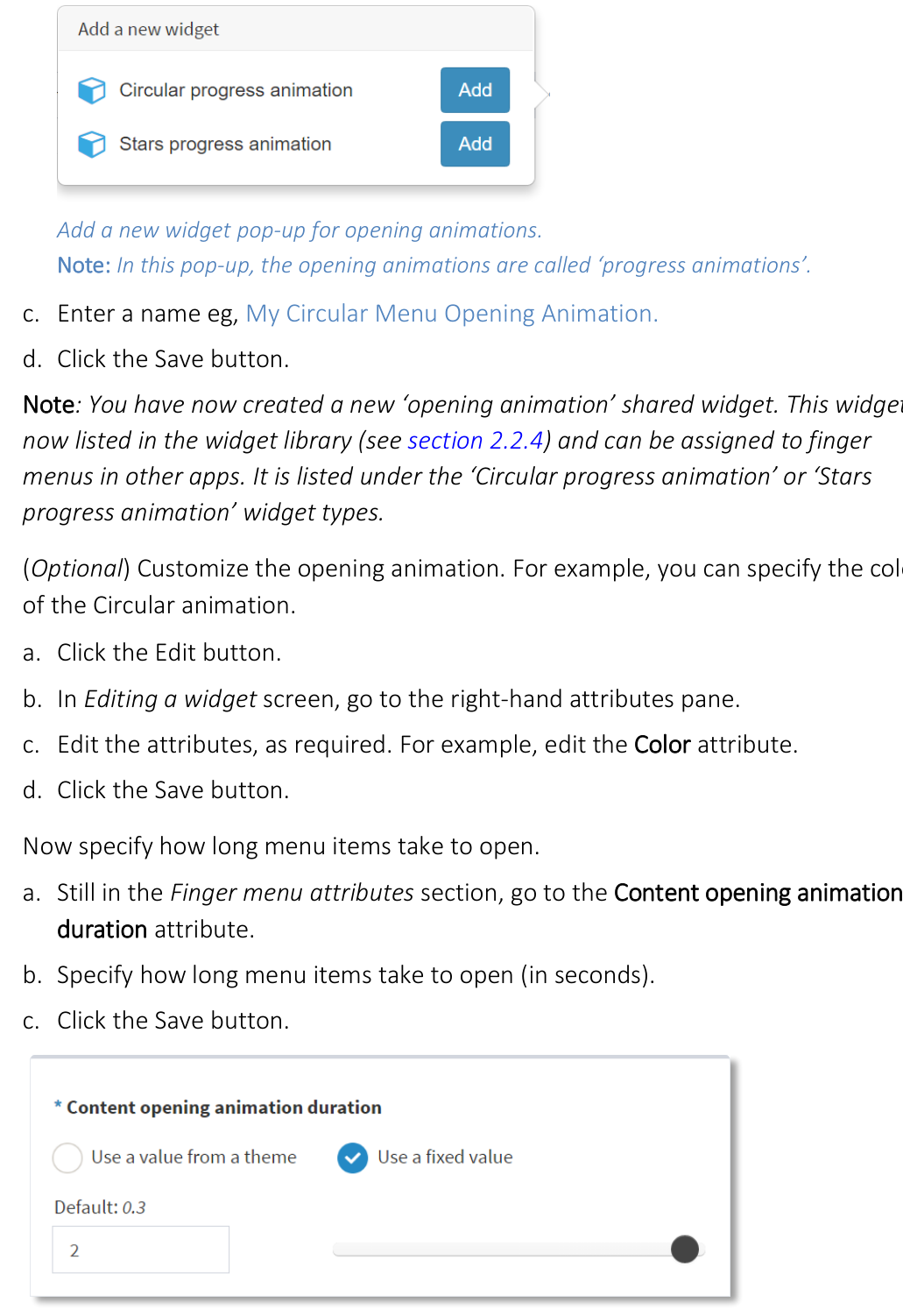
Add a new widget pop-up for opening animations. Note: In this pop-up, the opening animations are called "progress animations".
Enter a name, e.g., My Circular Menu Opening Animation.
Click the Save button.
Note
You have now created a new "opening animation" shared widget. This widget is now listed in the widget library and can be assigned to finger menus in other apps. It is listed under the "Circular progress animation" or "Stars progress animation" widget types.
(Optional) Customize the opening animation. For example, you can specify the color of the Circular animation.
Click the Edit button.
In Editing a widget screen, go to the right-hand attributes pane.
Edit the attributes, as required. For example, edit the Color attribute.
Click the Save button.
Now specify how long menu items take to open.
Still in the Finger menu attributes section, go to the Content opening animation duration attribute.
Specify how long menu items take to open (in seconds).
Click the Save button.
- align
center
- alt
Editing a structure screen showing Content opening animation duration attribute
Editing a structure screen: Content opening animation duration attribute.
Content Hotspots
You can choose how long widgets take to open when launched from a content hotspot.
Note
Content hotspots are described in the content hotspots documentation.
This section describes how to set the duration of content opening animations by editing an app directly. But you can also set this duration in a theme. Open the theme you want, go to the content hotspot component, and repeat the instructions below.
To edit a content hotspot directly, follow these steps:
Click Structures in the left-hand pane.
Click the structure that contains the content hotspot you want to edit. For example, My First Structure. The Editing a Structure screen opens.
Go to the Main section and click the Content Hotspot widget.
In the right-hand attributes pane, go to the Content hotspot attributes section.
Click the Show advanced attributes hyperlink.
Go to the Content opening animation duration attribute.
Specify how long menu items take to open (in seconds).
Click the Save button.
Codice Content
You can choose how long widgets take to open when a user launches Codice content by presenting a Codice card.
Note
Codice content is described in the Codice documentation.
This section describes how to set the duration of content opening animations by editing an app directly. But you can also set this duration in a theme. Open the theme you want, go to the codice content component, and repeat the instructions below.
To edit a Codice content directly, follow these steps:
Click Codice Database in the left-hand pane.
In the Codice Database screen, go to the Personal Markers pane.
Go to a personal marker that has Codice content assigned to it.
Click the Edit codice content hyperlink. The Editing a Structure screen opens.
In the left-hand Structure pane, click the Codice Content widget.
In the right-hand Codice content attributes pane:
Click the Show advanced attributes hyperlink.
Go to the Content opening animation duration attribute.
Specify how long menu items take to open (in seconds).
Click the Save button.
Password Protection
The MT Showcase Editor can be password-protected to prevent unauthorized changes to apps, structures, themes and so on. When the Editor is protected, any app designer who wants to open the Editor must enter the correct user name and password.
Password protection for the Editor can be enabled (or disabled) by an MT Showcase administrator. It is the administrator's responsibility to inform app designers of the user name and password needed to access the Editor. For setup details, see the MT Showcase Editor Installation Manual. Registered users can download this manual from https://cornerstone.multitouch.fi/showcase.

MT Showcase Editor authentication dialog.
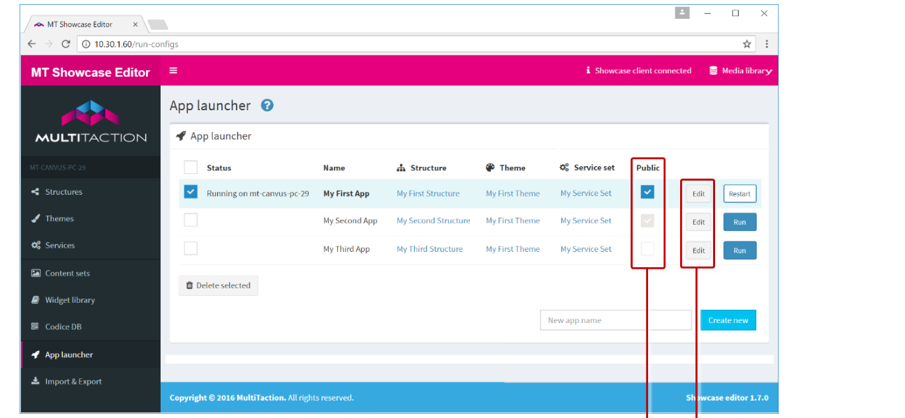
Welcome Screen with App List
By default, available apps are listed on the MT Showcase welcome screen. This is generally useful, though you can remove apps if required:
Safeguard against deleted apps: Listing the available apps is a useful safeguard if users are inadvertently directed to the welcome screen. For example, if a user taps an MT Launcher tile to open an MT Showcase app that no longer exists, the user is taken instead to the MT Showcase welcome screen.
Note
MT Launcher is designed to run on video walls and provide end-users with a simple method for launching applications such as MT Showcase or MT Canvus. For setup details, see the MT Launcher Installation Manual. Registered users can download this manual from https://cornerstone.multitouch.fi/mt-launcher.
Allow users to choose an app: Listing the available apps can also be a useful way of allowing users to choose the app they want. If so, you will need to provide users with a method of getting to the welcome screen; see below.
Note
An alternative, more sophisticated approach is to create a collection of linked apps, based on app switcher widgets. Users can tap strategically organized app switchers to navigate around the collection.
Remove apps from the welcome screen: Alternatively, you may want to keep some apps private. That is, you do not want them listed on the welcome screen.
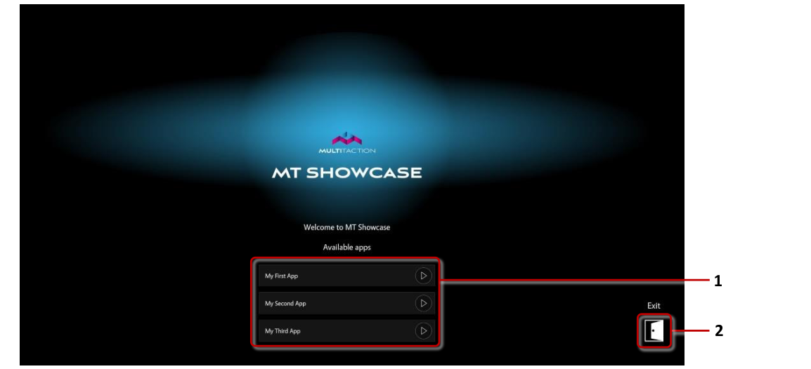
Welcome screen. 1 Available apps. 2 Exit button.
Provide a Method to Access the Welcome Screen
You can allow users to access the welcome screen from an MT Showcase app or from a tile in MT Launcher:
You can add a "none" app switcher widget to your app that switches back to the welcome screen. The app switcher can be a finger menu item, a content hotspot, or Codice content.
You can set up an MT Launcher tile that, instead of launching an app, opens the welcome screen. To do this, you must append
--app,noneto the arguments setting in the MT Showcase pipeline configuration screen. For full details, see the MT Launcher Installation Manual. Registered users can download this manual from https://cornerstone.multitouch.fi/mt-launcher.
Closing Content
There are several ways to close content in Showcase:
Widget interaction: You can simply throw a content widget such as an Image viewer or Video viewer out of the screen. It is automatically closed when it is outside the visible area. You can tap the root node of a menu to close the menu.
Close button: You can add a close button to the widget's toolbar. User can tap the button to close the widget.
Close after idle: You can make content close automatically after it has been idle for a while. Most content widgets have a Close after idle attribute. You can set this attribute to a shared widget that automatically closes the content when it is idle, and choose the timeout value. Menus also have a Close after idle attribute that affects all the widgets launched from the menu. You can make the menu itself close by editing the Menu idle timeout attribute.
Close content on next tap: Menus and content hotspots have a Close content on next tap? attribute. When enabled for a hotspot, it will close its content when tapped instead of launching new content if it already had open content. When enabled for a menu, tapping a menu node will close any previous content launched from the same menu and then open that node's content if it was not previously open.
Close content when launcher is closed: Menus, content hotspots and Codice content each have an attribute to close content when the menu, hotspot or Codice is removed. Normally this only affects content launched directly by that launcher. For example, if you enable this for a menu, when you launch a hotspot image from that menu only the image is closed when the menu is closed. Anything launched from the hotspot image is left open. If you also enable this attribute for the hotspot, then closing the menu closes the hotspot, which in turn closes any additional content launched from that hotspot.
Screen wipe: You can add a Screen wipe widget to your app. You can add this widget to a menu, hotspot or Codice content. When this widget is launched, it immediately closes all user-launched content on screen. This includes content such as open menus and widgets launched from menus, hotspots and Codices.
App switch: When you switch apps or restart an app from the Editor, the current app is completely reset. All content is closed, videos are reset to start, annotations are cleared, etc. Next time you load the app, it is back in its initial state.